IaaS

<style type="text/css">@import url("https://fonts.googleapis.com/css2?family=Montserrat:ital,wght@0,400;0,7…;);
html {
font-family: sans-serif;
/* 1 */
-ms-text-size-adjust: 100%;
/* 2 */
-webkit-text-size-adjust: 100%;
/* 2 */
}

/**
* Remove default margin.
*/
body {
margin: 0;
}

/* HTML5 display definitions
========================================================================== */
/**
* Correct `block` display not defined for any HTML5 element in IE 8/9.
* Correct `block` display not defined for `details` or `summary` in IE 10/11
* and Firefox.
* Correct `block` display not defined for `main` in IE 11.
*/
article,
aside,
details,
figcaption,
figure,
footer,
header,
hgroup,
main,
menu,
nav,
section,
summary {
display: block;
}

/**
* 1. Correct `inline-block` display not defined in IE 8/9.
* 2. Normalize vertical alignment of `progress` in Chrome, Firefox, and Opera.
*/
audio,
canvas,
progress,
video {
display: inline-block;
/* 1 */
vertical-align: baseline;
/* 2 */
}

/**
* Prevent modern browsers from displaying `audio` without controls.
* Remove excess height in iOS 5 devices.
*/
audio:not([controls]) {
display: none;
height: 0;
}

/**
* Address `[hidden]` styling not present in IE 8/9/10.
* Hide the `template` element in IE 8/9/10/11, Safari, and Firefox < 22.
*/
[hidden],
template {
display: none;
}

/* Links
========================================================================== */
/**
* Remove the gray background color from active links in IE 10.
*/
a {
background-color: transparent;
}

/**
* Improve readability of focused elements when they are also in an
* active/hover state.
*/
a:active,
a:hover {
outline: 0;
}

/* Text-level semantics
========================================================================== */
/**
* Address styling not present in IE 8/9/10/11, Safari, and Chrome.
*/
abbr[title] {
border-bottom: 1px dotted;
}

/**
* Address style set to `bolder` in Firefox 4+, Safari, and Chrome.
*/
b,
strong {
font-weight: bold;
}

/**
* Address styling not present in Safari and Chrome.
*/
dfn {
font-style: italic;
}

/**
* Address variable `h1` font-size and margin within `section` and `article`
* contexts in Firefox 4+, Safari, and Chrome.
*/
h1 {
font-size: 2em;
margin: 0.67em 0;
}

/**
* Address styling not present in IE 8/9.
*/
mark {
background: #ff0;
color: #000;
}

/**
* Address inconsistent and variable font size in all browsers.
*/
small {
font-size: 80%;
}

/**
* Prevent `sub` and `sup` affecting `line-height` in all browsers.
*/
sub,
sup {
font-size: 75%;
line-height: 0;
position: relative;
vertical-align: baseline;
}

sup {
top: -0.5em;
}

sub {
bottom: -0.25em;
}

/* Embedded content
========================================================================== */
/**
* Remove border when inside `a` element in IE 8/9/10.
*/
img {
border: 0;
}

/**
* Correct overflow not hidden in IE 9/10/11.
*/
svg:not(:root) {
overflow: hidden;
}

/* Grouping content
========================================================================== */
/**
* Address margin not present in IE 8/9 and Safari.
*/
figure {
margin: 1em 40px;
}

/**
* Address differences between Firefox and other browsers.
*/
hr {
box-sizing: content-box;
height: 0;
}

/**
* Contain overflow in all browsers.
*/
pre {
overflow: auto;
}

/**
* Address odd `em`-unit font size rendering in all browsers.
*/
code,
kbd,
pre,
samp {
font-family: monospace, monospace;
font-size: 1em;
}

/* Forms
========================================================================== */
/**
* Known limitation: by default, Chrome and Safari on OS X allow very limited
* styling of `select`, unless a `border` property is set.
*/
/**
* 1. Correct color not being inherited.
* Known issue: affects color of disabled elements.
* 2. Correct font properties not being inherited.
* 3. Address margins set differently in Firefox 4+, Safari, and Chrome.
*/
button,
input,
optgroup,
select,
textarea {
color: inherit;
/* 1 */
font: inherit;
/* 2 */
margin: 0;
/* 3 */
}

/**
* Address `overflow` set to `hidden` in IE 8/9/10/11.
*/
button {
overflow: visible;
}

/**
* Address inconsistent `text-transform` inheritance for `button` and `select`.
* All other form control elements do not inherit `text-transform` values.
* Correct `button` style inheritance in Firefox, IE 8/9/10/11, and Opera.
* Correct `select` style inheritance in Firefox.
*/
button,
select {
text-transform: none;
}

/**
* 1. Avoid the WebKit bug in Android 4.0.* where (2) destroys native `audio`
* and `video` controls.
* 2. Correct inability to style clickable `input` types in iOS.
* 3. Improve usability and consistency of cursor style between image-type
* `input` and others.
*/
button,
html input[type="button"],
input[type="reset"],
input[type="submit"] {
-webkit-appearance: button;
/* 2 */
cursor: pointer;
/* 3 */
}

/**
* Re-set default cursor for disabled elements.
*/
button[disabled],
html input[disabled] {
cursor: default;
}

/**
* Remove inner padding and border in Firefox 4+.
*/
button::-moz-focus-inner,
input::-moz-focus-inner {
border: 0;
padding: 0;
}

/**
* Address Firefox 4+ setting `line-height` on `input` using `!important` in
* the UA stylesheet.
*/
input {
line-height: normal;
}

/**
* It's recommended that you don't attempt to style these elements.
* Firefox's implementation doesn't respect box-sizing, padding, or width.
*
* 1. Address box sizing set to `content-box` in IE 8/9/10.
* 2. Remove excess padding in IE 8/9/10.
*/
input[type="checkbox"],
input[type="radio"] {
box-sizing: border-box;
/* 1 */
padding: 0;
/* 2 */
}

/**
* Fix the cursor style for Chrome's increment/decrement buttons. For certain
* `font-size` values of the `input`, it causes the cursor style of the
* decrement button to change from `default` to `text`.
*/
input[type="number"]::-webkit-inner-spin-button,
input[type="number"]::-webkit-outer-spin-button {
height: auto;
}

/**
* 1. Address `appearance` set to `searchfield` in Safari and Chrome.
* 2. Address `box-sizing` set to `border-box` in Safari and Chrome.
*/
input[type="search"] {
-webkit-appearance: textfield;
/* 1 */
box-sizing: content-box;
/* 2 */
}

/**
* Remove inner padding and search cancel button in Safari and Chrome on OS X.
* Safari (but not Chrome) clips the cancel button when the search input has
* padding (and `textfield` appearance).
*/
input[type="search"]::-webkit-search-cancel-button,
input[type="search"]::-webkit-search-decoration {
-webkit-appearance: none;
}

/**
* Define consistent border, margin, and padding.
*/
fieldset {
border: 1px solid #c0c0c0;
margin: 0 2px;
padding: 0.35em 0.625em 0.75em;
}

/**
* 1. Correct `color` not being inherited in IE 8/9/10/11.
* 2. Remove padding so people aren't caught out if they zero out fieldsets.
*/
legend {
border: 0;
/* 1 */
padding: 0;
/* 2 */
}

/**
* Remove default vertical scrollbar in IE 8/9/10/11.
*/
textarea {
overflow: auto;
}

/**
* Don't inherit the `font-weight` (applied by a rule above).
* NOTE: the default cannot safely be changed in Chrome and Safari on OS X.
*/
optgroup {
font-weight: bold;
}

/* Tables
========================================================================== */
/**
* Remove most spacing between table cells.
*/
table {
border-collapse: collapse;
border-spacing: 0;
}

td,
th {
padding: 0;
}

.clearfix:after {
content: "";
display: block;
clear: both;
}

.ellipsis {
white-space: nowrap;
/* 1 */
text-overflow: ellipsis;
/* 2 */
overflow: hidden;
}

html {
box-sizing: border-box;
}

.paragraph--type--body-text {
padding: 0 !important;
}

*,
*:before,
*:after {
box-sizing: inherit;
}

* {
max-height: 1000000px;
}

body {
color: #000;
background: #fff;
font: 16px/1.5 "Montserrat", "Arial", "Helvetica Neue", "Helvetica", sans-serif;
min-width: 320px;
-webkit-font-smoothing: antialiased;
-moz-osx-font-smoothing: grayscale;
}

img {
max-width: 100%;
height: auto;
vertical-align: top;
}

.gm-style img {
max-width: none;
}

h1,
.h1,
h2,
.h2,
h3,
.h3,
h4,
.h4,
h5,
.h5,
h6,
.h6,
.h {
font-family: inherit;
font-weight: bold;
margin: 0 0 0.5em;
color: inherit;
}

h1,
.h1 {
font-size: 36px;
}

h2,
.h2 {
font-size: 30px;
}

h3,
.h3 {
font-size: 28px;
}

h4,
.h4 {
font-size: 26px;
}

h5,
.h5 {
font-size: 24px;
}

h6,
.h6 {
font-size: 20px;
}

p {
margin: 0 0 1em;
}

a {
color: inherit;
}
a:hover,
a:focus {
text-decoration: none;
}

form,
fieldset {
margin: 0;
padding: 0;
border-style: none;
}

input[type="text"],
input[type="tel"],
input[type="email"],
input[type="search"],
input[type="password"],
textarea {
-webkit-appearance: none;
-webkit-border-radius: 0;
box-sizing: border-box;
border: 1px solid #999;
padding: 0.4em 0.7em;
}
input[type="text"]:focus,
input[type="tel"]:focus,
input[type="email"]:focus,
input[type="search"]:focus,
input[type="password"]:focus,
textarea:focus {
border-color: #000;
}
input[type="text"]::-webkit-input-placeholder,
input[type="tel"]::-webkit-input-placeholder,
input[type="email"]::-webkit-input-placeholder,
input[type="search"]::-webkit-input-placeholder,
input[type="password"]::-webkit-input-placeholder,
textarea::-webkit-input-placeholder {
color: #999;
}
input[type="text"]::-moz-placeholder,
input[type="tel"]::-moz-placeholder,
input[type="email"]::-moz-placeholder,
input[type="search"]::-moz-placeholder,
input[type="password"]::-moz-placeholder,
textarea::-moz-placeholder {
opacity: 1;
color: #999;
}
input[type="text"]:-moz-placeholder,
input[type="tel"]:-moz-placeholder,
input[type="email"]:-moz-placeholder,
input[type="search"]:-moz-placeholder,
input[type="password"]:-moz-placeholder,
textarea:-moz-placeholder {
color: #999;
}
input[type="text"]:-ms-input-placeholder,
input[type="tel"]:-ms-input-placeholder,
input[type="email"]:-ms-input-placeholder,
input[type="search"]:-ms-input-placeholder,
input[type="password"]:-ms-input-placeholder,
textarea:-ms-input-placeholder {
color: #999;
}
input[type="text"].placeholder,
input[type="tel"].placeholder,
input[type="email"].placeholder,
input[type="search"].placeholder,
input[type="password"].placeholder,
textarea.placeholder {
color: #999;
}

select {
-webkit-border-radius: 0;
}

textarea {
resize: vertical;
vertical-align: top;
}

button,
input[type="button"],
input[type="reset"],
input[type="file"],
input[type="submit"] {
-webkit-appearance: none;
-webkit-border-radius: 0;
cursor: pointer;
}

.video-modal__btn {
background-color: #000000;
color: #ffffff !important;
padding: 10px 17px !important;
font-size: 16px !important;
text-decoration: none !important;
-ms-touch-action: manipulation;
touch-action: manipulation;
cursor: pointer;
white-space: nowrap;
-webkit-user-select: none;
-ms-user-select: none;
user-select: none;
}

.video-modal__img-btn::after {
display: none !important;
}

.sec-nav-container,
.section-styles,
.section-01-container,
.section-02-container,
.section-03-container,
.section-04-container,
.section-05-container,
.section-06-container,
.section-07-container,
.section-08-container,
.section-09-container,
.section-10-container,
.section-11-container,
.section-12-container,
.section-13-container,
.section-14-container,
.section-sticky-btn {
width: 100%;
}
.sec-nav-container .field--name-field-body,
.section-styles .field--name-field-body,
.section-01-container .field--name-field-body,
.section-02-container .field--name-field-body,
.section-03-container .field--name-field-body,
.section-04-container .field--name-field-body,
.section-05-container .field--name-field-body,
.section-06-container .field--name-field-body,
.section-07-container .field--name-field-body,
.section-08-container .field--name-field-body,
.section-09-container .field--name-field-body,
.section-10-container .field--name-field-body,
.section-11-container .field--name-field-body,
.section-12-container .field--name-field-body,
.section-13-container .field--name-field-body,
.section-14-container .field--name-field-body,
.section-sticky-btn .field--name-field-body {
max-width: 100% !important;
}

.section,
.section-01,
.section-02,
.section-03,
.section-04,
.section-05,
.section-06,
.section-07,
.section-08,
.section-09 {
overflow: hidden;
position: relative;
color: #000;
font: 16px/1.5 "Montserrat", "Arial", "Helvetica Neue", "Helvetica", sans-serif;
}
.section *,
.section-01 *,
.section-02 *,
.section-03 *,
.section-04 *,
.section-05 *,
.section *:before,
.section-01 *:before,
.section-02 *:before,
.section-03 *:before,
.section-04 *:before,
.section-05 *:before,
.section *:after,
.section-01 *:after,
.section-02 *:after,
.section-03 *:after,
.section-04 *:after,
.section-05 *:after,
.section-06 *:after,
.section-07 *:after,
.section-08 *:after,
.section-09 *:after {
box-sizing: border-box;
}
.field .section h1,
.field .section-01 h1,
.field .section-02 h1,
.field .section-03 h1,
.field .section-04 h1,
.field .section-05 h1,
.field .section h2,
.field .section-01 h2,
.field .section-02 h2,
.field .section h3,
.field .section-01 h3,
.field .section-02 h3,
.field .section-03 h3,
.field .section-04 h3,
.field .section-05 h3,
.field .section h4,
.field .section-01 h4,
.field .section-02 h4,
.field .section-03 h4,
.field .section-04 h4,
.field .section-05 h4,
.field .section h5,
.field .section-01 h5,
.field .section-02 h5,
.field .section-03 h5,
.field .section-04 h5,
.field .section-05 h5,
.field .section h6,
.field .section-01 h6,
.field .section-02 h6,
.field .section-03 h6,
.field .section-04 h6,
.field .section-05 h6,
.section h1,
.section-01 h1,
.section-02 h1,
.section-03 h1,
.section-04 h1,
.section-05 h1,
.section h2,
.section-01 h2,
.section-02 h2,
.section-04 h2,
.section-06 h2,
.section-07 h2,
.section-08 h2,
.section-09 h2,
.section h3,
.section-01 h3,
.section-02 h3,
.section-03 h3,
.section-04 h3,
.section-05 h3,
.section-06 h3,
.section-07 h3,
.section-08 h3,
.section-09 h3,
.section h4,
.section-01 h4,
.section-02 h4,
.section-03 h4,
.section-04 h4,
.section-05 h4,
.section-06 h4,
.section-07 h4,
.section-08 h4,
.section-09 h4,
.section h5,
.section-01 h5,
.section-02 h5,
.section-03 h5,
.section-04 h5,
.section-05 h5,
.section-06 h5,
.section-07 h5,
.section-08 h5,
.section-09 h5,
.section h6,
.section-01 h6,
.section-02 h6,
.section-03 h6,
.section-04 h6,
.section-05 h6,
.section-06 h6,
.section-07 h6,
.section-08 h6,
.section-09 h6 {
font-family: inherit;
font-weight: bold;
margin: 0 0 0.5em;
line-height: 1.2;
color: inherit;
}
.field .section h1,
.field .section-01 h1,
.field .section-02 h1,
.field .section-03 h1,
.field .section-04 h1,
.field .section-05 h1,
.section h1,
.section-01 h1,
.section-02 h1,
.section-03 h1,
.section-04 h1,
.section-05 h1,
.section-06 h1,
.section-07 h1,
.section-08 h1,
.section-09 h1 {
font-size: 36px;
line-height: 1.09;
letter-spacing: -1.59px;
}
@media (min-width: 768px) {
.field .section h1,
.field .section-01 h1,
.field .section-02 h1,
.field .section-03 h1,
.field .section-04 h1,
.field .section-05 h1,
.section h1,
.section-01 h1,
.section-02 h1,
.section-03 h1,
.section-04 h1,
.section-05 h1,
.section-06 h1,
.section-07 h1,
.section-08 h1 {
font-size: 46px;
line-height: 0.94;
}
}
@media (min-width: 1024px) {
.field .section h1,
.field .section-01 h1,
.field .section-02 h1,
.field .section-03 h1,
.field .section-04 h1,
.field .section-05 h1,
.section h1,
.section-01 h1,
.section-02 h1,
.section-03 h1,
.section-04 h1,
.section-05 h1,
.section-06 h1,
.section-07 h1,
.section-08 h1 ,
.section-09 h1 {
line-height: 1.09;
letter-spacing: -1.59px;
}
}
.field .section h2,
.field .section-01 h2,
.field .section-02 h2,
.section h2,
.section-01 h2,
.section-02 h2,
.section-07 h2,
.section-08 h2,
.section-09 h2 {
font-size: 30px;
line-height: 1.1;
letter-spacing: -0.9px;
color: #8246af;
}
@media (min-width: 768px) {
.field .section h2,
.field .section-01 h2,
.field .section-02 h2,
.section h2,
.section-01 h2,
.section-02 h2,
.section-07 h2,
.section-08 h2,
.section-09 h2 {
font-size: 35px;
}
}
@media (min-width: 1024px) {
.field .section h2,
.field .section-01 h2,
.field .section-02 h2,
.section h2,
.section-01 h2,
.section-02 h2,
.section-07 h2,
.section-08 h2,
.section-09 h2 {
font-size: 40px;
letter-spacing: -1.2px;
}
}
.field .section h3,
.field .section-01 h3,
.field .section-02 h3,
.field .section-03 h3,
.field .section-04 h3,
.field .section-05 h3,
.section h3,
.section-01 h3,
.section-02 h3,
.section-03 h3,
.section-04 h3,
.section-05 h3,
.section-06 h3,
.section-07 h3,
.section-08 h3,
.section-09 h3 {
font-size: 24px;
line-height: 1.17;
letter-spacing: -0.6px;
}
@media (min-width: 768px) {
.field .section h3,
.field .section-01 h3,
.field .section-02 h3,
.field .section-03 h3,
.field .section-04 h3,
.field .section-05 h3,
.section h3,
.section-01 h3,
.section-02 h3,
.section-03 h3,
.section-04 h3,
.section-05 h3 {
font-size: 28px;
line-height: 1.2;
}
}
.field .section h4,
.field .section-01 h4,
.field .section-02 h4,
.field .section-03 h4,
.field .section-04 h4,
.field .section-05 h4,
.section h4,
.section-01 h4,
.section-02 h4,
.section-03 h4,
.section-04 h4,
.section-05 h4 {
font-size: 24px;
line-height: 1.17;
letter-spacing: -0.4px;
}
@media (min-width: 768px) {
.field .section h4,
.field .section-01 h4,
.field .section-02 h4,
.field .section-03 h4,
.field .section-04 h4,
.field .section-05 h4,
.section h4,
.section-01 h4,
.section-02 h4,
.section-03 h4,
.section-04 h4,
.section-05 h4 {
font-size: 28px;
line-height: 1.1;
}
.sec-nav-container,
.section-styles,
.section-01-container,
.section-02-container,
.section-03-container,
.section-04-container,
.section-05-container,
.section-06-container,
.section-07-container,
.section-08-container,
.section-09-container,
.section-10-container,
.section-11-container,
.section-12-container,
.section-13-container,
.section-14-container,
.section-sticky-btn {
padding: 0 !important;
}
}
@media (min-width: 1024px) {
.field .section h4,
.field .section-01 h4,
.field .section-02 h4,
.field .section-03 h4,
.field .section-04 h4,
.field .section-05 h4,
.section h4,
.section-01 h4,
.section-02 h4,
.section-03 h4,
.section-04 h4,
.section-05 h4 {
font-size: 30px;
letter-spacing: -0.9px;
}
}
.field .section h5,
.field .section-01 h5,
.field .section-02 h5,
.field .section-03 h5,
.field .section-04 h5,
.field .section-05 h5,
.section h5,
.section-01 h5,
.section-02 h5,
.section-03 h5,
.section-04 h5,
.section-05 h5 {
font-size: 24px;
line-height: 1.17;
letter-spacing: -0.4px;
}
@media (min-width: 768px) {
.field .section h5,
.field .section-01 h5,
.field .section-02 h5,
.field .section-03 h5,
.field .section-04 h5,
.field .section-05 h5,
.section h5,
.section-01 h5,
.section-02 h5,
.section-03 h5,
.section-04 h5,
.section-05 h5 {
font-size: 24px;
line-height: 1.17;
letter-spacing: -0.4px;
}
}
.field .section h6,
.field .section-01 h6,
.field .section-02 h6,
.field .section-03 h6,
.field .section-04 h6,
.field .section-05 h6,
.section h6,
.section-01 h6,
.section-02 h6,
.section-03 h6,
.section-04 h6,
.section-05 h6 {
font-size: 24px;
line-height: 1.17;
letter-spacing: -0.4px;
}
.section a,
.section-01 a,
.section-02 a,
.section-03 a,
.section-04 a,
.section-05 a {
color: inherit;
}
.section a:hover,
.section-01 a:hover,
.section-02 a:hover,
.section-03 a:hover,
.section-04 a:hover,
.section-05 a:hover,
.section a:focus,
.section-01 a:focus,
.section-02 a:focus,
.section-03 a:focus,
.section-04 a:focus,
.section-05 a:focus {
text-decoration: none;
}
.section a[href^="tel"]:hover,
.section-01 a[href^="tel"]:hover,
.section-02 a[href^="tel"]:hover,
.section-03 a[href^="tel"]:hover,
.section-04 a[href^="tel"]:hover,
.section-05 a[href^="tel"]:hover {
text-decoration: none;
}
.section sup,
.section-01 sup,
.section-02 sup,
.section-03 sup,
.section-04 sup,
.section-05 sup {
font-size: 60%;
}
@media (max-width: 1023px) {
.section .hm,
.section-01 .hm,
.section-02 .hm,
.section-03 .hm,
.section-04 .hm,
.section-05 .hm {
display: none;
}
}
.section img,
.section-01 img,
.section-02 img,
.section-03 img,
.section-04 img,
.section-05 img,
.section-06 img,
.section-07 img,
.section-08 img,
.section-09 img {
max-width: 100%;
height: auto;
vertical-align: top;
}
.section .container,
.section-01 .container,
.section-02 .container,
.section-03 .container,
.section-04 .container,
.section-05 .container,
.section-06 .container,
.section-07 .container,
.section-08 .container,
.section-09 .container {
max-width: 1190px;
padding: 0;
width: 100%;
margin: 0 auto;
}
.section .arrow-right,
.section-01 .arrow-right,
.section-02 .arrow-right,
.section-03 .arrow-right,
.section-04 .arrow-right,
.section-05 .arrow-right,
.section .cta,
.section-01 .cta,
.section-02 .cta,
.section-03 .cta,
.section-04 .cta,
.section-05 .cta,
.section .btn,
.section-01 .btn,
.section-02 .btn,
.section-03 .btn,
.section-07 .btn,
.section-08 .btn,
.section-09 .btn {
position: relative;
display: inline-block;
}
.section .arrow-right:after,
.section-01 .arrow-right:after,
.section-02 .arrow-right:after,
.section-03 .arrow-right:after,
.section-04 .arrow-right:after,
.section-05 .arrow-right:after,
.section-06 .arrow-right:after,
.section-07 .arrow-right:after,
.section-08 .arrow-right:after,
.section-09 .arrow-right:after,
.section .cta:after,
.section-01 .cta:after,
.section-02 .cta:after,
.section-03 .cta:after,
.section-04 .cta:after,
.section-05 .cta:after,
.section-06 .cta:after,
.section-07 .cta:after,
.section-08 .cta:after,
.section-09 .cta:after,
.section .btn:after,
.section-01 .btn:after,
.section-02 .btn:after,
.section-03 .btn:after,
.section-04 .btn:after,
.section-05 .btn:after,
.section-06 .btn:after,
.section-07 .btn:after,
.section-08 .btn:after,
.section-09 .btn:after {
content: "\e258";
font-family: "Glyphicons Halflings" !important;
font-style: normal;
font-weight: 400;
line-height: 1;
font-size: 22px;
-webkit-font-smoothing: antialiased;
-moz-osx-font-smoothing: grayscale;
vertical-align: -6px;
}
.section .logo,
.section-01 .logo,
.section-02 .logo,
.section-03 .logo,
.section-04 .logo,
.section-05 .logo {
width: 160px;
display: block;
}
.section .logo a,
.section-01 .logo a,
.section-02 .logo a,
.section-03 .logo a,
.section-04 .logo a,
.section-05 .logo a,
.section .logo img,
.section-01 .logo img,
.section-02 .logo img,
.section-03 .logo img,
.section-04 .logo img,
.section-05 .logo img {
display: block;
}
.section .link-gated-resource:hover,
.section-01 .link-gated-resource:hover,
.section-02 .link-gated-resource:hover,
.section-03 .link-gated-resource:hover,
.section-04 .link-gated-resource:hover,
.section-05 .link-gated-resource:hover {
color: #fff;
}
.section .link-gated-resource:hover span,
.section-01 .link-gated-resource:hover span,
.section-02 .link-gated-resource:hover span,
.section-03 .link-gated-resource:hover span,
.section-04 .link-gated-resource:hover span,
.section-05 .link-gated-resource:hover span {
text-decoration: none;
}
.section .btn,
.section-01 .btn,
.section-02 .btn,
.section-03 .btn,
.section-07 .btn,
.section-08 .btn,
.section-09 .btn {
-webkit-transition: background 0.2s ease-in-out;
transition: background 0.2s ease-in-out;
text-align: center;
text-decoration: none;
display: inline-block;
background: #f04187;
color: #fff;
padding: 10px 17px;
font-size: 16px;
line-height: 1.5;
font-weight: 700;
}
.section .btn:hover,
.section-01 .btn:hover,
.section-02 .btn:hover,
.section-03 .btn:hover,
.section-07 .btn:hover,
.section-08 .btn:hover,
.section-09 .btn:hover {
color: #f04187;
background-color: #fff;
}
.section .btn:hover span,
.section-01 .btn:hover span,
.section-02 .btn:hover span,
.section-03 .btn:hover span,
.section-07 .btn:hover span,
.section-08 .btn:hover span,
.section-09 .btn:hover span {
text-decoration: none;
}
.section .btn:after,
.section-01 .btn:after,
.section-02 .btn:after,
.section-03 .btn:after,
.section-04 .btn:after,
.section-05 .btn:after,
.section-06 .btn:after,
.section-07 .btn:after,
.section-08 .btn:after,
.section-09 .btn:after {
border-color: #fff;
}
.section .btn:before,
.section-01 .btn:before,
.section-02 .btn:before,
.section-03 .btn:before,
.section-04 .btn:before,
.section-05 .btn:before,
.section-06 .btn:before,
.section-07 .btn:before,
.section-08 .btn:before,
.section-09 .btn:before {
display: none;
}
.section .cta,
.section-01 .cta,
.section-02 .cta,
.section-03 .cta,
.section-04 .cta,
.section-05 .cta,
.section-06 .cta,
.section-07 .cta,
.section-08 .cta,
.section-09 .cta {
font-weight: 700;
color: #3e8ddd;
letter-spacing: -0.4px;
text-decoration: none;
padding: 0;
width: 100%;
display: inline-block;
background: none;
}
.section .cta:after,
.section-01 .cta:after,
.section-02 .cta:after,
.section-03 .cta:after,
.section-04 .cta:after,
.section-05 .cta:after,
.section-06 .cta:after,
.section-07 .cta:after,
.section-08 .cta:after,
.section-09 .cta:after {
border-color: #3e8ddd;
}
.section .cta:hover,
.section-01 .cta:hover,
.section-02 .cta:hover,
.section-03 .cta:hover,
.section-04 .cta:hover,
.section-05 .cta:hover,
.section-06 .cta:hover,
.section-07 .cta:hover,
.section-08 .cta:hover,
.section-09 .cta:hover {
text-decoration: underline;
}

.body-inner-wrapper .dialog-off-canvas-main-canvas .format-modal-form {
left: auto !important;
right: 70px !important;
}
@media (max-width: 479px) {
.body-inner-wrapper .dialog-off-canvas-main-canvas .format-modal-form {
left: 0 !important;
right: 0 !important;
}
}
.body-inner-wrapper .dialog-off-canvas-main-canvas .format-modal-form:hover {
color: #fff;
}
.body-inner-wrapper .dialog-off-canvas-main-canvas .format-modal-form:hover span {
text-decoration: none !important;
}
.body-inner-wrapper .dialog-off-canvas-main-canvas .format-modal-form .link-text {
width: 100px !important;
}

.body-inner-wrapper .dialog-off-canvas-main-canvas .link-gated-resource:hover {
color: #fff;
}
.body-inner-wrapper .dialog-off-canvas-main-canvas .link-gated-resource:hover span {
text-decoration: none !important;
}

@media (min-width: 480px) {
.body-inner-wrapper .dialog-off-canvas-main-canvas .region {
padding: 0 !important;
}
}

.section-01-container {
background-repeat: no-repeat !important;
background-size: auto 87% !important;
background-position: right 20% top !important;
background-color: #000 !important;
}
@media (min-width: 650px) {
.section-01-container {
font-size: 20px !important;
line-height: 1.4 !important;
}
}
@media (min-width: 650px) {
.section-01-container {
background-size: auto 100% !important;
background-position: left top !important;
}
}
@media (min-width: 768px) {
.section-01-container {
background-size: cover !important;
}
}
@media (max-width: 768px) {
.section-01 {
min-height: 804px !important;
}
.section-01-container {
background-image: url('/origind8/sites/default/files/2022-03/img-header-mobile@2x_0.png') !important;
background-size: 100% !important;
}
}

@media (min-width: 1366px) {
.section-01-container {
background-position: center !important;
}
}

.section-01 {
background-repeat: no-repeat;
background-size: auto 87%;
background-position: right 20% top;
padding: 50px 0 55px;
display: -webkit-box;
display: -ms-flexbox;
display: flex;
-webkit-box-align: end;
-ms-flex-align: end;
align-items: flex-end;
font-size: 18px;
line-height: 1.56;
color: #fff;
min-height: 573px;
}
.section-01 h1 {
font-size: 53px !important;
line-height: 1.09;
font-weight: bold;
letter-spacing: -1.59px;
}
.section-01 p {
font-size: 20px !important;
font-weight: 500;
line-height: 1.4;
letter-spacing: -0.4px;
}
@media (min-width: 650px) {
.section-01 {
font-size: 20px;
line-height: 1.4;
}
}
@media (min-width: 650px) {
.section-01 {
min-height: 400px;
background-size: auto 100%;
background-position: left top;
-webkit-box-align: center;
-ms-flex-align: center;
align-items: center;
}
}
@media (min-width: 768px) {
.section-01 {
min-height: 450px;
background-size: cover;
}
}
@media (max-width: 768px) {
.section-01 h1 {
font-size: 36px !important;
line-height: 1.11;
letter-spacing: -1.08px;
}
.section-01 p {
font-size: 18px !important;
font-weight: normal;
line-height: 1.33;
letter-spacing: -0.36px;
}
}
@media (min-width: 1024px) {
.section-01 {
min-height: 622px;
}
}
@media (min-width: 1366px) {
.section-01 {
background-position: center;
}
}
@media (max-width: 649px) {
.section-01:before {
width: 100%;
height: 100%;
content: "";
display: block;
position: absolute;
top: 0;
left: 0;
}
}
.section-01 .btn {
margin: 10px 0 0;
}
.section-01 .container {
position: relative;
z-index: 1;
}
.section-01 .post-block {
max-width: 596px;
}
.section-01 .post-block p {
max-width: 392px;
}
@media (max-width: 479px) {
.section-01 {
padding: 32px 32px 48px !important;
}
.section-01 .post-block {
max-width: 307px;
}
}
.section-03 .columns-block {
align-items: normal !important;
}
.section-03 .columns-block .column {
width: 33%;
text-align: center;
}
.section-05 .columns-block .column {
width: 50%;
}
.section-03 .columns-block .column .text-block,
.section-05 .columns-block .column .img-block,
.section-05 .columns-block .column .text-block {
display: inline-block;
vertical-align: middle;
}
.section-03 .columns-block .column .img-block {
display: block;
}
.section-03 .columns-block .column .img-block img {
margin: 0 auto 24px;
}
.section-03 .columns-block .column .text-block {
display: inline-block;
vertical-align: middle;
max-width: 340px;
margin-left: 24px;
color: #000;
}
.section-03 .columns-block .column .text-block {
margin-left: 0;
}
.section-05 .columns-block .column .text-block {
margin-left: 22px;
max-width: 321px;
}
.section-03 .columns-block .column .text-block p {
margin: 0;
color: #000;
font-size: 16px;
line-height: 1.4;
letter-spacing: -0.4px;
}
.section-03 .columns-block .column.c2 .text-block {
max-width: 340px;
}
.section-05 .columns-block .column.c2 .text-block {
max-width: 321px;
}
.section-03 .columns-block.cb2,
.section-05 .columns-block.cb2 {
max-width: 782px;
margin: 0 auto;
}
.section-03 .columns-block.cb2 .column,
.section-05 .columns-block.cb2 .column {
width: auto;
}
.section-03 .columns-block.cb2 .column .text-block,
.section-05 .columns-block.cb2 .column .text-block {
max-width: 540px;
}
.section-03 .columns-block.cb2 .column .text-block h3,
.section-05 .columns-block.cb2 .column .text-block h3 {
font-size: 61px;
line-height: 1.3;
letter-spacing: -1.22px;
margin-bottom: 8px;
color: #333f48;
}
.section-03 .columns-block.cb2 .column .text-block h3 {
margin: 0 0 16px !important;
font-size: 28px !important;
}
.section-03 .columns-block.cb2 .column .text-block p {
line-height: 1.3;
font-size: 16px !important;
line-height: 1.5;
letter-spacing: -0.32px;
},
.section-05 .columns-block.cb2 .column .text-block p {
line-height: 1.3;
font-size: 20px;
line-height: 1.5;
letter-spacing: -0.32px;
}
@media (max-width: 768px) {
.section-03 h2 {
display: none !important;
}
.section-03 .columns-block .column,
.section-05 .columns-block .column {
width: 100%;
}
.section-03 .columns-block .column .img-block,
.section-03 .columns-block.cb2 .column .img-block,
.section-05 .columns-block .column .img-block,
.section-05 .columns-block.cb2 .column .img-block {
width: 100%;
margin-top: 48px;
margin-bottom: 24px;
}
.section-03 .columns-block .column .img-block img,
.section-05 .columns-block .column .img-block img {
margin: 0 auto;
}
.section-03 .columns-block .column:first-child .img-block,
.section-05 .columns-block .column:first-child .img-block {
margin-top: 0;
}
.section-03 .columns-block.cb2 .column:first-child .img-block,
.section-05 .columns-block.cb2 .column:first-child .img-block {
margin-top: 48px;
}
.section-03 .columns-block .column .img-block,
.section-03 .columns-block .column .text-block,
.section-03 .columns-block .column.c2 .text-block,
.section-03 .columns-block.cb2 .column .text-block,
.section-05 .columns-block .column .img-block,
.section-05 .columns-block .column .text-block,
.section-05 .columns-block .column.c2 .text-block,
.section-05 .columns-block.cb2 .column .text-block {
text-align: center;
max-width: 100%;
margin-left: 0;
}
.section-05 .columns-block .column .img-block,
.section-05 .columns-block .column:first-child .img-block {
margin-bottom: 0;
}
.section-05 .columns-block.cb2 .column:first-child .img-block {
margin-bottom: 24px !important;
}
.section-05 .columns-block .column .text-block h3 {
margin-top: 0;
}
.section-03 .columns-block .column .text-block h3,
.section-05 .columns-block .column .text-block h3 {
font-size: 26px;
line-height: 0.69;
letter-spacing: -0.52px;
}
.section-07 .columns-block,
.section-09 .columns-block {
flex-direction: column-reverse !important;
}
}

.section-04 .columns-block,
.section-05 .columns-block,
.section-06 .columns-block {
flex-wrap: wrap;
}
.section-04 .columns-block .column,
.section-05 .columns-block .column,
.section-06 .columns-block .column {
background-color: #fff;
margin-bottom: 24px;
}
.section-04 .columns-block .column {
width: calc(33.3% - 12px);
height: 553px;
}
.section-05 .columns-block .column {
width: calc(25% - 12px);
height: 628px;
}
.section-06 .columns-block .column {
width: calc(25% - 12px);
height: 667px;
margin-right: 24px;
}
.section-04 .columns-block .column .img-block,
.section-05 .columns-block .column .img-block,
.section-06 .columns-block .column .img-block {
width: 100%;
height: 180px;
display: block;
overflow: hidden;
}
.section-04 .columns-block .column .img-block img,
.section-05 .columns-block .column .img-block img,
.section-06 .columns-block .column .img-block img {
width: 100% !important;
display: block;
}
.section-04 .columns-block .column .text-block,
.section-06 .columns-block .column .img-block,
.section-06 .columns-block .column .text-block {
display: inline-block;
vertical-align: middle;
}
.section-04 .columns-block.cb2 .column .img-block {
margin-left: 20px;
}
.section-04 .columns-block .column .text-block,
.section-05 .columns-block .column .text-block,
.section-06 .columns-block .column .text-block {
display: inline-block;
vertical-align: middle;
padding: 24px;
color: #000;
margin: 0;
max-width: 100%;
}
.section-06 .columns-block .column .large-text-block {
color: #fff;
font-size: 100px;
letter-spacing: -2px;
line-height: 1.2;
font-weight: bold;
margin: 20px 20px 0 0;
}
.section-06 .columns-block .column .large-text-block span {
line-height: 0.1;
font-size: 50px;
letter-spacing: -1px;
}
.section-06 .columns-block .column .large-text-block span.over {
display: block;
padding-left: 25px;
}
.section-04 .columns-block.cb2 .column .text-block {
padding-top: 46px;
vertical-align: top;
}
.section-04 .columns-block.cb2 .column .text-block ul {
list-style: none;
padding: 0;
}
.section-04 .columns-block.cb2 .column .text-block ul li {
font-size: 20px;
line-height: 1.3;
letter-spacing: -0.4px;
}
.section-04 .columns-block.cb2 .column .text-block ul li span {
font-size: 40px;
letter-spacing: -0.8px;
font-weight: bold;
}
.section-04 .columns-block .column .text-block p,
.section-05 .columns-block .column .text-block p,
.section-06 .columns-block .column .text-block p {
margin: 0;
color: #000;
font-size: 16px !important;
line-height: 1.5;
letter-spacing: -0.32px;
}
.section-04 .columns-block .column.c2 .text-block {
max-width: 340px;
}
.section-06 .columns-block .column.c2 .text-block {
max-width: 348px;
}
.section-04 .columns-block.cb2,
.section-06 .columns-block.cb2 {
max-width: 782px;
margin: 0 auto;
}
.section-04 .columns-block.cb2 .column,
.section-06 .columns-block.cb2 .column {
width: auto;
}
.section-04 .columns-block.cb2 .column .text-block,
.section-06 .columns-block.cb2 .column .text-block {
max-width: 540px;
}
.section-04 .columns-block .column .text-block h3,
.section-05 .columns-block .column .text-block h3,
.section-06 .columns-block .column .text-block h3 {
font-size: 30px;
font-weight: bold;
line-height: 1.1;
letter-spacing: -0.9px;
margin-bottom: 16px;
color: #000;
}
.section-04 .columns-block .column .text-block .btn,
.section-05 .columns-block .column .text-block .btn,
.section-06 .columns-block .column .text-block .btn {
font-size: 16px;
font-weight: 600;
line-height: 1.25;
letter-spacing: -0.32px;
color: #f04187;
padding: 0;
margin-top: 20px;
}
.section-04 .columns-block.cb2 .column .text-block p,
.section-06 .columns-block.cb2 .column .text-block p {
line-height: 1.3;
}
@media (max-width: 768px) {
.section-04 .columns-block .column,
.section-06 .columns-block .column {
width: 100%;
}
.section-04 .columns-block .column .img-block,
.section-04 .columns-block.cb2 .column .img-block,
.section-06 .columns-block .column .img-block,
.section-06 .columns-block.cb2 .column .img-block {
width: 100%;
margin-top: 48px;
margin-bottom: 24px;
}
.section-04 .columns-block.cb2 .column .img-block {
margin-top: 40px;
margin-bottom: -4px;
margin-left: 0;
}
.section-04 .columns-block .column .img-block img,
.section-06 .columns-block .column .img-block img {
margin: 0 auto;
}
.section-04 .columns-block .column:first-child .img-block {
margin-top: 0;
}
.section-04 .columns-block.cb2 .column:first-child .img-block {
margin-top: 33px;
}
.section-04 .columns-block .column .img-block,
.section-04 .columns-block .column .text-block,
.section-04 .columns-block .column.c2 .text-block,
.section-04 .columns-block.cb2 .column .text-block,
.section-06 .columns-block .column .img-block,
.section-06 .columns-block .column .text-block,
.section-06 .columns-block .column.c2 .text-block,
.section-06 .columns-block.cb2 .column .text-block {
text-align: center;
max-width: 100%;
margin-left: 0;
}
.section-04 .columns-block.cb2 .column .text-block {
display: block;
margin-bottom: 48px;
}
.section-04 .columns-block .column.c2:first-child .img-block {
margin-bottom: 24px;
}
.section-04 .columns-block.cb2 .column .text-block ul {
text-align: left;
padding-left: 10px;
}
.section-04 .columns-block .column .text-block h3,
.section-06 .columns-block .column .text-block h3 {
font-size: 26px;
line-height: 0.69;
letter-spacing: -0.52px;
}
.section-08 .container {
padding: 0 !important;
}
.section-08 .columns-block {
margin-top: 40px !important;
}
}

.section-02,
.section-09 {
padding: 50px 5px 10px 0;
background: #fff;
}
.section-08 {
background: #fff;
}
.section-07 {
padding: 50px 5px 10px 0;
}
.section-09 {
padding: 0 5px 10px 0;
background: #fff;
}
.section-02 p,
.section-08 p,
.section-09 p {
color: #000 !important;
font-size: 16px !important;
line-height: 1.4;
letter-spacing: -0.4px;
}
.section-07 p {
color: #fff !important;
font-size: 16px !important;
line-height: 1.5;
letter-spacing: -0.32px;
}
.section-09 p {
color: #000 !important;
font-size: 16px !important;
line-height: 1.5;
letter-spacing: -0.32px;
max-width: 532px;
}
.section-08 p {
max-width: 497px;
}
@media (min-width: 768px) {
.section-02,
.section-07 {
padding: 80px 0 0;
}
}
.section-02 .columns-block,
.section-07 .columns-block,
.section-08 .columns-block,
.section-09 .columns-block {
display: -webkit-box;
display: -ms-flexbox;
display: flex;
-webkit-box-orient: vertical;
-webkit-box-direction: normal;
-ms-flex-direction: column;
flex-direction: column;
margin-bottom: 40px;
}
.section-08 .columns-block {
margin-top: 40px;
}
@media (min-width: 650px) {
.section-02 .columns-block,
.section-07 .columns-block,
.section-08 .columns-block,
.section-09 .columns-block {
-webkit-box-orient: horizontal;
-webkit-box-direction: normal;
-ms-flex-direction: row;
flex-direction: row;
-webkit-box-pack: justify;
-ms-flex-pack: justify;
justify-content: space-between;
-webkit-box-align: center;
-ms-flex-align: center;
align-items: center;
margin-bottom: 80px;
}
.section-08 .columns-block {
margin-top: 80px;
}
}
.section-02 .columns-block .post-column {
margin-bottom: 5px;
}
.section-08 .columns-block .column:first-child {
width: 468px;
height: 320px;
padding: 40px;
margin-left: auto;
background-repeat: no-repeat;
background-size: cover;
background-image: url('/origind8/sites/default/files/2022-03/img-lenovo-infrastructure@2x.png');
}
.section-08 .columns-block .column:last-child {
width: 468px;
height: 320px;
padding: 40px;
margin-right: auto;
background-repeat: no-repeat;
background-size: cover;
background-image: url('/origind8/sites/default/files/2022-03/img-daas.png');
}
.section-03 .columns-block .column h3 {
font-size: 30px !important;
}
.section-08 .columns-block .column h3 {
font-size: 24px;
font-weight: bold;
line-height: 1.17;
letter-spacing: -0.48px;
margin-bottom: 16px;
max-width: 338px;
}
.section-08 .columns-block .column p {
color: #fff !important;
font-size: 16px !important;
font-style: normal;
line-height: 1.5;
letter-spacing: -0.32px;
margin-bottom: 32px;
}
.section-08 .columns-block .column:first-child p {
max-width: 327px;
}
.section-08 .columns-block .column:last-child p {
max-width: 283px;
}
.section-07 .columns-block .post-column,
.section-08 .columns-block .post-column,
.section-09 .columns-block .post-column {
margin-bottom: 40px;
}
@media (max-width: 649px) {
.section-02 .columns-block .post-column,
.section-07 .columns-block .post-column,
.section-08 .columns-block .post-column,
.section-09 .columns-block .post-column {
-webkit-box-ordinal-group: 2;
-ms-flex-order: 1;
order: 1;

}
.section-07, .section-02, .section-09 {
padding: 48px 32px;
}
}
@media (min-width: 650px) {
.section-02 .columns-block .post-column,
.section-07 .columns-block .post-column,
.section-08 .columns-block .post-column,
.section-09 .columns-block .post-column {
width: calc(50% - 15px);
}
}
@media (min-width: 1024px) {
.section-02 .columns-block .post-column,
.section-07 .columns-block .post-column,
.section-08 .columns-block .post-column,
.section-09 .columns-block .post-column {
width: calc(50% - 30px);
margin: 0 0 -1em;
}
}
@media (max-width: 649px) {
.section-02 .columns-block .img-column,
.section-07 .columns-block .img-column,
.section-08 .columns-block .img-column,
.section-09 .columns-block .img-column {
-webkit-box-ordinal-group: 3;
-ms-flex-order: 2;
order: 2;
}
}
@media (min-width: 650px) {
.section-02 .columns-block .img-column,
.section-07 .columns-block .img-column,
.section-08 .columns-block .img-column,
.section-09 .columns-block .img-column {
width: calc(50% - 15px);
}
}
@media (min-width: 1024px) {
.section-02 .columns-block .img-column,
.section-07 .columns-block .img-column,
.section-08 .columns-block .img-column,
.section-09 .columns-block .img-column {
max-width: 532px;
width: calc(50% - 30px);
}
}

.section-03-container {
background-color: #fff;
}
.section-05-container {
color: #fff !important;
background-repeat: no-repeat;
background-size: cover;
background-image: url('/origind8/sites/default/files/2022-03/img-background-grad-bg.png');
}

.section-03,
.section-04,
.section-05,
.section-06 {
padding: 50px 0;
}
.section-03 {
padding: 0 0 50px;
}
.section-04,
.section-06 {
color: #fff;
}
@media (min-width: 768px) {
.section-05,
.section-06 {
padding: 80px 0;
}
.section-04 {
padding: 80px 0 81px;
}
.section-04 .columns-block,
.section-04 .columns-block .column:nth-child(4),
.section-04 .columns-block .column:nth-child(5),
.section-04 .columns-block .column:nth-child(6),
.section-05 .columns-block,
.section-05 .columns-block .column,
.section-06 .columns-block,
.section-06 .columns-block .column {
margin-bottom: 0 !important;
}
.section-03 {
padding: 0 0 80px;
}
}
.section-03 .columns-block,
.section-04 .columns-block,
.section-05 .columns-block,
.section-06 .columns-block {
display: -webkit-box;
display: -ms-flexbox;
display: flex;
-webkit-box-orient: vertical;
-webkit-box-direction: normal;
-ms-flex-direction: column;
flex-direction: column;
margin-bottom: 15px;
}
.section-06 .columns-block {
justify-content: left !important;
}
@media (min-width: 650px) {
.section-03 .columns-block,
.section-04 .columns-block,
.section-05 .columns-block,
.section-06 .columns-block {
-webkit-box-orient: horizontal;
-webkit-box-direction: normal;
-ms-flex-direction: row;
flex-direction: row;
-webkit-box-pack: justify;
-ms-flex-pack: justify;
justify-content: space-between;
-webkit-box-align: center;
-ms-flex-align: center;
align-items: center;
}
}

.section-04 {
color: #fff;
}

@media (min-width: 480px) and (max-width: 767px) {
#footer > div {
padding: 30px 0 65px !important;
}
}
.section-07-container {
background-repeat: no-repeat;
background-size: cover;
background-image: url('/origind8/sites/default/files/2022-03/img-background-grad-bg@2x.png');
}
.section-04-container,
.section-06-container {
background-color: #f5f5f5 !important;
}
.section-03 h2,
.section-05 h2,
.section-04 h2,
.section-06 h2 {
max-width: 704px;
margin: 0 auto;
text-align: center;
color: #000 !important;
margin-bottom: 60px;
font-size: 40px !important;
line-height: 1.1;
letter-spacing: -1.2px;
}
.section-05 h2 {
text-align: left;
max-width: inherit;
margin: 0 0 24px;
color: #fff !important;
}
.section-05 p,
.section-06 p {
font-size: 20px !important;
line-height: 1.4;
letter-spacing: -0.4px;
max-width: 744px;
margin-bottom: 40px;
}
.section-06 p {
color: #000 !important;
}
.section-03 h2,
.section-04 h2 {
max-width: 1004px;
margin-bottom: 40px;
}
.section-06 h2 {
max-width: 798px;
}
.section-04 h2 {
color: #000 !important;
}
.section-06 h2 {
text-align: left;
max-width: inherit;
margin: 0 0 24px;
color: #8246af !important;
}
@media (max-width: 768px) {
.section-03 h2,
.section-04 h2,
.section-05 h2,
.section-06 h2 {
font-size: 30px !important;
}
}
.section-07 .btn,
.section-07 .btn a,
.section-08 .btn,
.section-08 .btn a ,
.section-09 .btn,
.section-09 .btn a {
color: #fff !important;
background-color: #f04187;
}
.section-07 .btn:hover,
.section-07 .btn a:hover,
.section-08 .btn:hover,
.section-08 .btn a:hover ,
.section-09 .btn:hover,
.section-09 .btn a:hover {
color: #f04187 !important;
background-color: #fff;
}
.section-07 h2 {
font-size: 40px !important;
line-height: 1.1;
letter-spacing: -1.2px;
color: #fff !important;
max-width: 420px;
}
.section-09 h2 {
font-size: 40px !important;
line-height: 1.1;
letter-spacing: -1.2px;
color: #8246af !important;
}

.visible-mobile {
display: none !important;
}
@media (max-width: 768px) {
.visible-mobile {
display: block !important;
}
.hide-mobile {
display: none !important;
}
.section-07 .columns-block .post-column,
.section-09 .columns-block .post-column {
margin-bottom: 0 !important;
}
.section-07 .columns-block .img-column,
.section-09 .columns-block .img-column {
margin-bottom: 24px !important;
}
.section-08 .columns-block {
margin-top: 0 !important;
}
.section-08 .columns-block .column {
width: 100% !important;
padding: 32px !important;
}

.section-04-container h2,
.section-05-container h2,
.section-06-container h2 {
color: #000 !important;
font-size: 30px;
font-weight: bold;
line-height: 1.1;
letter-spacing: -0.9px;
margin-bottom: 16px;
font-family: "Montserrat-Bold",Helvetica,Arial,sans-serif;
}
.section-05-container h2 {
color: #fff !important;
text-align: left;
}
.section-06-container h2 {
color: #8246af !important;
text-align: left;
}
.section-05-container p,
.section-06-container p {
color: #fff !important;
text-align: left;
font-size: 18px;
line-height: 1.56;
letter-spacing: -0.36px;
margin-bottom: 32px;
}
.section-06-container p {
color: #000 !important;
}

.section-04-container,
.section-05-container,
.section-06-container {
padding: 50px 0 80px !important;
}
.section-04,
.section-05,
.section-06 {
padding: 0 !important;
}
.section-04 .columns-block,
.section-05 .columns-block,
.section-06 .columns-block {
padding: 0 !important;
margin: 0 !important;
flex-direction: column;
}
.section-04 .columns-block .column,
.section-05 .columns-block .column,
.section-06 .columns-block .column {
width: 100%;
height: 527px !important;
max-width: 296px !important;
margin: 0 auto !important;
}
.section-05 .columns-block .column {
height: 503px !important;
}
.section-06 .columns-block .column {
height: 555px !important;
}
.section-04 .columns-block .column .text-block,
.section-05 .columns-block .column .text-block,
.section-06 .columns-block .column .text-block {
text-align: left !important;
}
.section-04 .columns-block .column .text-block h3,
.section-05 .columns-block .column .text-block h3,
.section-06 .columns-block .column .text-block h3 {
text-align: left !important;
font-size: 24px !important;
line-height: 1.17 !important;
letter-spacing: -0.48px !important;
}
.section-04 .columns-block .column .img-block,
.section-05 .columns-block .column .img-block,
.section-06 .columns-block .column .img-block {
height: 148px !important;
margin-top: 0 !important;
margin-bottom: 0 !important;
}
.section-04 .columns-block .column .text-block p,
.section-05 .columns-block .column .text-block p,
.section-06 .columns-block .column .text-block p {
text-align: left !important;
}
.section-05 .columns-block .column .text-block p {
color: #000 !important;
}

.paragraph--type--slide-anything .slick-slide-anything .slick-dots {
bottom: -40px !important;
}
.paragraph--type--slide-anything .slick-slide-anything .slick-dots li button {
border-radius: 50%;
width: 9px;
height: 9px;
text-indent: -1000px;
margin-top: 2.5px;
background: #000 !important;
}
.paragraph--type--slide-anything .slick-slide-anything .slick-dots li.slick-active button {
width: 14px;
height: 14px;
margin-top: 0px;
}
.section-05-container.paragraph--type--slide-anything .slick-slide-anything .slick-dots li button {
background: #fff !important;
}
.section-09 h2 {
font-size: 24px !important;
line-height: 1.17 !important;
letter-spacing: -0.48px !important;
}
.section-02 p, .section-08 p, .section-09 p {
font-size: 16px !important;
line-height: 1.5;
letter-spacing: -0.32px;
}
.section-03 .columns-block .column .text-block h3 {
font-size: 24px;
font-weight: bold;
font-stretch: normal;
font-style: normal;
line-height: 1.17;
letter-spacing: -0.48px;
}
.section-03 .columns-block .column .text-block p {
font-size: 16px;
line-height: 1.5;
letter-spacing: -0.32px;
}
.section-07 h2 {
font-size: 24px !important;
}
.section-08 .columns-block .column h3 {
font-size: 20px !important;
}
}
/*# sourceMappingURL=main.css.map */
</style>

<section class="section-01">
<div class="container">
<div class="post-block">
<h1>Infrastructure-as-a-service: the fast route to a flexible future</h1>

<p>Helping you adopt IT infrastructure-as-a-service solutions that scale quickly and cost-effectively to power your digital transformation.</p>
<cta-button data-embed-class="btn" data-embed-label="Discover more" data-embed-media="" data-embed-scheme="link" data-embed-target="" data-embed-text="" data-embed-type="link" data-embed-url="">Discover more</cta-button></div>
</div>
</section>

<section class="section-02">
<div class="container">
<div class="columns-block">
<div class="post-column">
<h2>Designed for dynamic environments</h2>

<p>The world of hybrid working is driving demand for more flexible, customizable and scalable solutions.</p>

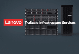
<p>Our IaaS model provides a cloud-like experience with on-prem security and control that can be tailored to your needs, resulting in flexibility for the peace of mind of any size enterprise. All with the expertise of the end-to-end infrastructure lifecycle services from the data center to the Edge provided by Lenovo Infrastructure Services.</p>
</div>

<div class="img-column">
<drupal-entity data-embed-button="media_entity_embed" data-entity-embed-display="view_mode:media.original_dimension" data-entity-embed-display-settings="" data-entity-type="media" data-entity-uuid="890062f3-a163-4511-bd9e-24910b7fb354" data-langcode="ww-en"></drupal-entity>
</div>
</div>
</div>
</section>

<div class="section-03">
<div class="container">
<h2>Lenovo TruScale: Rise to the challenge</h2>

<div class="columns-block">
<div class="column">
<div class="img-block">
<drupal-entity data-embed-button="media_entity_embed" data-entity-embed-display="view_mode:media.original_dimension" data-entity-embed-display-settings="" data-entity-type="media" data-entity-uuid="d269c158-b585-41d3-ad02-d078324f8126" data-langcode="ww-en"></drupal-entity>
</div>

<div class="text-block">
<h3>End-to-end support</h3>

<p>Lenovo managed services provides technical expertise and consistent support across the world.</p>
</div>
</div>

<div class="column">
<div class="img-block">
<drupal-entity data-embed-button="media_entity_embed" data-entity-embed-display="view_mode:media.original_dimension" data-entity-embed-display-settings="" data-entity-type="media" data-entity-uuid="1370f50d-3761-4fc4-8441-ba9e3533913e" data-langcode="ww-en"></drupal-entity>
</div>

<div class="text-block">
<h3>Flexibility & scalability</h3>

<p>Unique pay as you go model to align infrastructure with business demands.</p>
</div>
</div>

<div class="column">
<div class="img-block">
<drupal-entity data-embed-button="media_entity_embed" data-entity-embed-display="view_mode:media.original_dimension" data-entity-embed-display-settings="" data-entity-type="media" data-entity-uuid="281c1055-ff90-4668-9f21-307b20832ac0" data-langcode="ww-en"></drupal-entity>
</div>

<div class="text-block">
<h3>Security &amp; sovereignty</h3>

<p>Experience a turnkey solution on-premises with support from the edge to the cloud.</p>
</div>
</div>
</div>
</div>
</div>

<div class="section-04">
<div class="container">
<h2>TruScale Infrastructure Solutions</h2>

<div class="columns-block">
<div class="column">
<div class="img-block">
<drupal-entity data-embed-button="media_entity_embed" data-entity-embed-display="view_mode:media.original_dimension" data-entity-embed-display-settings="" data-entity-type="media" data-entity-uuid="b244ae80-01ad-40e3-ae5f-613910185fad" data-langcode="ww-en"></drupal-entity>
</div>

<div class="text-block">
<h3>Lenovo TruScale Infinite Storage</h3>

<p>Lenovo TruScale Infinite Storage is an on-premises file, block, and object, as a Service solution, with built-in technology refresh. Control your data and let Lenovo manage the infrastructure.</p>
<cta-button data-embed-class="btn" data-embed-label="Learn more" data-embed-media="15874" data-embed-scheme="link" data-embed-target="_blank" data-embed-text="" data-embed-type="media" data-embed-url="">Learn more</cta-button></div>
</div>

<div class="column">
<div class="img-block">
<drupal-entity data-embed-button="media_entity_embed" data-entity-embed-display="view_mode:media.original_dimension" data-entity-embed-display-settings="" data-entity-type="media" data-entity-uuid="75c97786-fa44-4cf3-80a4-cd8707eff4ac" data-langcode="ww-en"></drupal-entity>
</div>

<div class="text-block">
<h3>Lenovo TruScale Hybrid Cloud with Microsoft</h3>

<p>A familiar Hyper-V standardized architecture that allows your team to manage existing virtualization and storage skills. Experience managed services for virtualization and infrastructure that delivers a seamless customer experience.</p>
<cta-button data-embed-class="btn" data-embed-label="Learn more" data-embed-media="15875" data-embed-scheme="link" data-embed-target="_blank" data-embed-text="" data-embed-type="media" data-embed-url="">Learn more</cta-button>
</div>
</div>

<div class="column">
<div class="img-block">
<drupal-entity data-embed-button="media_entity_embed" data-entity-embed-display="view_mode:media.original_dimension" data-entity-embed-display-settings="" data-entity-type="media" data-entity-uuid="9ea7b5a2-b150-476b-a6c8-ea7c4494445f" data-langcode="ww-en"></drupal-entity>
</div>

<div class="text-block">
<h3>Lenovo TruScale Hybrid Cloud with VMware</h3>

<p>A future-ready hybrid cloud solution that offers enterprises access to the infrastructure resources they need when they need them with the flexibility of a scalable pay-as-you-go model.</p>
<cta-button data-embed-class="btn" data-embed-label="Learn more" data-embed-media="15876" data-embed-scheme="link" data-embed-target="_blank" data-embed-text="" data-embed-type="media" data-embed-url="">Learn more</cta-button>
</div>
</div>

<div class="column">
<div class="img-block">
<drupal-entity data-embed-button="media_entity_embed" data-entity-embed-display="view_mode:media.original_dimension" data-entity-embed-display-settings="" data-entity-type="media" data-entity-uuid="77995d5a-849b-4055-b0a6-1827098e29b8" data-langcode="ww-en"></drupal-entity>
</div>

<div class="text-block">
<h3>Lenovo TruScale Multi-cloud with Deloitte</h3>

<p>Empower your private, hybrid and multi-cloud environments. We deliver a simple and direct path to modern apps and multi-cloud environments in one complete, automated platform.</p>
<cta-button data-embed-class="btn" data-embed-label="Learn more" data-embed-media="15877" data-embed-scheme="link" data-embed-target="_blank" data-embed-text="" data-embed-type="media" data-embed-url="">Learn more</cta-button></div>
</div>

<div class="column">
<div class="img-block">
<drupal-entity data-embed-button="media_entity_embed" data-entity-embed-display="view_mode:media.original_dimension" data-entity-embed-display-settings="" data-entity-type="media" data-entity-uuid="1f1584fa-99ee-4dbd-9feb-f6d3d60b680e" data-langcode="ww-en"></drupal-entity>
</div>

<div class="text-block">
<h3>Lenovo TruScale for Hosted Desktops</h3>

<p>Experience the simplicity and flexibility of the cloud with infrastructure on-premise. A complete hosted desktop solution including client devices and hyperconverged systems with VDI software.</p>
<a class="btn" href="https://www.lenovo.com/us/en/resources/data-center-solutions/solution-b…; target="_blank">Learn more</a></div>
</div>

<div class="column">
<div class="img-block">
<drupal-entity data-embed-button="media_entity_embed" data-entity-embed-display="view_mode:media.original_dimension" data-entity-embed-display-settings="" data-entity-type="media" data-entity-uuid="998943b2-44f5-48bf-8a02-794cca9351e9" data-langcode="ww-en"></drupal-entity>
</div>

<div class="text-block">
<h3>TruScale with RISE with SAP S/4HANA Cloud</h3>

<p>An on-premises version of SAP’s public cloud service is offered with Lenovo TruScale. Get greater flexibility, transparency, agility and reduced financial risk to accelerate digital transformation.</p>
<a class="btn" href="https://www.lenovo.com/us/en/resources/data-center-solutions/solution-b…; target="_blank">Learn more</a></div>
</div>
</div>
</div>
</div>

<h2>TruScale<br />
Infrastructure<br />
Solutions</h2>

<div class="column">
<div class="img-block">
<div class="embedded-entity" data-embed-button="media_entity_embed" data-entity-embed-display="view_mode:media.original_dimension" data-entity-type="media" data-entity-uuid="b244ae80-01ad-40e3-ae5f-613910185fad" data-langcode="ww-en">
<div>
<div class="field field--name-field-media-image field--type-image field--label-hidden field--item"><img alt="Lenovo TruScale Infinite Storage" class="img-responsive" loading="lazy" src="/origind8/sites/default/files/styles/original/public/2022-03/img-truescale-storage.png?itok=RqDMaXKK" typeof="foaf:Image" /></div>
</div>
</div>
</div>

<div class="text-block">
<h3>Lenovo TruScale Infinite Storage</h3>

<p>Lenovo TruScale Infinite Storage is an on-premises file, block, and object, as a Service solution, with built-in technology refresh. Control your data and let Lenovo manage the infrastructure.</p>
<cta-button data-embed-class="btn" data-embed-label="Learn more" data-embed-media="15874" data-embed-scheme="link" data-embed-target="_blank" data-embed-text="" data-embed-type="media" data-embed-url="">Learn more</cta-button></div>
</div>

<div class="column">
<div class="img-block">
<div class="embedded-entity" data-embed-button="media_entity_embed" data-entity-embed-display="view_mode:media.original_dimension" data-entity-type="media" data-entity-uuid="75c97786-fa44-4cf3-80a4-cd8707eff4ac" data-langcode="ww-en">
<div>
<div class="field field--name-field-media-image field--type-image field--label-hidden field--item"><img alt="Lenovo TruScale Hybrid Cloud with Microsoft" class="img-responsive" loading="lazy" src="/origind8/sites/default/files/styles/original/public/2022-03/img-truscale-microsoft.png?itok=Tpsv7vQJ" typeof="foaf:Image" /></div>
</div>
</div>
</div>

<div class="text-block">
<h3>Lenovo TruScale Hybrid Cloud with Microsoft</h3>

<p>A familiar Hyper-V standardized architecture that allows your team to manage existing virtualization and storage skills. Experience managed services for virtualization and infrastructure that delivers a seamless customer experience.</p>
<cta-button data-embed-class="btn" data-embed-label="Learn more" data-embed-media="15875" data-embed-scheme="link" data-embed-target="_blank" data-embed-text="" data-embed-type="media" data-embed-url="">Learn more</cta-button></div>
</div>

<div class="column">
<div class="img-block">
<div class="embedded-entity" data-embed-button="media_entity_embed" data-entity-embed-display="view_mode:media.original_dimension" data-entity-type="media" data-entity-uuid="9ea7b5a2-b150-476b-a6c8-ea7c4494445f" data-langcode="ww-en">
<div>
<div class="field field--name-field-media-image field--type-image field--label-hidden field--item"><img alt="Lenovo TruScale Hybrid Cloud with VMware" class="img-responsive" loading="lazy" src="/origind8/sites/default/files/styles/original/public/2022-03/img-truscale-vmware.png?itok=kPiUvsF7" typeof="foaf:Image" /></div>
</div>
</div>
</div>

<div class="text-block">
<h3>Lenovo TruScale Hybrid Cloud with VMware</h3>

<p>A future-ready hybrid cloud solution that offers enterprises access to the infrastructure resources they need when they need them with the flexibility of a scalable pay-as-you-go model.</p>
<cta-button data-embed-class="btn" data-embed-label="Learn more" data-embed-media="15876" data-embed-scheme="link" data-embed-target="_blank" data-embed-text="" data-embed-type="media" data-embed-url="">Learn more</cta-button></div>
</div>

<div class="column">
<div class="img-block">
<div class="embedded-entity" data-embed-button="media_entity_embed" data-entity-embed-display="view_mode:media.original_dimension" data-entity-type="media" data-entity-uuid="77995d5a-849b-4055-b0a6-1827098e29b8" data-langcode="ww-en">
<div>
<div class="field field--name-field-media-image field--type-image field--label-hidden field--item"><img alt="Lenovo TruScale Multi-cloud with Deloitte" class="img-responsive" loading="lazy" src="/origind8/sites/default/files/styles/original/public/2022-03/img-deliotte.png?itok=LP1E2n-d" typeof="foaf:Image" /></div>
</div>
</div>
</div>

<div class="text-block">
<h3>Lenovo TruScale Multi-cloud with Deloitte</h3>

<p>Empower your private, hybrid and multi-cloud environments. We deliver a simple and direct path to modern apps and multi-cloud environments in one complete, automated platform.</p>
<cta-button data-embed-class="btn" data-embed-label="Learn more" data-embed-media="15877" data-embed-scheme="link" data-embed-target="_blank" data-embed-text="" data-embed-type="media" data-embed-url="">Learn more</cta-button></div>
</div>

<div class="column">
<div class="img-block">
<div class="embedded-entity" data-embed-button="media_entity_embed" data-entity-embed-display="view_mode:media.original_dimension" data-entity-type="media" data-entity-uuid="1f1584fa-99ee-4dbd-9feb-f6d3d60b680e" data-langcode="ww-en">
<div>
<div class="field field--name-field-media-image field--type-image field--label-hidden field--item"><img alt="Lenovo TruScale for Hosted Desktops with Nutanix" class="img-responsive" loading="lazy" src="/origind8/sites/default/files/styles/original/public/2022-03/img-nutanix_0.png?itok=zVzFd5GO" typeof="foaf:Image" /></div>
</div>
</div>
</div>

<div class="text-block">
<h3>Lenovo TruScale for Hosted Desktops</h3>

<p>Experience the simplicity and flexibility of the cloud with infrastructure on-premise. A complete hosted desktop solution including client devices and hyperconverged systems with VDI software.</p>
<a class="btn" href="https://www.lenovo.com/us/en/resources/data-center-solutions/solution-b…; target="_blank">Learn more</a></div>
</div>

<div class="column">
<div class="img-block">
<div class="embedded-entity" data-embed-button="media_entity_embed" data-entity-embed-display="view_mode:media.original_dimension" data-entity-type="media" data-entity-uuid="998943b2-44f5-48bf-8a02-794cca9351e9" data-langcode="ww-en">
<div>
<div class="field field--name-field-media-image field--type-image field--label-hidden field--item"><img alt="TruScale with RISE with SAP S/4HANA Cloud" class="img-responsive" loading="lazy" src="/origind8/sites/default/files/styles/original/public/2022-03/img-SAP-cloud.png?itok=3JtGKI1Z" typeof="foaf:Image" /></div>
</div>
</div>
</div>

<div class="text-block">
<h3>TruScale with RISE with SAP S/4HANA Cloud</h3>

<p>An on-premises version of SAP’s public cloud service is offered with Lenovo TruScale. Get greater flexibility, transparency, agility and reduced financial risk to accelerate digital transformation.</p>
<a class="btn" href="
https://www.lenovo.com/us/en/resources/data-center-solutions/solution-b…; target="_blank">Learn more</a></div>
</div>

<div class="section-05">
<div class="container">
<h2>Subscription models at your service</h2>

<p>Enter a new world of streamlined innovation. Right size your IT infrastructure, so you can align costs with growth and make a difference in the digital era.</p>

<div class="columns-block">
<div class="column">
<div class="img-block">
<drupal-entity data-embed-button="media_entity_embed" data-entity-embed-display="view_mode:media.original_dimension" data-entity-embed-display-settings="" data-entity-type="media" data-entity-uuid="0c921192-b3b9-442d-980b-f3e9a5ba7de6" data-langcode="ww-en"></drupal-entity>
</div>

<div class="text-block">
<h3>Ready for a subscription-based world?</h3>

<p>Fast-paced, exciting changes are underway. Organizations prioritizing growth, innovation are outpacing the competition. Pay-for-what-you-use models offer a competitive edge. How can you benefit?</p>
<a class="btn" href="https://www.lenovo.com/us/en/resources/data-center-solutions/whitepaper…; target="_blank">Download the whitepaper</a></div>
</div>

<div class="column">
<div class="img-block">
<drupal-entity data-embed-button="media_entity_embed" data-entity-embed-display="view_mode:media.original_dimension" data-entity-embed-display-settings="" data-entity-type="media" data-entity-uuid="c34404df-8c17-4aeb-9e9e-9baaf6c34a26" data-langcode="ww-en"></drupal-entity>
</div>

<div class="text-block">
<h3>The pay-for-what-you-use data center</h3>

<p>Get your data center on subscription. Free your business from expensive hardware and services. A new flexible, agile and efficient model just got here.</p>
<a class="btn" href="https://www.lenovo.com/us/en/resources/data-center-solutions/infographi…; target="_blank">Read the infographic</a></div>
</div>

<div class="column">
<div class="img-block">
<drupal-entity data-embed-button="media_entity_embed" data-entity-embed-display="view_mode:media.original_dimension" data-entity-embed-display-settings="" data-entity-type="media" data-entity-uuid="93dbb8b7-2185-4c32-b347-f6f5ec3a5646" data-langcode="ww-en"></drupal-entity>
</div>

<div class="text-block">
<h3>Get to know Lenovo Infrastructure services</h3>

<p>Take a deep dive into TruScale Infrastructure services with distinguished engineer, Eric Kern. Discover how it works and why it’s a great option for you.</p>
<a class="btn use-ajax link link-gated-resource video-link clicked" data-dialog-options="{&quot;width&quot;:&quot;600&quot;,&quot;dialogClass&quot;:&quot;&quot;}" data-dialog-type="modal" data-modal-width="600px" href="/gb/en/solutions/media/15879">Watch the video</a></div>
</div>

<div class="column">
<div class="img-block">
<drupal-entity data-embed-button="media_entity_embed" data-entity-embed-display="view_mode:media.original_dimension" data-entity-embed-display-settings="" data-entity-type="media" data-entity-uuid="9c4d6e29-2c26-41c1-83e8-dd14298346ab" data-langcode="ww-en"></drupal-entity>
</div>

<div class="text-block">
<h3>Lenovo TruScale: The Pay-for-What-You-Use Data Center Solution</h3>

<p>Discover the new way to meet your growing infrastructure needs with an agile, scalable, cost effective and elegant solution</p>
<a class="btn use-ajax link link-gated-resource video-link clicked" data-dialog-options="{&quot;width&quot;:&quot;600&quot;,&quot;dialogClass&quot;:&quot;&quot;}" data-dialog-type="modal" data-modal-width="600px" href="/gb/en/solutions/media/15880">Watch the video</a></div>
</div>
</div>
</div>
</div>

<h2>Subscription models at your service</h2>

<p>Enter a new world of streamlined innovation. Right size your IT infrastructure, so you can align costs with growth and make a difference in the digital era.</p>

<div class="column">
<div class="img-block">
<div class="embedded-entity" data-embed-button="media_entity_embed" data-entity-embed-display="view_mode:media.original_dimension" data-entity-type="media" data-entity-uuid="0c921192-b3b9-442d-980b-f3e9a5ba7de6" data-langcode="ww-en">
<div>
<div class="field field--name-field-media-image field--type-image field--label-hidden field--item"><img alt="Ready for a subscription-based world?" class="img-responsive" loading="lazy" src="/origind8/sites/default/files/styles/original/public/2022-03/img-ready-subscription.png?itok=13h6VmnJ" typeof="foaf:Image" /></div>
</div>
</div>
</div>

<div class="text-block">
<h3>Ready for a subscription-based world?</h3>

<p>Fast-paced, exciting changes are underway. Organizations prioritizing growth, innovation are outpacing the competition. Pay-for-what-you-use models offer a competitive edge. How can you benefit?</p>
<a class="btn link link-cta-button" href="https://www.lenovo.com/us/en/resources/data-center-solutions/whitepaper…; target="_blank"><span>Download the whitepaper</span></a></div>
</div>

<div class="column">
<div class="img-block">
<div class="embedded-entity" data-embed-button="media_entity_embed" data-entity-embed-display="view_mode:media.original_dimension" data-entity-type="media" data-entity-uuid="c34404df-8c17-4aeb-9e9e-9baaf6c34a26" data-langcode="ww-en">
<div>
<div class="field field--name-field-media-image field--type-image field--label-hidden field--item"><img alt="The pay-for-what-you-use data center" class="img-responsive" loading="lazy" src="/origind8/sites/default/files/styles/original/public/2022-03/img-pay-for-what.png?itok=4NPL4MTD" typeof="foaf:Image" /></div>
</div>
</div>
</div>

<div class="text-block">
<h3>The pay-for-what-you-use data center</h3>

<p>Get your data center on subscription. Free your business from expensive hardware and services. A new flexible, agile and efficient model just got here.</p>
<a class="btn link link-cta-button" href="https://www.lenovo.com/us/en/resources/data-center-solutions/infographi…; target="_blank"><span>Read the infographic</span></a></div>
</div>

<div class="column">
<div class="img-block">
<div class="embedded-entity" data-embed-button="media_entity_embed" data-entity-embed-display="view_mode:media.original_dimension" data-entity-type="media" data-entity-uuid="93dbb8b7-2185-4c32-b347-f6f5ec3a5646" data-langcode="ww-en">
<div>
<div class="field field--name-field-media-image field--type-image field--label-hidden field--item"><img alt="Get to know Lenovo Infrastructure services" class="img-responsive" loading="lazy" src="/origind8/sites/default/files/styles/original/public/2022-03/img-infrastructure-services_0.png?itok=t0MMhaO0" typeof="foaf:Image" /></div>
</div>
</div>
</div>

<div class="text-block">
<h3>Get to know Lenovo Infrastructure services</h3>

<p>Take a deep dive into TruScale Infrastructure services with distinguished engineer, Eric Kern. Discover how it works and why it’s a great option for you.</p>
<a class="btn use-ajax link link-gated-resource video-link clicked" data-dialog-options="{&quot;width&quot;:&quot;600&quot;,&quot;dialogClass&quot;:&quot;&quot;}" data-dialog-type="modal" data-modal-width="600px" href="/gb/en/solutions/media/15879">Watch the video</a></div>
</div>

<div class="column">
<div class="img-block">
<div class="embedded-entity" data-embed-button="media_entity_embed" data-entity-embed-display="view_mode:media.original_dimension" data-entity-type="media" data-entity-uuid="9c4d6e29-2c26-41c1-83e8-dd14298346ab" data-langcode="ww-en">
<div>
<div class="field field--name-field-media-image field--type-image field--label-hidden field--item"><img alt="Lenovo TruScale: The Pay-for-What-You-Use Data Center Solution" class="img-responsive" loading="lazy" src="/origind8/sites/default/files/styles/original/public/2022-03/img-cloud-solutions.png?itok=9Gb9_po2" typeof="foaf:Image" /></div>
</div>
</div>
</div>

<div class="text-block">
<h3>Lenovo TruScale: The Pay-for-What-You-Use Data Center Solution</h3>

<p>Discover the new way to meet your growing infrastructure needs with an agile, scalable, cost effective and elegant solution</p>
<a class="btn use-ajax link link-gated-resource video-link clicked" data-dialog-options="{&quot;width&quot;:&quot;600&quot;,&quot;dialogClass&quot;:&quot;&quot;}" data-dialog-type="modal" data-modal-width="600px" href="/gb/en/solutions/media/15880">Watch the video</a></div>
</div>

<div class="section-06">
<div class="container">
<h2>IaaS customer success stories</h2>

<p>Behind every digital success lies an arsenal of solutions designed to deliver a super fluid, agile and consistent response. Get there with IaaS.</p>

<div class="columns-block">
<div class="column">
<div class="img-block">
<drupal-entity data-embed-button="media_entity_embed" data-entity-embed-display="view_mode:media.original_dimension" data-entity-embed-display-settings="" data-entity-type="media" data-entity-uuid="19160dbe-8b4b-4a77-abd3-ca28c8d3091d" data-langcode="ww-en"></drupal-entity>
</div>

<div class="text-block">
<h3>Konecta’s new work-from-anywhere agility</h3>

<p>Discover how Konecta, one of the largest business process outsourcing providers in Peru, used Lenovo TruScale Infrastructure services to successfully adapt to remote working.</p>
<cta-button data-embed-class="btn" data-embed-label="Learn more" data-embed-media="15878" data-embed-scheme="link" data-embed-target="_blank" data-embed-text="" data-embed-type="media" data-embed-url="">Learn more</cta-button></div>
</div>

<div class="column">
<div class="img-block">
<drupal-entity data-embed-button="media_entity_embed" data-entity-embed-display="view_mode:media.original_dimension" data-entity-embed-display-settings="" data-entity-type="media" data-entity-uuid="a3cb4a66-1fa3-4ae2-af8c-34ef8f049a27" data-langcode="ww-en"></drupal-entity>
</div>

<div class="text-block">
<h3>Helping millions of Mexican travelers reach their destination</h3>

<p>How STGT used Lenovo TruScale Infrastructure services to reduce costs, increase profit margins and enhance their offerings to win new business.</p>
<a class="btn" href="https://www.lenovo.com/us/en/resources/data-center-solutions/case-studi…; target="_blank">Learn more</a></div>
</div>

<div class="column">
<div class="img-block">
<drupal-entity data-embed-button="media_entity_embed" data-entity-embed-display="view_mode:media.original_dimension" data-entity-embed-display-settings="" data-entity-type="media" data-entity-uuid="cdbc2970-4c53-484c-82a8-fcccda8988cf" data-langcode="ww-en"></drupal-entity>
</div>

<div class="text-block">
<h3>Powering business growth and streamlining distribution</h3>

<p>Servimed, a distributor of pharmaceuticals and consumer products, switched to Lenovo ThinkAgile VX hyperconverged solutions to fuel its growth ambitions, unlock new efficiencies and enhance productivity.</p>
<a class="btn" href="https://www.lenovo.com/us/en/resources/data-center-solutions/case-studi…; target="_blank">Learn more</a></div>
</div>
</div>
</div>
</div>

<h2>IaaS customer<br />
success stories</h2>

<p>Behind every digital success lies an arsenal of solutions designed to deliver a super fluid, agile and consistent response. Get there with IaaS.</p>

<div class="column">
<div class="img-block">
<div class="embedded-entity" data-embed-button="media_entity_embed" data-entity-embed-display="view_mode:media.original_dimension" data-entity-type="media" data-entity-uuid="19160dbe-8b4b-4a77-abd3-ca28c8d3091d" data-langcode="ww-en">
<div>
<div class="field field--name-field-media-image field--type-image field--label-hidden field--item">
<drupal-entity data-embed-button="media_entity_embed" data-entity-embed-display="view_mode:media.original_dimension" data-entity-embed-display-settings="" data-entity-type="media" data-entity-uuid="7aa86b02-58ec-42fb-bf5c-f9b935e1e195" data-langcode="ww-en"></drupal-entity>
</div>
</div>
</div>
</div>

<div class="text-block">
<h3>Konecta’s new work-from-anywhere agility</h3>

<p>Discover how Konecta, one of the largest business process outsourcing providers in Peru, used Lenovo TruScale Infrastructure services to successfully adapt to remote working.</p>
<cta-button data-embed-class="btn" data-embed-label="Learn more" data-embed-media="15878" data-embed-scheme="link" data-embed-target="_blank" data-embed-text="" data-embed-type="media" data-embed-url="">Learn more</cta-button></div>
</div>

<div class="column">
<div class="img-block">
<div class="embedded-entity" data-embed-button="media_entity_embed" data-entity-embed-display="view_mode:media.original_dimension" data-entity-type="media" data-entity-uuid="a3cb4a66-1fa3-4ae2-af8c-34ef8f049a27" data-langcode="ww-en">
<div>
<div class="field field--name-field-media-image field--type-image field--label-hidden field--item">
<drupal-entity data-embed-button="media_entity_embed" data-entity-embed-display="view_mode:media.original_dimension" data-entity-embed-display-settings="" data-entity-type="media" data-entity-uuid="c1e50f4b-0ed0-4207-8060-db1b7bae215b" data-langcode="ww-en"></drupal-entity>
</div>
</div>
</div>
</div>

<div class="text-block">
<h3>Helping millions of Mexican travelers reach their destination</h3>

<p>How STGT used Lenovo TruScale Infrastructure services to reduce costs, increase profit margins and enhance their offerings to win new business.</p>
<a class="btn link link-cta-button" href="https://www.lenovo.com/us/en/resources/data-center-solutions/case-studi…; target="_blank"><span>Learn more</span></a></div>
</div>

<div class="column">
<div class="img-block">
<div class="embedded-entity" data-embed-button="media_entity_embed" data-entity-embed-display="view_mode:media.original_dimension" data-entity-type="media" data-entity-uuid="cdbc2970-4c53-484c-82a8-fcccda8988cf" data-langcode="ww-en">
<div>
<div class="field field--name-field-media-image field--type-image field--label-hidden field--item">
<drupal-entity data-embed-button="media_entity_embed" data-entity-embed-display="view_mode:media.original_dimension" data-entity-embed-display-settings="" data-entity-type="media" data-entity-uuid="b516f37d-6c23-40a1-bde6-9b2bbafebd58" data-langcode="ww-en"></drupal-entity>
</div>
</div>
</div>
</div>

<div class="text-block">
<h3>Powering business growth and streamlining distribution</h3>

<p>Servimed, a distributor of pharmaceuticals and consumer products, switched to Lenovo ThinkAgile VX hyperconverged solutions to fuel its growth ambitions, unlock new efficiencies and enhance productivity.</p>
<a class="btn link link-cta-button" href="https://www.lenovo.com/us/en/resources/data-center-solutions/case-studi…; target="_blank"><span>Learn more</span></a></div>
</div>

<section class="section-07">
<div class="container">
<div class="columns-block">
<div class="img-column">
<drupal-entity data-embed-button="media_entity_embed" data-entity-embed-display="view_mode:media.original_dimension" data-entity-embed-display-settings="" data-entity-type="media" data-entity-uuid="28937015-989d-4633-8eae-08c4613c56f3" data-langcode="ww-en"></drupal-entity>
</div>

<div class="post-column">
<h2>Growth beyond IT with TruScale</h2>

<p>Everything-as-a-service, from the pocket to the data center. Take advantage of the entire Lenovo portfolio, available as-a-service, from a single source.</p>
<cta-button data-embed-class="btn" data-embed-label="Discover Lenovo TruScale" data-embed-media="5331" data-embed-scheme="link" data-embed-target="_blank" data-embed-text="" data-embed-type="link" data-embed-url="/ww/en/truscale">Discover Lenovo TruScale</cta-button></div>
</div>
</div>
</section>

<div class="section-08">
<div class="container">
<div class="columns-block">
<div class="column">
<div class="text-block">
<h3>Get transformation ready with Infrastructure services</h3>

<p>Get ready to outpace change with a complete suite of answers to even your most challenging business questions.</p>
<cta-button data-embed-class="btn" data-embed-label="Find out more" data-embed-media="5327" data-embed-scheme="link" data-embed-target="" data-embed-text="" data-embed-type="link" data-embed-url="/ww/en/infrastructure-services">Find out more</cta-button></div>
</div>

<div class="column">
<div class="text-block">
<h3>Lenovo Device-as-a-Service</h3>

<p>Simplify device configuration, deployment, management and renewal for your entire workforce with one end-to-end solution.</p>
<cta-button data-embed-class="btn" data-embed-label="Find out more" data-embed-media="3133" data-embed-scheme="link" data-embed-target="" data-embed-text="" data-embed-type="link" data-embed-url="/ww/en/daas">Find out more</cta-button></div>
</div>
</div>
</div>
</div>

<div class="section-09">
<div class="container">
<div class="columns-block">
<div class="post-column">
<h2>Let’s explore the possibilities</h2>

<p>For more about how we can help your IT scale with your business, get in touch.</p>
<gated-resource data-embed-button-icon="" data-embed-class="btn" data-embed-form="6598" data-embed-label="Have a rep contact you" data-embed-media="" data-embed-scheme="pink" data-embed-target="" data-embed-type="form" data-embed-url="">Have a rep contact you</gated-resource></div>

<div class="img-column">
<drupal-entity data-embed-button="media_entity_embed" data-entity-embed-display="view_mode:media.original_dimension" data-entity-embed-display-settings="" data-entity-type="media" data-entity-uuid="d9d07553-9b2c-433e-aa46-495eb0a1e7fd" data-langcode="ww-en"></drupal-entity>
</div>
</div>
</div>
</div>