Chrome Zero Touch

<p data-aos="fade-down" data-aos-mirror="false" data-aos-once="true"><span class="weight-900"><span class="large-title">Chrome OS</span></span><br />
<span class="weight-900"><span class="large-title">Zero-Touch Enrollment</span></span></p>

<p>&nbsp;</p>

<p data-aos="fade-up" data-aos-mirror="false" data-aos-once="true"><span class="weight-900"><span class="xx-large-title">Ready-to-Use Enterprise Chromebooks for Distributed Teams</span></span></p>

<style type="text/css">

.new-section { width: 100% !important; padding: 0 !important; background-color: #fff; }
.new-section > div { max-width: 1920px !important; }

/* Containers */
.new-section__background { background-size: cover; background-position: center; padding: 40px 20px 65px 20px; }
.new-section__container--top { max-width: 1238px; width: 100%; margin: auto; display: flex; flex-direction: column; justify-content: center; align-items: center; }
.new-section__container--bottom { padding-top: 77px; max-width: 1386px; width: 100%; margin: auto; }
.new-section__tile-container { margin-top: 40px; display: flex; justify-content: center; }
.new-section__tile { margin-right: 47px; display: flex; align-items: flex-start; }

/* Typography */
.new-section__heading { font-family: 'Lato-Bold', sans-serif; font-weight: 700; font-size: 40px !important; line-height: 55px; color: #3E8DDD !important; margin-bottom: 20px !important; text-align: center; }
.new-section__paragraph-primary { width: 85% !important; font-family: 'Lato', sans-serif; font-weight: 400; font-size: 16px !important; line-height: 20px; color: #333F48 !important; text-align: center; }
.new-section__bold { font-family: 'Lato-Bold', sans-serif; font-weight: 700; font-size: 44px !important; line-height: 1; }
.new-section__paragraph-primary--1 { max-width: 439px; text-align: left; }
.new-section__paragraph-primary--2 { max-width: 523px; text-align: left; }

/* Images */
.new-section__image { width: 135px; margin-right: 54px; }

@media screen and (max-width: 1068px) {
.desktop-only { display: none !important; }
}

@media screen and (max-width: 900px) {
.new-section__background { padding: 40px 60px 0 60px; }
.new-section__tile-container { flex-direction: column; }
.new-section__tile { margin-bottom: 63px; }
.desktop-only { display: inline-block !important; }
.new-section__container--bottom { padding-top: 40px; }
}

@media screen and (max-width: 600px) {
.new-section__background { padding: 40px 20px 0 20px; }
.new-section__heading { text-align: left; }
.new-section__paragraph-primary { text-align: center; }
.new-section__image { width: 96px; margin-right: 15px; }
.new-section__heading { font-size: 25px !important; line-height: 30px; }
.new-section__tile { margin-bottom: 40px; margin-right: 0; }
}
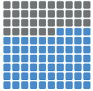
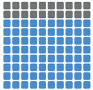
</style><div class="new-section__background"><div class="new-section__container--top"><p class="new-section__heading">Adapting to Remote and Hybrid Work Models</p><p class="new-section__paragraph-primary">As organizations adapt to new ‘work from anywhere’ models, many IT teams are learning just how prepared (or unprepared) they are. With entire work forces now offsite, IT must confront getting the right devices to employees, securing endpoints, surfacing new cloud-based tools, managing overburdened help desks, and much more.</p></div><div class="new-section__tile-container"><div class="new-section__tile"><p><img class="new-section__image new-section__image--1" alt="" src="/origind8/sites/default/files/2020-12/Graphs_new_64_.png"></p><p class="new-section__paragraph-primary new-section__paragraph-primary--1"><span class="new-section__bold">64%</span> of IT decision makers<br>say Enterprise IT is more complex<br>compared with 2 years ago<sup>1</sup></p></div><div class="new-section__tile"><p><img class="new-section__image new-section__image--1" alt="" src="/origind8/sites/default/files/2020-12/Graphs_new_80_.png"></p><p class="new-section__paragraph-primary new-section__paragraph-primary--2"><span class="new-section__bold">80%</span> of knowledge<br>workers are now working<br>from home<sup>2</sup></p></div></div></div>

<style type="text/css">@import url("https://fonts.googleapis.com/css?family=Lato:400,700,900&display=swap&q…;);

.section-20 {
background-color: #333F48;
width: 100%;
}

.section-20__heading {
font-family: "Lato", sans-serif;
font-weight: 700;
font-size: 40px !important;
line-height: 48px;
color: #ffffff !important;
text-align: center;
margin-bottom: 24px !important;
}
.section-20__secondary-heading {
font-family: "Lato", sans-serif;
font-weight: bold;
font-size: 20px !important;
line-height: 28px;
color: #ffffff !important;
text-align: center;
margin-top: 24px;
}
.section-20__btn-paragraph,
.section-20__paragraph {
font-family: "Lato", sans-serif;
font-weight: 400;
font-size: 16px !important;
line-height: 20px;
color: #ffffff !important;
text-align: center;
margin: auto;
}
.section-20__paragraph {
max-width: 850px;
margin-bottom: 10px;
}
.section-20__btn-paragraph {
max-width: 300px;
}
.section-20__container {
max-width: 1300px !important;
margin: 0 auto !important;
}
.section-20__btn {
text-align: center;
margin-top: 10px;
}
.section-20__btn img {
width: 80px;
height: auto;
margin: auto !important;
}
.red-text {
color: #e1140a !important;
}
.section-20__btn-container {
display: flex;
justify-content: space-between;
max-width: 1300px;
padding: 0px 0px 20px 0px;
}

/* Set CTA button scheme colour to Black */
.section-20__btn--white a::after {
color: #000000 !important;
}

@media screen and (max-width: 700px) {
.section-20 {
padding-top: 0px !important;
padding-bottom: 10px !important;
}
.section-20__btn-paragraph,
.section-20__paragraph {
margin-bottom: 10px;
}
.section-20__btn-container {
flex-direction: column;
}
.section-20__btn {
margin-top: 0;
}
.section-20__btn img {
margin: auto !important;
}
}

@media screen and (max-width: 600px) {
.section-20__heading {
font-size: 40px !important;
line-height: 38px;
}
.section-20__paragraph {
font-size: 16px !important;
line-height: 22px;
}
}
</style>
<p>&nbsp;</p>

<p class="section-20__heading"><span class="weight-700">Seamless Deployment for Enterprise Chromebooks</span></p>

<p class="section-20__paragraph"><span class="weight-400">Zero-Touch enrollments from Lenovo and Google allow remote deployment and auto-enrollment of Chromebooks<sup>3</sup>. Pre-registered by Lenovo, devices ship directly to your users – ready for use with minimal IT assistance.</span></p>

<div class="section-20__btn-container">
<div class="section-20__btn">
<drupal-entity alt="productivity icon" data-align="center" data-embed-button="media_entity_embed" data-entity-embed-display="view_mode:media.original_dimension" data-entity-embed-display-settings="" data-entity-type="media" data-entity-uuid="d8113e31-3c19-40ef-9c15-b9a9a3b601aa" data-langcode="ww-en"></drupal-entity>

<p>&nbsp;</p>

<p class="section-20__btn-paragraph"><strong>Pre-Registered<br />
by Experts</strong><br />
<br />
Lenovo pre-registers Chromebooks to enroll automatically once in the hands of end users.</p>
</div>

<div class="section-20__btn">
<drupal-entity alt="collaboration icon" data-align="center" data-embed-button="media_entity_embed" data-entity-embed-display="view_mode:media.original_dimension" data-entity-embed-display-settings="" data-entity-type="media" data-entity-uuid="cbc221ec-0a1f-4264-9059-f1a267c18c88" data-langcode="ww-en"></drupal-entity>

<p>&nbsp;</p>

<p class="section-20__btn-paragraph"><strong>Drop-Shipped to<br />
Employees Anywhere</strong><br />
<br />
No matter where your employees work, Lenovo ensures devices get where they need to be.</p>
</div>

<div class="section-20__btn">
<drupal-entity alt="endpoint security icon" data-align="center" data-embed-button="media_entity_embed" data-entity-embed-display="view_mode:media.original_dimension" data-entity-embed-display-settings="" data-entity-type="media" data-entity-uuid="3edd85a8-e113-4967-b718-bda4ccf7e051" data-langcode="ww-en"></drupal-entity>

<p>&nbsp;</p>

<p class="section-20__btn-paragraph"><strong>Built with Security<br />
in Mind</strong><br />
<br />
Zero-touch enrollments feature hardware-backed attestation to prevent spoofing attacks.</p>
</div>

<div class="section-20__btn">
<drupal-entity alt="endpoint security icon" data-align="center" data-embed-button="media_entity_embed" data-entity-embed-display="view_mode:media.original_dimension" data-entity-embed-display-settings="" data-entity-type="media" data-entity-uuid="8e3bc4a4-bbf5-412a-98d3-05f4bbd91b62" data-langcode="ww-en"></drupal-entity>

<p>&nbsp;</p>

<p class="section-20__btn-paragraph"><strong>Easy Enrollment &amp;<br />
Ready to Go</strong><br />
<br />
End users simply connect to the internet and log in. The PC is already equipped with the right settings and applications.</p>
</div>
</div>

<div data-aos="fade-left" data-aos-mirror="false" data-aos-once="true">
<p class="center-body-text-on-tablet-and-mobile"><span class="weight-700"><span class="small-title-24">Smarter 'Work From Anywhere' Solutions</span></span></p>

<p class="center-body-text-on-tablet-and-mobile">Learn how Lenovo can help with your digital transformation and help you (or your organization) adapt to swiftly shifting workplaces.</p>

<p class="center-body-text-on-tablet-and-mobile">Speak with your Lenovo representative today or download the brochure.<br />
&nbsp;</p>

<p class="center-body-text-on-tablet-and-mobile"><cta-button data-embed-class="" data-embed-label="DOWNLOAD BROCHURE" data-embed-media="8737" data-embed-scheme="blue" data-embed-target="" data-embed-type="media" data-embed-url="">DOWNLOAD BROCHURE</cta-button></p>
</div>

<style type="text/css">@import url("https://fonts.googleapis.com/css?family=Lato:400,700,900&display=swap&q…;);

.section-20-a {
background-color: #f5f5f5;
width: 100%;
}

.section-20-a__heading {
font-family: "Lato", sans-serif;
font-weight: 700;
font-size: 40px !important;
line-height: 48px;
color: #000000 !important;
text-align: center;
margin-bottom: 10px !important;
}
.section-20-a__secondary-heading {
font-family: "Lato", sans-serif;
font-weight: bold;
font-size: 20px !important;
line-height: 28px;
color: #000000 !important;
text-align: center;
margin-top: 10px;
}
.section-20-a__btn-paragraph,
.section-20-a__paragraph {
font-family: "Lato", sans-serif;
font-weight: 400;
font-size: 12px !important;
line-height: 14px;
color: #000000 !important;
text-align: center;
margin: auto;
}
.section-20-a__paragraph {
max-width: 850px;
margin-bottom: 10px;
}
.section-20-a__btn-paragraph {
max-width: 300px;
}
.section-20-a__container {
max-width: 1300px !important;
margin: 0 auto !important;
}
.section-20-a__btn {
text-align: center;
margin-top: 10px;
}
.section-20-a__btn img {
width: 80px;
height: auto;
margin: auto !important;
}
.red-text {
color: #e1140a !important;
}
.section-20-a__btn-container {
display: flex;
justify-content: space-between;
max-width: 1300px;
padding: 0px 0px 10px 0px;
}

/* Set CTA button scheme colour to Black */
.section-20__btn--white a::after {
color: #000000 !important;
}

@media screen and (max-width: 700px) {
.section-20-a {
padding-top: 0px !important;
padding-bottom: 10px !important;
}
.section-20-a__btn-paragraph,
.section-20-a__paragraph {
margin-bottom: 10px;
}
.section-20-a__btn-container {
flex-direction: column;
}
.section-20__btn {
margin-top: 0;
}
.section-20-a__btn img {
margin: auto !important;
}
}

@media screen and (max-width: 600px) {
.section-20-a__heading {
font-size: 40px !important;
line-height: 38px;
}
.section-20-a__paragraph {
font-size: 16px !important;
line-height: 22px;
}
}
</style>
<p class="section-20-a__paragraph"><span class="weight-400">(1) ESG Master Survey Results, Technology Impact of COVID-19: ITDM View, May 2020. (2) ESG Research Report, 2020 Technology Spending Intentions Survey, February 2020. (3) A valid device license with Google is required for zero-touch enrollment.</span></p>