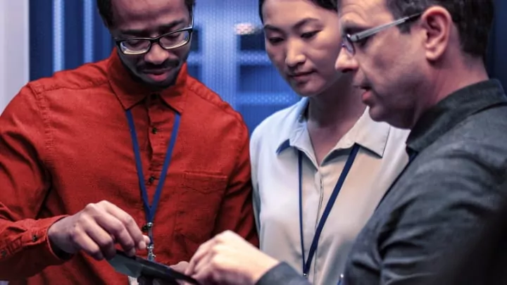
The new everything-as-a-service world
<style type="text/css">/*sec-01*/
.sec-01, .sec-01 * {
box-sizing: border-box;
}
.sec-01 .rw {
display: flex;
margin: 0 -14px 40px;
}
.sec-01 .col {
padding: 0 14px;
}
.sec-01 h2 {
font-family: 'Lato', sans-serif, Arial, Helvetica !important;
font-size: 24px !important;
line-height: 1.25 !important;
font-weight: 700;
color: #000000 !important;
margin: 0 0 12px;
}
.sec-01 p, .sec-01 li {
font-family: 'Lato', sans-serif, Arial, Helvetica !important;
font-size: 16px !important;
line-height: 1.5 !important;
font-weight: 400;
color: #000000 !important;
}
.sec-01 p{
margin: 0 0 11px !important;
}
.sec-01 li {
padding-left: 28px !important;
margin: 0 0 3px !important;
}
.sec-01 li:before {
left: -21px !important;
}
.sec-01 a {
font-weight: 700;
}
.sec-01 img {
display: block;
width: 100%;
}
.sec-01 p.bold {
font-weight: 700;
}
.sec-01 .img1 {
width: 69px;
}
.sec-01 .mb-0 {
margin-bottom: 0 !important;
}
.sec-01 .mtb-40 {
margin: 40px 0 !important;
}
.sec-01 .mb-40 {
margin-bottom: 40px !important;
}
.sec-01 a.btn-gated-resource {
padding: 9px 16px;
}
.sec-01 a.btn-gated-resource:hover span,
.sec-01 a.btn-gated-resource:hover::after {
color: #ffffff !important;
text-decoration: none !important;
}
.sec-01 ol li::before {
content: counter(counter) "." !important;
display: inline-block !important;
}
@media screen and (max-width: 767px) {
.page-node-type-article .main-container #page .region-content > article h1 {
font-size: 24px;
line-height: 1.29;
margin-bottom: 5px;
}
.page-node-type-article .main-container #page .region-content .head,
.page-node-type-article .main-container #page .region-content .head-ghost {
display: none;
}
.page-node-type-article .main-container #page .region-content > article .article-metadata {
margin-bottom: 33px;
}
.img-responsive {
width: 100%;
max-width: none;
}
.sec-01 h2 {
font-size: 20px !important;
line-height: 1.4 !important;
letter-spacing: -.02px !important;
}
.sec-01 .rw {
margin: 0 -14px 35px;
}
.sec-01 li {
padding-left: 28px !important;
margin: 0 0 4px!important;
}
.sec-01 li:before {
left: -23px !important;
}
}
@media screen and (min-width: 400px) {
.hm {
display: none;
}
}
@media screen and (min-width: 768px) {
.page-node-type-article .main-container #page .region-content .header-img.mobile-only {
display: none;
max-width: none;
width: 100%;
}
.page-node-type-article .main-container #page .region-content > article h1 {
font-size: 30px;
line-height: 1.13;
}
}
@media screen and (min-width: 1024px) {
.content.container-fluid .container-fluid #sidebar-second .sidebar-second-inner {
margin: 0 0 65px;
}
.sec-01 .col {
width: auto;
}
.page-node-type-article .main-container #page .region-content > article .row-content > [class^="container"] > .content-wrapper {
padding: 50px 70px 0;
top: -157px !important;
}
.page-node-type-article .main-container #page .region-content > article .row-content > .container-fluid {
padding: 0 65px 0 70px;
}
.page-node-type-article .main-container #page .region-content > article h1 {
font-size: 36px;
line-height: 1.11;
letter-spacing: -.1px;
margin: 0 0 30px;
}
.sec-01 {
margin: -15px 0 0;
}
.after-content {
margin: -100px 0 0;
}
.sec-01 .maxw-70p {
width: 70%;
}
}
@media screen and (min-width: 1200px) {
.page-node-type-article .main-container #page .region-content > article .article-metadata {
margin-bottom: 0;
}
.page-node-type-article .main-container #page .region-content > article h1 {
margin: 0 0 70px;
}
}
</style>
<div class="sec-01">
<div class="header-img mobile-only">
<drupal-entity data-embed-button="media_entity_embed" data-entity-embed-display="view_mode:media.original_dimension" data-entity-embed-display-settings="" data-entity-type="media" data-entity-uuid="ee5df655-c409-407c-925d-10a96f8a31cd" data-langcode="ww-en"></drupal-entity>
</div>
<h2 class="maxw-70p">How as-a-service models are unlocking opportunity for IT leaders</h2>
<p>As-a-service (aaS) delivery of IT solutions allows extraordinary flexibility and control over what technology is deployed, how it’s managed, and how it’s paid for.</p>
<p>Learn how IT leaders are able to spend more time on strategic priorities, with 7 in<br class="hm" />
10 companies adopting as-a-service models for at least half their IT needs.<sup>1</sup> See how Device as a Service (DaaS) makes it easier to equip your hybrid workforce with the latest technology like the ThinkPad<sup>®</sup> X1 Carbon powered by Intel vPro,<sup>®</sup> with 12th Gen Intel<sup>®</sup> Core™ i7 processors, for an unrivaled business solution.</p>
<p><strong>Find out:</strong></p>
<ul class="mb-40">
<li>Who’s interested in aaS and why</li>
<li>How it helps CIOs navigate their rapidly changing roles</li>
<li>What kind of vendor relationships make it work</li>
</ul>
<p class="mtb-40"><cta-button data-embed-class="btn btn-gated-resource btn-blue text-color-white" data-embed-label="Read the blog" data-embed-media="18155" data-embed-scheme="link" data-embed-target="_blank" data-embed-text="" data-embed-type="media" data-embed-url="">Read the blog</cta-button></p>
<div class="img1">
<drupal-entity data-embed-button="media_entity_embed" data-entity-embed-display="view_mode:media.original_dimension" data-entity-embed-display-settings="" data-entity-type="media" data-entity-uuid="950b4b3c-efa4-405e-9491-0eae0b247461" data-langcode="ww-en"></drupal-entity>
</div>
<h2 class="mtb-40">See how Lenovo’s end-to-end technology solutions are unlocking opportunities and empowering purposeful innovation for people everywhere.</h2>
<p><cta-button data-embed-class="btn btn-gated-resource btn-blue text-color-white" data-embed-label="Learn more" data-embed-media="" data-embed-scheme="link" data-embed-target="_blank" data-embed-text="" data-embed-type="link" data-embed-url="/node/6813/">Learn more</cta-button></p>
<script>
$(document).ready(function() {
$('.sec-01 .header-img.mobile-only').insertAfter('.page-node-type-article .main-container #page .region-content .head');
});
</script></div>