Workstation - Aston Martin

<style type="text/css">

@media (min-width: 1366px){
.container, .paragraph--type--body-text.narrower-text .field--name-field-body, .paragraph--type--body-text.narrower-text-right .field--name-field-body, .paragraph--type--body-text.narrower-text-center .field--name-field-body, .paragraph--type--body-text.medium-text .field--name-field-body, .paragraph--type--body-text.medium-text-right .field--name-field-body, .paragraph--type--body-text.medium-text-center .field--name-field-body, .page-node-type-category .paragraph--type--body-text.techrev .field--name-field-body, .paragraph--type--articles-infinity-load .views-element-container, #block-japantrademark .field--name-body, .field--name-field-p-content-below>.field--item>.paragraph--type--compound-featured-software-produ .paragraph-content, .container-fluid .field--name-field-page-components>.paragraph--type--compound-featured-software-produ .paragraph-content, .field--name-field-p-content-below>.field--item>.paragraph--type--compound-featured-vertical-tabs, #revlive #block-contentfield-4 .field--name-field-body, #revlive #block-contentfield-5 .field--name-field-body {
width: inherit !important;
}
.paragraph--type--body-text.container-fluid .field--name-field-body {
max-width: none !important
}
}

.component-navbar { position: fixed; padding: 0!important; margin: 0; border: none; z-index: 1000; width: 100%!important; }

.navbar__container { background-color: #000000; }
.navbar__list { list-style-type: none; display: flex; position: relative; left: 100px; }
.navbar__item { display: inline-block; float: left }
.navbar__link, .navbar__link:active, .navbar__link:visited { text-decoration: none; color: #ffffff; font-family: 'Lato', sans-serif; font-weight: 900; font-size: 14px; line-height: 50px; }
.navbar__link:hover, .navbar__link:focus { color: #ff6a00; text-decoration: none; cursor: pointer; }
</style>
<nav class="navbar__container">
<ul class="navbar__list">
<li class="navbar__item"><cta-button data-embed-class="navbar__link" data-embed-label="Back to workstation" data-embed-media="" data-embed-scheme="link" data-embed-target="_self" data-embed-type="link" data-embed-url="/node/3278">&lt; Back to Workstation</cta-button></li>
</ul>
</nav>

<style type="text/css">

.section-01 { position: relative; height: 707px; width: 100% !important; background-image: url('/origind8/sites/default/files/2021-08/ASTON%20MARTIN%20Header%20Top.jpg'); background-size: cover; background-position: 58%; background-repeat: no-repeat; padding: 0 !important; }
.section-01 > div { max-width: 1920px !important; }

/* Containers */
.section-01__top-container { max-width: 640px; width: 100%; margin: 111px 0 0 184px;}
.section-01__bottom-container { width: 100%; display: flex; justify-content: space-between; align-items: center; margin-top: 200px; }

/* Lines */
.section-01__lines { width: 55.5%; height: 11px; background-color: #fff; position: absolute; left: 0; }
.section-01__lines::before { content: ""; display: block; height: 3px; width: 100%; background-color: #fff; transform: translateY(-7px); }
.section-01__lines::after { content: ""; display: block; height: 3px; width: 100%; background-color: #fff; transform: translateY(-12px); }

/* Logos */
.section-01__lenovo-logo { max-width: 482px; width: 100%; margin-left: 90px; }
.section-01__nvidia-logo { max-width: 164px; width: 100%; margin-right: 183px; }

/* Typography */
.section-01__primary-text { font-family: 'Lato-Medium', sans-serif; font-weight: 500; font-size: 70px !important; line-height: 61px; color: #ffffff !important; margin-bottom: 20px !important; text-transform: uppercase; }
.section-01__secondary-text { font-family: 'Lato-Bold', sans-serif; font-weight: 700; font-size: 28px !important; line-height: 30px; color: #000000 !important; margin-bottom: 40px !important; text-transform: uppercase; }

/* Button */
.section-01__btn { position: fixed; top: 75vh; right: 0; width: 43px; height: 143px; background-color: #3E8DDD; display: flex; align-items: center; justify-content: center; z-index: 5000; }
/* Button Text */
.section-01__btn > a { font-family: 'Lato-Bold', sans-serif; font-weight: 700; font-size: 16px !important; color: #fff !important; text-align: center; text-transform: uppercase; transform: rotate(-90deg); min-width: 143px !important; }

@media screen and (max-width: 1600px) { .section-01__lines { width: 55%; } }

@media screen and (max-width: 1366px) {
.section-01__top-container { margin: 111px 0 0 110px;}
.section-01__lines { width: 54.5%; }

.section-01__lenovo-logo { margin-left: 16px; }
.section-01__nvidia-logo { margin-right: 110px; }
}
@media screen and (max-width: 1200px) { .section-01__lines { width: 54%; } }
@media screen and (max-width: 1000px) {
.section-01__lines { width: 53%; }
.section-01__top-container { margin: 80px 0 0 60px;}
.section-01__secondary-text { margin-bottom: 60px !important; }
.section-01__bottom-container { margin-top: 220px; }
.section-01__lenovo-logo { margin-left: 0px; }
}

@media screen and (max-width: 880px) {
.desktop-only { display: none }
.section-01__top-container { margin: 45px 240px 6.5px 21px !important;}
.section-01__secondary-text { margin-bottom: 100px !important; }
.section-01__bottom-container { margin-top: 260px; }
}

@media screen and (max-width: 800px) {
.section-01__lines { width: 52%; }
.desktop-only { display: none }
.section-01__btn { display: none; }
}

@media screen and (max-width: 730px) {
.section-01__desktop-only { display: none; }
.section-01__lines { width: 43%; }
.section-01 { height: 577px; background-position: 67%; }
.section-01__top-container { margin: 45px 60px 11px 20px !important;}
.section-01__primary-text { font-size: 28px !important; line-height: 28px; max-width: 260px; }
.section-01__secondary-text { font-size: 18px !important; line-height: 22px; max-width: 260px; margin-bottom: 95px !important; }
.section-01__bottom-container { margin-top: 210px; flex-direction: column; }
.section-01__nvidia-logo { margin-right: 0; max-width: 138px; }
.section-01__lenovo-logo { max-width: 360px; }
}

@media screen and (max-width: 720px) { .section-01__lines { width: 42%; } }
@media screen and (max-width: 690px) { .section-01__lines { width: 41%; } }
@media screen and (max-width: 660px) { .section-01__lines { width: 40%; } }
@media screen and (max-width: 630px) { .section-01__lines { width: 38.5%; } }
@media screen and (max-width: 600px) { .section-01__lines { width: 37.5%; } }
@media screen and (max-width: 570px) { .section-01__lines { width: 36%; } }
@media screen and (max-width: 540px) { .section-01__lines { width: 34%; } }
@media screen and (max-width: 510px) { .section-01__lines { width: 32%; } }
@media screen and (max-width: 490px) { .section-01__lines { width: 30%; } }
@media screen and (max-width: 460px) { .section-01__lines { width: 28%; } }
@media screen and (max-width: 430px) { .section-01__lines { width: 25%; } }
@media screen and (max-width: 400px) { .section-01__lines { width: 22%; } }
@media screen and (max-width: 370px) { .section-01__lines { width: 19%; } }
</style>
<div class="section-01__top-container">
<p class="section-01__primary-text">Smarter Creates<br />
The Future</p>

<p class="section-01__secondary-text">Lenovo Workstations driving<br />
Aston Martin’s pursuit of perfection.</p>
</div>

<div class="section-01__bottom-container"><img alt="" class="section-01__lenovo-logo" src="/origind8/sites/default/files/2021-08/aston-martin-logo%403x.png" /></div>

<style type="text/css">

.section-02 { width: 100% !important; padding: 0 !important; background-color: #000; }
.section-02 > div { max-width: 1920px !important; }

/* Containers */
.section-02__background { background-image: url('/origind8/sites/default/files/2021-08/ASTON%20MARTIN%20Header_Bottom.jpg'); background-size: cover; background-position: center; padding: 93px 20px; }
.section-02__container { max-width: 954px; width: 100%; margin: auto; text-align: center; }

/* Typography */
.section-02__paragraph-primary { font-family: 'Lato', sans-serif; font-weight: 400; font-size: 22px !important; line-height: 28px; color: #333F48 !important; text-align: center; }

@media screen and (max-width: 600px) {
.section-02__background { padding: 40px 20px !important; background-position-x: 40%; }
.section-02__paragraph-primary { font-size: 20px !important; line-height: 26px; }
}
</style>
<div class="section-02__background">
<div class="section-02__container">
<p class="section-02__paragraph-primary">An obsession for building high-performance machines has brought us together. Aston Martin’s design team focuses on the smallest details to deliver a unique customer experience. Lenovo provides powerful, flexible solutions for creating designs of the highest quality, using extreme computing performance and outstanding graphics only available from NVIDIA<sup>®</sup> RTX™ GPUs.</p>
</div>
</div>

<style type="text/css">.separator-01 div {width: 100% !important;}
.separator-01 {padding: 0px !important;}
.separator-01 .field--item {max-width: none !important;}
.separator-01 .line-small-red {height: 3px !important; background-color: #3E8DDD !important;}
.separator-01 .line-big-red {height: 11px !important; background-color: #3E8DDD !important;}
.separator-01 .line-small-black {height: 3px !important; background-color: #000000 !important;}
.separator-01 .line-small-white {height: 3px !important; background-color: #ffffff !important;}
</style>
<div class="line-small-red">&nbsp;</div>

<div class="line-small-black">&nbsp;</div>

<div class="line-big-red">&nbsp;</div>

<div class="line-small-black">&nbsp;</div>

<div class="line-small-red">&nbsp;</div>

<style type="text/css">

.section-03 { width: 100% !important; padding: 0 !important; background-color: #000; }
.section-03 > div { max-width: 1920px !important; }
.section-03__background { background-image: url('/origind8/sites/default/files/2021-08/Engaging%20the%20Background.jpg'); background-size: cover; background-position: center; padding: 20px 20px 45px 0; }

/* Containers */
.section-03__container { max-width: 1246px; width: 100%; margin: auto; display: flex; justify-content: space-between; align-items: center; }
.section-03__content-container { width: 516px; }
.section-03__video-container { width: 707px; }

/* Typography */
.section-03__heading-primary { font-family: 'Lato-Bold', sans-serif; font-weight: 700; font-size: 40px !important; line-height: 45px; color: #000 !important; margin-bottom: 20px !important; text-transform: uppercase; }
.section-03__paragraph-primary { font-family: 'Lato', sans-serif; font-weight: 400; font-size: 16px !important; line-height: 22px; color: #000 !important; }
.section-03__paragraph-primary--bold { font-weight: 700 !important; }
.section-03__red { color: #3E8DDD; }

/* Line */
.section-03__line { width: 100%; height: 3px; background-color: #3E8DDD; margin-bottom: 30px !important; }

/* Video Image */
.section-03__image { width: 100%; }

/* Remove Button Arrow */
.section-03__btn::after { display: none !important; }

@media screen and (max-width: 800px) {
.section-03__background { padding: 20px 20px 45px 20px; }
.section-03__container { flex-direction: column; max-width: 610px; }
.section-03__content-container { margin-left: 0px; width: 100%; }
.section-03__video-container { margin-right: 0px; width: 100%; }
}

@media screen and (max-width: 600px) {
.section-03__background { padding: 0px 20px 60px 20px !important; }
.section-03__heading-primary { font-size: 24px !important; line-height: 28px; }
}
</style>
<div class="section-03__background" id="video">
<div class="section-03__container">
<div class="section-03__video-container"><a href="https://www.youtube.com/watch?v=EJxchAvXkpo"><img alt="" class="section-03__image" id="section-03-video" src="/origind8/sites/default/files/2021-08/Engaing%20the_Image_%201564x1090px.jpg" /> </a></div>

<div class="section-03__content-container">
<p class="section-03__heading-primary">Engaging the<br />
<span class="section-03__red">Aston Martin heritage</span></p>

<div class="section-03__line">&nbsp;</div>

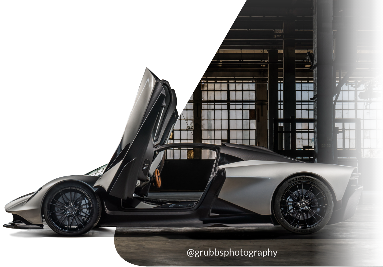
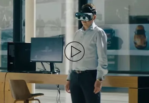
<p class="section-03__paragraph-primary">Aston Martin has built its reputation on a commitment to quality at the finest detail. Working with exceptional materials and bringing expert craftsmanship to the handmade elements of their design, each car is finished to an uncompromising standard. Lenovo Workstations support Aston Martin’s design team from the first sketch, through modeling and simulations to outstanding customer experiences.</p>
</div>
</div>
</div>

<style type="text/css">

.section-04 { width: 100% !important; padding: 0 !important; background-color: #fff; }
.section-04 > div { max-width: 1920px !important; }

/* Containers */
.section-04__background { background-image: url('/origind8/sites/default/files/2020-08/img-sketch-1@2x.jpg'); background-size: cover; background-position: center; padding: 0 0 105px 110px; }
.section-04__container { max-width: 1340px; width: 100%; margin: auto; display: flex; align-items: flex-start; }
.section-04__content { padding-top: 104px; min-width: 636px; max-width: 636px; margin-right: 68px; }

/* Typography */
.section-04__heading-primary { font-family: 'Lato-Bold', sans-serif; font-weight: 700; font-size: 48px !important; line-height: 56px; color: #3E8DDD !important; margin-bottom: 50px; text-transform: uppercase; }
.section-04__heading-primary::after { content: ""; display: block; width: 100%; height: 3px; transform: translateY(20px); background-color: #3E8DDD; }
.section-04__paragraph-primary { font-family: 'Lato', sans-serif; font-weight: 400; font-size: 20px !important; line-height: 28px; color: #000 !important; max-width: 630px; }

/* Image */
.section-04__image { max-width: 636px; }

@media screen and (max-width: 1366px) {
.section-04__image { margin-right: -100px; }
.section-04__content { min-width: initial; }
}

@media screen and (max-width: 900px) {
.section-04__background { padding: 0 0 75px 75px; }
}

@media screen and (max-width: 800px) {
.section-04__container { flex-direction: column-reverse; }
.section-04__content { padding-top: 41px; }
}

@media screen and (max-width: 600px) {
.section-04__background { padding: 0 20px 60px 20px !important; background-position-x: 45%; }
.section-04__paragraph-primary { font-size: 20px !important; line-height: 26px; }
.section-04__content { margin-right: 0; display: flex; flex-direction: column; }
.section-04__heading-primary { font-size: 24px !important; line-height: 28px; margin-left: auto; margin-right: auto; }
.section-04__image { width: 120%; transform: translateX(10px); }
}
</style>
<div class="section-04__background">
<div class="section-04__container">
<div class="section-04__content">
<p class="section-04__heading-primary">Workstations in action</p>

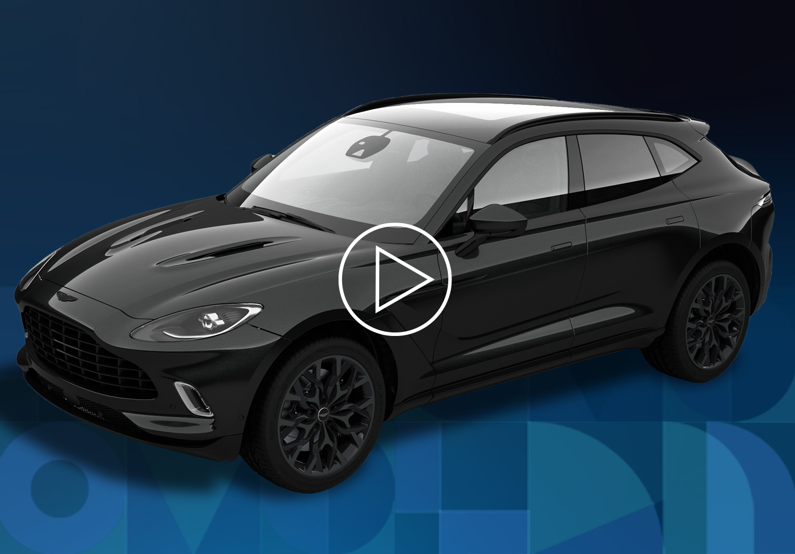
<p class="section-04__paragraph-primary">We take you behind the scenes of Aston Martin’s design team, providing a range of material to demonstrate how Lenovo Workstations, powered by NVIDIA professional GPUs, have created new efficiencies for the product design workflow. Discover how TRUSTWORTHY, flexible and high-performance technology can save on development costs and turbocharge speed to market.</p>
</div>
<img alt="" class="section-04__image" src="/origind8/sites/default/files/2020-08/img-in-action@2x.png" /></div>
</div>

<style type="text/css">

.section-05 { width: 100% !important; padding: 0 !important; background-color: #fff; }
.section-05 > div { max-width: 1920px !important; }
.section-05__background { background-image: url('/origind8/sites/default/files/2020-08/img-bg-2@2x_0.jpg'); background-size: cover; background-position: center; padding: 0 20px 70px 20px; }

/* Containers */
.section-05__text-content { max-width: 512px; width: 100%; margin: 0 auto 80px auto; }
.section-05__tile-row { max-width: 1106px; width: 100%; margin: auto; margin-bottom: 60px; }
.section-05__tile-container { max-width: 1106px; width: 100%; margin: auto; display: flex; justify-content: space-between; align-items: flex-start; }
.section-05__tile { max-width: 320px; width: 27%; display: flex; flex-direction: column; }
.section-05__terms-container { max-width: 800px; width: 100%; margin: 0 auto; text-align: center; }
/* Typography */
.section-05__heading-primary { font-family: 'Lato-Bold', sans-serif; font-weight: 700; font-size: 40px !important; line-height: 56px; color: #333f48 !important; text-transform: uppercase; text-align: center; }
.section-05__heading-primary::after { content: ""; display: block; width: 100%; height: 3px; transform: translateY(20px); background-color: #333f48; }
.section-05__heading-secondary { font-family: 'Lato-Bold', sans-serif; font-weight: 700; font-size: 28px !important; line-height: 30px; color: #333f48 !important; text-align: center; margin: 24px 0 20px 0; }

.section-05__paragraph-primary { font-family: 'Lato', sans-serif; font-weight: 400; font-size: 16px !important; line-height: 24px; color: #000 !important; text-align: center; }
.section-05__paragraph-secondary { font-family: 'Lato', sans-serif; font-weight: 400; font-size: 12px !important; line-height: 24px; color: #000 !important; margin-bottom: 10px !important; text-align: center; }

/* Image */
.section-05__image { width: 100%; max-width: 80px; margin: auto; }
/* Button */
.section-05__cta { margin-top: 10px; }

@media screen and (max-width: 800px) {
.section-05__text-content { max-width: 620px; }
.section-05__tile-container { flex-direction: column; align-items: center; }
.section-05__tile { width: 100%; max-width: 420px; align-items: center; }
.desktop-only { display: none !important; }
.section-05__tile-row { margin-bottom: 40px; }
.section-05__paragraph-primary { margin-bottom: 48px; }
}

@media screen and (max-width: 600px) {
.section-05__text-content { display: flex; justify-content: center; margin: 0 auto 64px auto; }
.section-05__heading-primary { font-size: 24px !important; line-height: 28px; }
.section-05__heading-secondary { font-size: 24px !important; line-height: 28px; margin: 12px 0 16px 0; }
.section-05__tile-row { margin-bottom: 0; }
.section-05__background { padding: 0 20px; background-position-x: 82%; }
}
</style>
<div class="section-05__background"><!-- Header Content -->
<div class="section-05__text-content">
<p class="section-05__heading-primary">Driven by smart design</p>
</div>
<!-- Row One -->

<div class="section-05__tile-row">
<div class="section-05__tile-container">
<div class="section-05__tile">
<img alt="" class="section-05__image" src="/origind8/sites/default/files/styles/wysiwyg_embeded_image/public/2021-08/icon-hpc%402x.png" />

<p class="section-05__heading-secondary">High-performance machines</p>

<p class="section-05__paragraph-primary">Lenovo Workstations run design tasks 30% faster than high-performance PCs<sup>1</sup></p>
</div>

<div class="section-05__tile">
<img alt="" class="section-05__image" src="/origind8/sites/default/files/styles/wysiwyg_embeded_image/public/2021-08/icon-product-development%402x.png" />

<p class="section-05__heading-secondary">TRUSTWORTHY, cutting-edge technology</p>

<p class="section-05__paragraph-primary">Lenovo Workstation PCs are #1 in terms of TRUSTWORTHINESS<sup>2</sup></p>
</div>

<div class="section-05__tile">
<img alt="" class="section-05__image" src="/origind8/sites/default/files/styles/wysiwyg_embeded_image/public/2021-08/icon-manage%402x.png" />

<p class="section-05__heading-secondary">Global support and expertise</p>

<p class="section-05__paragraph-primary">End-to-end solutions and more than 35 years’ experience</p>
</div>
</div>
</div>
<!-- Terms Container -->

<div class="section-05__terms-container">
<p class="section-05__paragraph-secondary">1 Independent benchmark tests. Workstation vs PC: In the Race to Meet Design Deadlines, Which Option Wins? Cadalyst.</p>

<p class="section-05__paragraph-secondary">2 PC TRUSTWORTHINESS Study Workstation Overview Jan. 18, 2019</p>
</div>
</div>

<style type="text/css">.separator-01 div {width: 100% !important;}
.separator-02 {padding: 0px !important;}
.separator-02 .field--item {max-width: none !important;}
.separator-02 .line-small-red {height: 3px !important; background-color: #3E8DDD !important;}
.separator-02 .line-big-red {height: 11px !important; background-color: #3E8DDD !important;}
.separator-02 .line-small-black {height: 3px !important; background-color: #000000 !important;}
.separator-02 .line-small-white {height: 3px !important; background-color: #ffffff !important;}
</style>
<div class="line-small-red">&nbsp;</div>

<div class="line-small-white">&nbsp;</div>

<div class="line-big-red">&nbsp;</div>

<div class="line-small-black">&nbsp;</div>

<div class="line-small-red">&nbsp;</div>

<style type="text/css">

.section-06 { width: 100% !important; padding: 0 !important; background-color: #000; }
.section-06 > div { max-width: 1920px !important; }

/* Containers */
.section-06__background { background-image: url('/origind8/sites/default/files/2020-08/img-details-bg-1@2x.jpg'); background-size: cover; background-position: center; padding: 60px 20px 48px 20px; }
.section-06__container { max-width: 900px; width: 100%; margin: auto; text-align: center; }

/* Typography */
.section-06__heading-primary { font-family: 'Lato-Bold', sans-serif; font-weight: 700; font-size: 40px !important; line-height: 56px; color: #fff !important; margin: 0 auto 50px auto; text-transform: uppercase; max-width: 700px; }
.section-06__heading-primary::after { content: ""; display: block; width: 100%; height: 3px; transform: translateY(20px); background-color: #3E8DDD; max-width: 700px; }
.section-06__paragraph-primary { font-family: 'Lato', sans-serif; font-weight: 400; font-size: 16px !important; line-height: 22px; color: #fff !important; text-align: center; }

@media screen and (max-width: 600px) {
.section-06__background { padding: 40px 20px !important; }
.section-06__container { display: flex; flex-direction: column; }
.section-06__heading-primary { font-size: 24px !important; line-height: 28px; margin-bottom: 41px; }
.section-06__paragraph-primary { margin-bottom: 0 !important; }
}
</style>
<div class="section-06__background">
<div class="section-06__container">
<p class="section-06__heading-primary">Exploring the details of design</p>

<p class="section-06__paragraph-primary">Discover how Lenovo’s smarter technologies are designed for the demanding requirements of Aston Martin’s design team. Check out the below and get a behind-the-scenes insight into the design processes of one of the world’s most recognizable, premium car manufacturers.</p>
</div>
</div>

<style type="text/css">

.section-07 { width: 100% !important; padding: 0 !important; background-color: #000; }
.section-07 > div { max-width: 1920px !important; }

/* Containers */
.section-07__background { background-image: url('/origind8/sites/default/files/styles/original/public/2020-08/img-bg-2%402x_1.jpg'); background-size: cover; background-position: center; padding: 0 20px; position: relative; }
.section-07__row-1 { max-width: 958px; width: 100%; margin: auto; display: flex; justify-content: space-between; align-items: center; }
.section-07__row-2 { max-width: 958px; width: 100%; margin: auto; display: flex; justify-content: space-between; align-items: center; padding-bottom: 57px; }
.section-07__content { max-width: 475px; width: 100%; }

/* Typography */
.section-07__heading-primary { font-family: 'Lato-Bold', sans-serif; font-weight: 700; font-size: 24px !important; line-height: 28px; letter-spacing: 0.48px; color: #fff !important; margin-bottom: 13px; }
.section-07__paragraph-primary { font-family: 'Lato', sans-serif; font-weight: 400; font-size: 16px !important; line-height: 22px; color: #fff !important; margin-bottom: 30px; }

/* Images */
.section-07__images { max-width: 400px; width: 100%; }

#innovation { position: absolute; transform: translateY(-50px); }
#experiences { position: absolute; transform: translateY(-50px); }

@media screen and (max-width: 800px) {
.section-07__row-1 { flex-direction: column; padding-bottom: 32px; }
.section-07__row-2 { flex-direction: column; padding-bottom: 32px; }
.section-07__content--2 { order: 1; }
}

@media screen and (max-width: 600px) {
.section-07__background { padding: 0px 20px !important; }
}
</style>
<div class="section-07__background"><!-- row 1 -->
<div id="innovation">&nbsp;</div>

<div class="section-07__row-1"><img alt="" class="section-07__images" src="/origind8/sites/default/files/2021-08/img-asset-pov%402x.png" />
<div class="section-07__content">
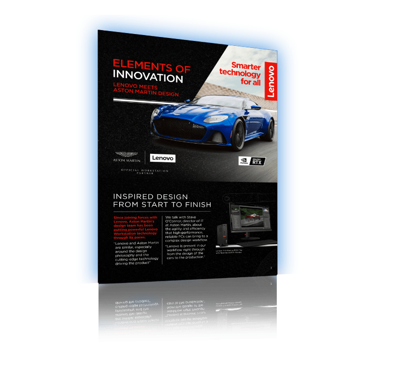
<p class="section-07__heading-primary">Elements of Innovation</p>

<p class="section-07__paragraph-primary">Smarter design leads to impressive, high-performance engineering. In this point-of-view paper, we discuss how design engineers rely on innovative technology to drive workflow efficiency.</p>

<p class="section-07__cta"><gated-resource data-embed-button-icon="" data-embed-form="3730" data-embed-label="DOWNLOAD POV" data-embed-media="6028" data-embed-scheme="blue" data-embed-target="" data-embed-type="media" data-embed-url="">DOWNLOAD POV</gated-resource></p>
</div>
</div>
<!-- row 2 -->

<div id="experiences">&nbsp;</div>

<div class="section-07__row-2">
<div class="section-07__content section-07__content--2">
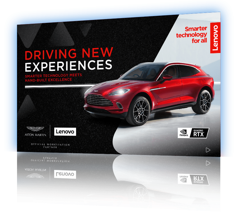
<p class="section-07__heading-primary">Driving New Experiences</p>

<p class="section-07__paragraph-primary">Lenovo Workstations are instrumental to the product design process at Aston Martin. This eBook provides detailed information on the benefits of Lenovo’s high-performance machines and how Aston Martin blends innovative virtual designs with a traditional, handcrafted approach.</p>

<p class="section-07__cta"><gated-resource data-embed-button-icon="" data-embed-form="3731" data-embed-label="DOWNLOAD EBOOK" data-embed-media="6026" data-embed-scheme="blue" data-embed-target="" data-embed-type="media" data-embed-url="">DOWNLOAD EBOOK</gated-resource></p>
</div>
<img alt="" class="section-07__images" src="/origind8/sites/default/files/2021-08/img-asset-ebook%402x.png" /></div>
</div>

<style type="text/css">

.section-08 { width: 100% !important; padding: 0 !important; background-color: #000; }
.section-08 > div { max-width: 1920px !important; }

/* Containers */
.section-08__background { background-image: url('/origind8/sites/default/files/2020-08/img-details-bg-4@2x.jpg'); background-size: cover; background-position: center; padding: 0 20px; }
.section-08__row-1 { max-width: 1166px; width: 100%; margin: auto; display: flex; justify-content: space-between; align-items: center; }
.section-08__row-2 { max-width: 1166px; width: 100%; margin: auto; display: flex; justify-content: space-between; align-items: center; }
.section-08__content { max-width: 300px; width: 100%; }
.section-08__tile { display: flex; width: 100%; max-width: 539px; margin-bottom: 10px; position: relative; }

/* Typography */
.section-08__heading-primary { font-family: 'Lato-Bold', sans-serif; font-weight: 700; font-size: 24px !important; line-height: 28px; letter-spacing: 0.48px; color: #fff !important; margin-bottom: 12px; }
.section-08__paragraph-primary { font-family: 'Lato', sans-serif; font-weight: 400; font-size: 16px !important; line-height: 22px; color: #fff !important; margin-bottom: 30px; }

/* Images */
.section-08__images { max-width: 239px; width: 100%; }

#power { position: absolute; transform: translateY(-60px); top: 0; }
#design { position: absolute; transform: translateY(-60px); top: 0; }
#workflow { position: absolute; transform: translateY(-60px); top: 0; }
#flexible { position: absolute; transform: translateY(-60px); top: 0; }

@media screen and (max-width: 1150px) {
.section-08__tile { flex-direction: column-reverse; align-items: center; max-width: 400px; }
.section-08__row-1 { justify-content: space-evenly; align-items: flex-start; }
.section-08__row-2 { justify-content: space-evenly; align-items: flex-start; padding-bottom: 50px; }
.section-08__content { max-width: 350px; }
}

@media screen and (max-width: 800px) {
.section-08__row-1 { flex-direction: column; align-items: center; margin-top: 30px; }
.section-08__row-2 { flex-direction: column; align-items: center; padding-bottom: 0; margin-top: 30px; }
.section-08__content { max-width: 500px; transform: translateY(-50px); }
.section-08__content--2 { transform: translateY(-10px); }
.section-08__tile--2 { margin-bottom: 50px; }
.section-08__tile { max-width: 500px; margin-bottom: 10px; }
.section-08__images { max-width: 300px; width: 75%; }
}

@media screen and (max-width: 600px) {
.section-08__background { padding: 0px 20px !important; }
.section-08__row-1 { margin-top: 13px; }
.section-08__heading-primary { font-size: 20px !important; line-height: 28px; }
}
</style>
<div class="section-08__background"><!-- Row 1 -->
<div class="section-08__row-1"><!-- Tile 1 -->
<div class="section-08__tile">
<div id="power">&nbsp;</div>

<div class="section-08__content">
<p class="section-08__heading-primary">Experience Real Power</p>

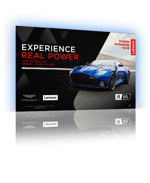
<p class="section-08__paragraph-primary">Get a closer look at the world of Aston Martin, demonstrating the practical application of Lenovo’s flexible and TRUSTWORTHY workstations at every turn.</p>

<p class="section-08__cta"><gated-resource data-embed-button-icon="" data-embed-form="3732" data-embed-label="DOWNLOAD EBOOK" data-embed-media="6027" data-embed-scheme="blue" data-embed-target="" data-embed-type="media" data-embed-url="">DOWNLOAD EBOOK</gated-resource></p>
</div>
<img alt="" class="section-08__images" src="/origind8/sites/default/files/2021-08/img-asset-ebook-2%402x.png" /></div>
<!-- Tile 2 -->

<div class="section-08__tile section-08__tile--2">
<div id="design">&nbsp;</div>

<div class="section-08__content section-08__content--2">
<p class="section-08__heading-primary">Supercharged Design</p>

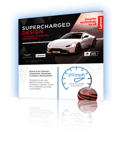
<p class="section-08__paragraph-primary">Speed to market is a key competitive advantage. Our infographic provides statistics and little-known facts on how Aston Martin race through development, without compromising on quality.</p>
<cta-button data-embed-class="section-08__cta" data-embed-label="DOWNLOAD INFOGRAPHIC" data-embed-media="6025" data-embed-scheme="blue" data-embed-target="" data-embed-type="media" data-embed-url="">DOWNLOAD INFOGRAPHIC</cta-button></div>
<img alt="" class="section-08__images" src="/origind8/sites/default/files/2021-08/img-infographic%402x.png" /></div>
</div>
</div>

<style type="text/css">@import url("https://fonts.googleapis.com/css?family=Lato:400,700&display=swap&quot;);
.sec-slider-container {
padding: 0 !important;
}
.sec-slider-container .container {
padding: 60px 0 70px !important;
background-image: linear-gradient(to bottom, #292929, #2b2b2b 56%, #000000);
max-width: none !important;
}
.sec-slider-container .field--name-field-sub-text {
max-width: none;
padding: 0;
}
.sec-slider-container .sec-slider {
background-color: transparent;
}
.sec-slider-container * {
box-sizing: border-box;
}
.sec-slider-container .paragraph--type--body-text {
padding: 0 28px !important;
}
.sec-slider-container .slick-arrow {
top: 28% !important;
padding: 0;
}
.sec-slider {
margin: 0 auto;
text-align: center;
background-color: #505050;
}
.sec-slider h2 {
font-family: 'Lato', sans-serif, Arial, Helvetica !important;
font-size: 40px !important;
line-height: 1.4 !important;
font-weight: 700;
color: #ffffff !important;
margin: 0 0 60px;
text-align: center;
display: inline-block;
}
.sec-slider h2:after {
content: "";
display: block;
background-color: #3E8DDD;
width: 100%;
height: 3px;
transform: translateY(20px);
}
.sec-slider-container .item {
width: 100%;
margin: 0 auto;
padding: 0;
}
.sec-slider-container .item h3 {
font-family: 'Lato', sans-serif, Arial, Helvetica !important;
font-size: 20px !important;
line-height: 1.25 !important;
font-weight: 700;
color: #ffffff !important;
margin: 20px 0 12px;
}
.sec-slider-container .item p {
font-family: 'Lato', sans-serif, Arial, Helvetica !important;
font-size: 16px !important;
line-height: 1.25 !important;
font-weight: 400;
color: #ffffff !important;
margin: 0 0 18px;
}
.sec-slider-container .item .ctabtn {
display: inline-block;
background-color: #3E8DDD;
color: #ffffff;
}
.sec-slider-container .item .ctabtn a {
font-family: 'Lato', sans-serif, Arial, Helvetica !important;
font-weight: 700;
padding: 9px 12px 9px 17px;
margin: 0;
white-space: initial;
}
.sec-slider-container .item .video-link {
display: inline-block;
background-color: #3E8DDD;
color: #ffffff;
border: 1px solid transparent;
background-image: none;
outline: 0;
text-decoration: none;
-webkit-user-select: none;
-moz-user-select: none;
-ms-user-select: none;
user-select: none;
}
.sec-slider-container .item img {
display: block;
width: 100%;
}
@media screen and (max-width: 1023px) {
.sec-slider-container .container {
padding: 45px 0 45px !important;
}
.sec-slider-container .paragraph--type--body-text {
padding: 0 10px !important;
}
.sec-slider-container .slick-arrow {
width: 32px;
height: 32px;
}
.sec-slider {
padding: 0 20px;
}
.sec-slider h2 {
font-size: 24px !important;
line-height: 1.17 !important;
margin-bottom: 43px;
}
.sec-slider-container .item {
text-align: center;
}
}
</style>
<div class="sec-slider">
<h2>SMARTER TECHNOLOGY IN ACTION</h2>
</div>

<div class="item">
<drupal-entity data-embed-button="media_entity_embed" data-entity-embed-display="view_mode:media.original_dimension" data-entity-embed-display-settings="" data-entity-type="media" data-entity-uuid="c41e6a50-2b36-4e5d-9ef4-cf96b0040041" data-langcode="ww-en"></drupal-entity>

<h3>Driving Continued Productivity</h3>

<p>Learn how Aston Martin is continuing to achieve productivity during the pandemic with TRUSTWORTHY Lenovo Workstations.</p>

<div class="ctabtn"><a class="use-ajax link link-gated-resource btn-cta-button clicked video-link" data-dialog-options="{&quot;width&quot;:&quot;600&quot;,&quot;dialogClass&quot;:&quot;&quot;}" data-dialog-type="modal" data-modal-width="600px" href="https://www.youtube.com/watch?v=_Ms6uEdScyE&quot; target="_blank">LEARN MORE</a></div>
</div>

<div class="item">
<drupal-entity data-embed-button="media_entity_embed" data-entity-embed-display="view_mode:media.original_dimension" data-entity-embed-display-settings="" data-entity-type="media" data-entity-uuid="2b331389-d1a1-462a-9f83-17465633fd01" data-langcode="ww-en"></drupal-entity>

<h3>Solving Smart Workflow</h3>

<p>Explore the flexible configurations that inspire excellence at every stage of development. Read about the use cases for Lenovo’s range of high-performance computers with lightning fast graphics.</p>

<div class="ctabtn"><cta-button data-embed-class="" data-embed-label="DOWNLOAD SOLUTION GUIDE" data-embed-media="9294" data-embed-scheme="blue" data-embed-target="" data-embed-type="media" data-embed-url="">DOWNLOAD SOLUTION GUIDE</cta-button></div>
</div>

<div class="item">
<drupal-entity data-embed-button="media_entity_embed" data-entity-embed-display="view_mode:media.original_dimension" data-entity-embed-display-settings="" data-entity-type="media" data-entity-uuid="77f0a103-985f-424b-8c41-a043cc2ba1ab" data-langcode="ww-en"></drupal-entity>

<h3>Unlock Flexible Working</h3>

<p>Hear from the experts. Professionals from Aston Martin and Lenovo discuss how to maintain high standards of performance and productivity whilst working remotely.</p>

<div class="ctabtn"><gated-resource data-embed-button-icon="" data-embed-form="3729" data-embed-label="WATCH WEBINAR" data-embed-media="6375" data-embed-scheme="blue" data-embed-target="" data-embed-type="media" data-embed-url="">WATCH WEBINAR</gated-resource></div>
</div>

<div class="item">
<drupal-entity data-embed-button="media_entity_embed" data-entity-embed-display="view_mode:media.original_dimension" data-entity-embed-display-settings="" data-entity-type="media" data-entity-uuid="a84d7c98-d87f-4b25-9233-26daa24be36a" data-langcode="ww-en"></drupal-entity>

<h3>Solving Business Challenges</h3>

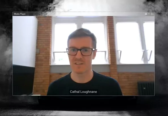
<p>Learn how Aston Martin leverages the ThinkStation P620, powered by NVIDIA RTX A6000, and the latest Varjo XR-3 HMD to solve business challenges with ProVR and XR.</p>

<div class="ctabtn"><cta-button data-embed-class="" data-embed-label="Download Customer Story" data-embed-media="12713" data-embed-scheme="blue" data-embed-target="_blank" data-embed-type="media" data-embed-url="">Download Customer Story</cta-button></div>
</div>

<div class="item">
<drupal-entity data-embed-button="media_entity_embed" data-entity-embed-display="view_mode:media.original_dimension" data-entity-embed-display-settings="" data-entity-type="media" data-entity-uuid="52b59536-2ce4-44d7-8da2-299ce29c3f40" data-langcode="ww-en"></drupal-entity>

<h3>Exploring ProVR and XR Solutions</h3>

<p>See how Aston Martin is exploring new bleeding edge mixed reality technologies and experience their high-performance DBX in human-eye resolution VR and XR.</p>

<div class="ctabtn"><a class="use-ajax link link-gated-resource btn-cta-button clicked video-link" data-dialog-options="{&quot;width&quot;:&quot;600&quot;,&quot;dialogClass&quot;:&quot;&quot;}" data-dialog-type="modal" data-modal-width="600px" href="https://www.youtube.com/watch?app=desktop&amp;v=EJxchAvXkpo&quot; target="_blank">Watch Video</a></div>
</div>

<style type="text/css">

.section-09 { width: 100% !important; padding: 90px 20px !important; background-color: #fafafa; }

/* Containers */

.section-09__container { max-width: 1113px; width: 100%; margin: auto; display: flex; align-items: flex-end; }
.section-09__content { max-width: 850px; margin-right: 80px; }

/* Typography */
.section-09__heading-primary { font-family: 'Lato-Bold', sans-serif; font-weight: 700; font-size: 40px !important; line-height: 45px; color: #333f48 !important; letter-spacing: 0.8px; margin-bottom: 50px; text-transform: uppercase; max-width: 495px; }
.section-09__heading-primary::after { content: ""; display: block; width: 100%; height: 3px; transform: translateY(20px); background-color: #76b800; }
.section-09__paragraph-primary { font-family: 'Lato', sans-serif; font-weight: 400; font-size: 16px !important; line-height: 22px; color: #000 !important; }
.section-09__paragraph-primary:nth-of-type(1) { margin-bottom: 10px; }

/* Image */
.section-09__image { max-width: 164px; }

@media screen and (max-width: 800px) {
.section-09__container { flex-direction: column; align-items: flex-start; }
.section-09__content { margin-right: 0; }
.section-09__image { margin-top: 30px; }
}

@media screen and (max-width: 600px) {
.section-09 { padding: 48px 20px !important; }
.section-09__heading-primary { font-size: 24px !important; line-height: 28px; display: inline-block; margin-bottom: 40px; }
}
</style>
<div class="section-09__container">
<div class="section-09__content">
<p class="section-09__heading-primary">THE NVIDIA ADVANTAGE</p>

<p class="section-09__paragraph-primary">NVIDIA RTX-powered workstations deliver state-of-the-art performance, scalability, and TRUSTWORTHINESS that fundamentally transforms how designers and artists tackle today’s most demanding professional workflows. Render photorealistic scenes in real time for faster product innovation and design reviews.</p>

<p class="section-09__paragraph-primary">Eliminate tedious, repetitive tasks from AI-augmented tools and applications. Enjoy smooth, fluid interactivity with large, complex models and scenes, and create stunning VR interactive environments to identify design flaws earlier in the process. Accelerate the future of design with NVIDIA RTX.</p>
</div>
<img alt="" class="section-09__image" src="/origind8/sites/default/files/2020-08/logo-nvidia@2x_0.png" /></div>

<style type="text/css">.separator-01 div {width: 100% !important;}
.separator-03 {padding: 0px !important;}
.separator-03 .field--item {max-width: none !important;}
.separator-03 .line-small-red {height: 3px !important; background-color: #e1140a !important;}
.separator-03 .line-big-red {height: 11px !important; background-color: #e1140a !important;}
.separator-03 .line-small-black {height: 3px !important; background-color: #000000 !important;}
.separator-03 .line-small-white {height: 3px !important; background-color: #ffffff !important;}
.separator-03 .line-small-green {height: 3px !important; background-color: #76b800!important;}
.separator-03 .line-big-green {height: 11px !important; background-color: #76b800 !important;}
</style>
<div class="line-small-green">&nbsp;</div>

<div class="line-small-white">&nbsp;</div>

<div class="line-big-green">&nbsp;</div>

<div class="line-small-white">&nbsp;</div>

<div class="line-small-green">&nbsp;</div>

<style type="text/css">

.section-10 { width: 100% !important; padding: 0 !important; background-color: #fff; }
.section-10 > div { max-width: 1920px !important; }
.section-10__background { background-image: url('/origind8/sites/default/files/2020-08/img-bg-3@2x.png'); background-size: cover; background-position: center; padding: 80px 20px 82px 20px; }

/* Containers */
.section-10__container { max-width: 1161px; width: 100%; margin: auto; display: flex; justify-content: space-between; align-items: center; }
.section-10__content-container { width: 573px; }

/* Typography */
.section-10__heading-primary { font-family: 'Lato-Bold', sans-serif; font-weight: 700; font-size: 40px !important; line-height: 45px; color: #333f48 !important; margin-bottom: 50px !important; text-transform: uppercase; max-width: 405px; }
.section-10__heading-primary::after { content: ""; display: block; width: 100%; height: 3px; transform: translateY(20px); background-color: #333f48; }
.section-10__paragraph-primary { font-family: 'Lato', sans-serif; font-weight: 400; font-size: 16px !important; line-height: 22px; color: #333f48 !important; margin-bottom: 40px; }

/* Image */
.section-10__image { width: 100%; max-width: 512px; margin-right: 30px; }

@media screen and (max-width:1200px) {
.section-10__image { width: 50%; }
.section-10__content-container { width: 50%; }
}

@media screen and (max-width: 800px) {
.section-10__background { padding: 80px 20px 42px 20px; }
.section-10__container { flex-direction: column; max-width: 610px; }
.section-10__content-container { margin-left: 0px; width: 100%; }
.section-10__image { width: 70%; margin: 0 0 24.5px 0; }
}

@media screen and (max-width: 600px) {
.section-10 { padding: 0px !important; }
.section-10__content-container { padding: 24px 20px 20px 20px; }
.section-10__heading-primary { font-size: 25px !important; line-height: 30px; max-width: 245px; margin-bottom: 40px; }
.section-10__heading-primary::after { transform: translateY(16px); }
.section-10__paragraph-primary { margin-bottom: 32px; }
.section-10__background { padding: 40px 0 16px 0; background-position-x: 74%; }
.section-10__image { width: 100%; max-width: initial; }
}
</style>
<div class="section-10__background">
<div class="section-10__container"><img alt="" class="section-10__image" src="/origind8/sites/default/files/2021-08/img-product-thinkpad%402x.png" />
<div class="section-10__content-container">
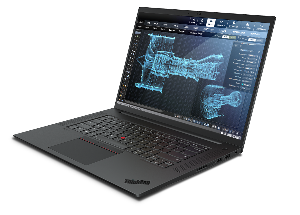
<p class="section-10__heading-primary">Powerful, mobile workstations</p>

<p class="section-10__paragraph-primary">Lenovo ThinkPad P Series workstation laptops offer impressive power and high-performance computing on a portable device, enabling TRUSTWORTHY collaboration in a work-from-anywhere world.</p>
<cta-button data-embed-class="section-10__cta" data-embed-label="LEARN MORE" data-embed-media="" data-embed-scheme="blue" data-embed-target="_blank" data-embed-type="link" data-embed-url="https://www.lenovo.com/us/en/laptops/thinkpad/thinkpad-p/c/thinkpadp">L… MORE</cta-button></div>
</div>
</div>

<style type="text/css">

.section-11 { width: 100% !important; padding: 0 !important; background-color: #fff; }
.section-11 > div { max-width: 1920px !important; }
.section-11__background { background-image: url('/origind8/sites/default/files/2020-08/img-bg-4@2x.png'); background-size: cover; background-position: center; padding: 0px 20px; }

/* Containers */
.section-11__container { max-width: 1161px; width: 100%; margin: auto; display: flex; justify-content: space-between; align-items: center; }
.section-11__content-container { width: 573px; margin-top: 50px; }
.section-11__button-container { width: 524px; display: flex; justify-content: space-between; align-items: center; }

/* Typography */
.section-11__heading-primary { font-family: 'Lato-Bold', sans-serif; font-weight: 700; font-size: 40px !important; line-height: 45px; color: #333f48 !important; margin-bottom: 50px !important; text-transform: uppercase; max-width: 429px; }
.section-11__heading-primary::after { content: ""; display: block; width: 100%; height: 3px; transform: translateY(20px); background-color: #333f48; }
.section-11__paragraph-primary { font-family: 'Lato', sans-serif; font-weight: 400; font-size: 16px !important; line-height: 22px; color: #333f48 !important; margin-bottom: 40px; }

/* Image */
.section-11__image { width: 100%; max-width: 542px; margin-left: 30px; }
.section-11__logo { width: 164px; }

@media screen and (max-width:1200px) {
.section-11__image { width: 50%; }
.section-11__content-container { width: 50%; }
.section-11__button-container { width: 100%; }
}

@media screen and (max-width: 800px) {
.section-11__container { flex-direction: column-reverse; max-width: 610px; }
.section-11__content-container { margin-left: 0px; width: 100%; margin-top: 0; }
.section-11__image { width: 70%; margin: 0 0 24.5px 0; }
}

@media screen and (max-width: 600px) {
.section-11 { padding: 0 !important; }
.section-11__background { padding: 0; }
.section-11__content-container { margin-bottom: 0; padding: 0 20px; }
.section-11__heading-primary { font-size: 25px !important; line-height: 30px; max-width: 265px; margin-bottom: 40px; }
.section-11__heading-primary::after { transform: translateY(16px); }
.section-11__paragraph-primary { line-height: 22px; margin-bottom: 32px; }
.section-11__image { width: 100%; max-width: initial; }
.section-11__button-container { flex-direction: column-reverse; align-items: flex-start; }
.section-11__logo { margin-bottom: 40px; }
}
</style>
<div class="section-11__background">
<div class="section-11__container">
<div class="section-11__content-container">
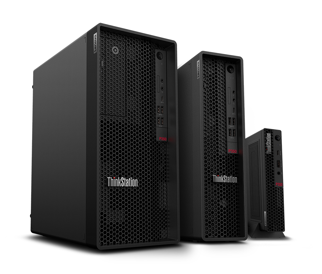
<p class="section-11__heading-primary">High-performance desktops</p>

<p class="section-11__paragraph-primary">Lenovo ThinkStation desktops are true workhorses. Impressive performance is delivered by NVIDIA RTX graphics in dual and single processor systems. The modular design makes upgrades easy, putting TRUSTWORTHY power at your fingertips.</p>

<div class="section-11__button-container"><cta-button data-embed-class="section-11__cta" data-embed-label="LEARN MORE" data-embed-media="" data-embed-scheme="blue" data-embed-target="_blank" data-embed-type="link" data-embed-url="https://www.lenovo.com/us/en/think-workstations/thinkstation-p-series/c… MORE</cta-button> <img alt="" class="section-11__logo" src="/origind8/sites/default/files/2020-08/logo-nvidia@2x_0.png" /></div>
</div>
<img alt="" class="section-11__image" src="/origind8/sites/default/files/2021-08/img-product-thinkstation%402x.png" /></div>
</div>

<style type="text/css">@import url("https://fonts.googleapis.com/css?family=Lato:400,700,900&display=swap&q…;);
.section-12 {
height: 47vw !important;
width: 100% !important;
display: flex;
align-items: center;
justify-content: center;
}

.section-12__content {
margin-top: 135px;
}
@media screen and (max-width: 1500px) {
.section-12 {
height: 650px !important;
}
}

@media screen and (max-width: 600px) {
.section-12 {
height: 405px !important;
}
.section-12 .text-resize-1 {
font-size: 24px !important;
line-height: 28px !important;
}
.section-12 .text-resize-2 {
font-size: 16px !important;
line-height: 22px !important;
}
.section-12__content {
margin-top: 50px;
}
}
</style>
<div class="section-12__content">
<div class="bg-resize" style="max-width:700px; margin: auto;text-align: center;">
<p class="text-resize-1" style="font-size: 40px; line-height: 1.4; font-family: 'Lato',sans-serif,Arial,Helvetica; padding-bottom:16px; font-weight:700; color: #3E8DDD; margin-bottom: 0px !important;">PASSION FOR HIGH‑PERFORMANCE</p>
</div>

<div class="bg-resize" style="max-width:826px; margin: auto;text-align: center;">
<p class="text-resize-2" style="font-size: 20px; line-height: 1.4; font-family: 'Lato',sans-serif,Arial,Helvetica; font-weight:normal; color: white; margin-bottom: 0px !important;">Lenovo and Aston Martin are committed to the smarter pursuit of perfection. Discover new efficiencies and outstanding design, making innovative use of cutting-edge technology. Get in touch for more information.</p>
</div>
</div>

<style type="text/css">

.s10-wrap { position: relative; height:500px; width: 100% !important }
.s10__container { width: 544px; position: absolute; top: 150px; left: 90px; }
.s10__primary-text { font-family: 'Lato', sans-serif; font-weight: 900; font-size: 41px !important; line-height: 41px !important; color: #ffffff !important; }
.s10__secondary-text { font-family: 'Lato', sans-serif; font-weight: 400; font-size: 22px !important; line-height: 26px !important; color: #ffffff !important; }

@media screen and (max-width: 600px) {
.s10-wrap { height: 350px !important; font-size: 16px !important }
.s10__container { width: 223px; position: absolute; top: 49px; left: 25px; }
.s10__primary-text { font-size: 28px !important; line-height: 28px; }
.s10__secondary-text { font-size: 16px !important; line-height: 18px; }
.s10-wrap .btn-orange {
width: 270px !important;
}
}
</style>
<div class="s10__container">
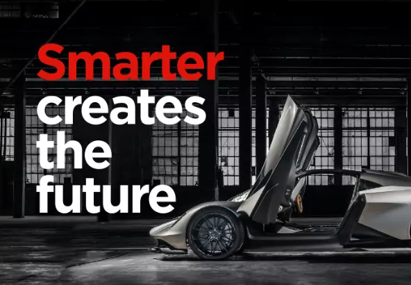
<p class="s10__primary-text">Smarter creates the future</p>

<p class="s10__secondary-text">Push the limits of productivity, creativity, and innovation with Lenovo Workstations.</p>
<cta-button data-embed-class="" data-embed-label="GO BACK TO WORKSTATION" data-embed-media="" data-embed-scheme="blue" data-embed-target="_self" data-embed-type="link" data-embed-url="/node/3278">GO BACK TO WORKSTATION</cta-button></div>