Work From Home, Work From Anywhere: Mobile Workstation Solutions

<style type="text/css">

@media (min-width: 1366px){
.container, .paragraph--type--body-text.narrower-text .field--name-field-body, .paragraph--type--body-text.narrower-text-right .field--name-field-body, .paragraph--type--body-text.narrower-text-center .field--name-field-body, .paragraph--type--body-text.medium-text .field--name-field-body, .paragraph--type--body-text.medium-text-right .field--name-field-body, .paragraph--type--body-text.medium-text-center .field--name-field-body, .page-node-type-category .paragraph--type--body-text.techrev .field--name-field-body, .paragraph--type--articles-infinity-load .views-element-container, #block-japantrademark .field--name-body, .field--name-field-p-content-below>.field--item>.paragraph--type--compound-featured-software-produ .paragraph-content, .container-fluid .field--name-field-page-components>.paragraph--type--compound-featured-software-produ .paragraph-content, .field--name-field-p-content-below>.field--item>.paragraph--type--compound-featured-vertical-tabs, #revlive #block-contentfield-4 .field--name-field-body, #revlive #block-contentfield-5 .field--name-field-body {
width: inherit !important;
}
.paragraph--type--body-text.container-fluid .field--name-field-body {
max-width: none !important
}
}

.component-navbar { position: fixed; padding: 0!important; margin: 0; border: none; z-index: 1000; width: 100%!important; }

.navbar__container { background-color: #000000; }
.navbar__list { list-style-type: none; display: flex; position: relative; left: 100px; }
.navbar__item { display: inline-block; float: left }
.navbar__link, .navbar__link:active, .navbar__link:visited { text-decoration: none; color: #ffffff; font-family: 'Lato', sans-serif; font-weight: 900; font-size: 14px; line-height: 50px; }
.navbar__link:hover, .navbar__link:focus { color: #ff6a00; text-decoration: none; cursor: pointer; }
</style>
<nav class="navbar__container">
<ul class="navbar__list">
<li class="navbar__item"><cta-button data-embed-class="navbar__link" data-embed-label="Back to workstation" data-embed-media="" data-embed-scheme="link" data-embed-target="_self" data-embed-type="link" data-embed-url="/node/3278">&lt; Back to workstation</cta-button></li>
</ul>
</nav>

<style type="text/css">.s1-wrap {width: 100% !important; padding: 120px 0 45px 130px !important}
.s1-text {
width: 768px;
font-family: "Lato";
font-size: 50px !important;
font-weight: 900 !important;
line-height: 110px !important;
color: #ffffff !important;
float: left;
margin: 0 !important;
}
.s1-image {
float: left;
}

.s1-image img {
width: 123px !important;
}
.logo-container {
padding-top: 50px !important;
}
@media (min-width: 320px) and (max-width: 480px) {

.s1-wrap {padding: 57px 0 !important}

.s1-text {
width: 269px !important;
font-family: "Lato";
font-size: 28px !important;
font-weight: 900 !important;
line-height: 33px !important;
float: none;
margin: auto !important;
}
.s1-image {
display: none !important;
}

.logo-container {
width: 269px!important;
margin: auto!important;
padding-top: 30px !important;
}

.logo-item {
width: 60px!important;
margin-right: 18px!important;
}
.logo-item-2 {
width: 58px!important;
}
}
</style>
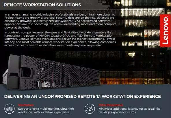
<p class="s1-text">Remote Workstation Solutions</p>

<div class="logo-container" style="width:100%; display: flex;">
<!--
<div class="logo-item" style="width: 95px; margin-right: 42px;">
<drupal-entity data-embed-button="media_entity_embed" data-entity-embed-display="view_mode:media.image_preview" data-entity-embed-display-settings="" data-entity-type="media" data-entity-uuid="4425d472-87fc-42ba-82f4-a0c2d99e0a48" data-langcode="mm-en"></drupal-entity>
</div>
-->

<div class="logo-item-2" style="width: 92px">
<drupal-entity alt="nvidia logo" data-embed-button="media_entity_embed" data-entity-embed-display="view_mode:media.image_preview" data-entity-embed-display-settings="" data-entity-type="media" data-entity-uuid="c5121cd8-9805-42f9-bd0e-573265718990" data-langcode="mm-en"></drupal-entity>
</div>
</div>

<style type="text/css">#smarter { position: absolute; top: -90px; }
.section-2 { background-color: #ffffff; width: 100%; padding-top: 40px!important; padding-bottom: 40px !important; position: relative; }
.section-2__container { max-width: 890px; margin: 0 auto; }
.section-2__heading-primary { font-family: 'Lato', sans-serif !important; color: #000000 !important; font-size: 30px !important; line-height: 36px !important; font-weight: 900 !important; margin-bottom: 16px; margin-top: 0 !important; }
.section-2__paragraph { font-family: 'Lato', sans-serif; color: #000000 !important; font-size: 20px !important; line-height: 25px !important; font-weight: 400 !important; }

@media only screen and (max-width: 600px) {
.section-2 { padding: 40px 20px 30px 20px !important; }
.section-2__heading-primary { font-size: 22px !important; line-height: 24px !important; }
.section-2__paragraph { font-size: 16px !important; line-height: 24px !important; margin-bottom: 0 !important; }
}
</style>
<p id="smarter">&nbsp;</p>

<div class="section-2__container">
<h1 class="section-2__heading-primary text-align-center">Connect your Entire Enterprise</h1>

<p class="section-2__paragraph text-align-center">In this new-normal hybrid working environment, work is what you do, no longer where you go. As a result, employee talent has become more dispersed than ever before, making remote productivity and collaboration a high business priority. Empower your hybrid workforce with a true work from anywhere solution designed for power users. With Lenovo’s best in class remote workstation solutions, users across your organization can stay securely connected, regardless of their workflow, software application or project size.</p>
</div>

<style type="text/css">@import url("https://fonts.googleapis.com/css?family=Lato:700&display=swap&quot;);

.section-06-container {
padding: 0 !important;
position: relative;
}

.section-06 .section-anchor {
position: absolute;
top: -60px;
}

.section-06, .section-06 * {
box-sizing: border-box;
}

.section-06 {
display: flex;
align-items: center;
height: 413px;
}

.section-06 .text-resize {
font-family: 'Lato', sans-serif, Arial, Helvetica !important;
font-size: 44px !important;
font-weight: 700 !important;
line-height: 1.2 !important;
margin: auto;
max-width: calc(100% - 40px);
text-align: center;
width: 100%
}
</style>
<div class="section-06">
<p class="text-resize">Designed for Power Users</p>
</div>

<style type="text/css">#smarter { position: absolute; top: -90px; }
.section-3 { background-color: #000000; width: 100%; padding-top: 40px!important; padding-bottom: 40px !important; position: relative; text-align: center }
.section-3__container { max-width: 1090px; margin: 0 auto; }
.section-3__heading-primary { font-family: 'Lato', sans-serif; color: #ffffff !important; font-size: 24px !important; line-height: 36px !important; font-weight: 900 !important; margin-bottom: 25px; margin-top: 0 !important; }
.section-3__paragraph { font-family: 'Lato', sans-serif; color: #ffffff !important; font-size: 20px !important; line-height: 25px !important; font-weight: 400 !important; margin-bottom: 40px !important; }

@media only screen and (max-width: 600px) {
.section-3 { padding: 40px 20px 30px 20px !important; }
.section-3__heading-primary { font-size: 22px !important; line-height: 24px !important; }
.section-3__paragraph { font-size: 16px !important; line-height: 24px !important; margin-bottom: 0 !important; }
}
</style>
<div class="section-3__container">
<p class="section-3__paragraph text-align-center">Specialized power users in industries such as Architecture, Engineering, Design, Media &amp; Entertainment, and Data Science have workflows that are far more complex than traditional desktop, mobile, or hybrid workers. These workflows demand higher-end compute and graphics capabilities typically only performed by high-powered professional workstations. With project size and complexity in these industries only continuing to grow, these specialized professionals need a solution to fit their unique needs.<br />
<br />
By delivering a solution that is not only easy to deploy and manage, but is also fully secure, Lenovo’s remote workstation solutions enable businesses of all sizes to stay productive, efficient and agile no matter what the future may hold.</p>
<cta-button data-embed-class="" data-embed-label="Learn How" data-embed-media="" data-embed-scheme="red" data-embed-target="_self" data-embed-type="link" data-embed-url="/mm/en/solutions/media/5544/download">Learn How</cta-button></div>

<style type="text/css">#benefit {
position: absolute;
top: -140px;
}

.section-2c {
background-color: #000000;
padding-top: 50px !important;
padding-bottom: 40px !important;
max-width: 1366px;
position: relative;
}

.section-2c__container {
max-width: 321px;
}

.section-2c>div {
position: relative;
}

.heading-primary--orange {
font-family: 'Lato', sans-serif;
color: #E1140A !important;
font-size: 24px !important;
line-height: 26px !important;
font-weight: 700 !important;
}

.heading-secondary--orange {
font-family: 'Lato', sans-serif;
color: #E1140A !important;
font-size: 22px !important;
line-height: 36px !important;
font-weight: 700 !important;
}

.paragraph-primary--white {
font-family: 'Lato', sans-serif;
color: #ffffff;
font-size: 18px !important;
line-height: 20px !important;
font-weight: 400;
}

.paragraph-secondary--white {
font-family: 'Lato', sans-serif;
color: #ffffff;
font-size: 16px !important;
line-height: 18px !important;
font-weight: 400;
}

.u-margin-bottom-small {
margin-bottom: 15px;
}

.section-2c__heading-main {
font-family: 'Lato', sans-serif;
color: #E1140A !important;
font-size: 30px !important;
line-height: 26px !important;
font-weight: 700;
margin: 0 0 50px 0;
display: block;
text-align: center;
}

.section-2c .nav-area .row {
display: flex;
flex-direction: column;
margin-right: 45px !important;
}

.section-2c .nav-area .row li {
text-align: right;
position: relative;
padding: 20px 0 !important;
}

.section-2c .nav-area .row li::after {
content: "";
display: block;
width: 46px;
height: 46px;
background-size: cover;
position: absolute;
top: 50%;
left: 90%;
transform: translate(-50%, -50%);
z-index: 100;
}

.section-2c .nav-area .row li:nth-of-type(1)::after {
background-image: url('/origind8/sites/default/files/2021-09/access-high-performance-w.png');
}

.section-2c .nav-area .row li:nth-of-type(2)::after {
background-image: url('/origind8/sites/default/files/2021-09/gain-ultimate-security-w.png');
}

.section-2c .nav-area .row li:nth-of-type(3)::after {
background-image: url('/origind8/sites/default/files/2021-09/seamless-collab-w.png');
}

.section-2c .nav-area .row li:nth-of-type(4)::after {
background-image: url('/origind8/sites/default/files/2021-09/deploy-with-ease-w.png');
}

.section-2c .nav-area .row li:nth-of-type(1).active::after {
background-image: url('/origind8/sites/default/files/2021-09/access-high-performance-red.png') !important;
}

.section-2c .nav-area .row li:nth-of-type(2).active::after {
background-image: url('/origind8/sites/default/files/2021-09/gain-ultimate-security-red.png') !important;
}

.section-2c .nav-area .row li:nth-of-type(3).active::after {
background-image: url('/origind8/sites/default/files/2021-09/seamless-collab-red.png') !important;
}

.section-2c .nav-area .row li:nth-of-type(4).active::after {
background-image: url('/origind8/sites/default/files/2021-09/deploy-with-ease-red.png') !important;
}

.paragraph--type--vertical-tabs .nav-area li.active a {
color: #E1140A !important;
}

.paragraph--type--vertical-tabs .nav-area li a {
color: #fff !important;
}

.paragraph-terms--white {
font-size: 12px !important;
line-height: 20px !important;
}

.section-2c img {
width: 360px;
margin-left: -45px;
}

.section-2c .vertical-primary-description {
padding-right: 45px !important;
}

.section-2c .nav-area a {
padding-right: 45px;
position: relative;
z-index: 200;
}

@media only screen and (max-width: 991px) {
.section-2c {
padding-top: 25px !important;
min-height: 450px;
}

.section-2c__heading-main {
font-size: 22px !important;
line-height: 24px !important;
margin: 0 0 10px 0;
}

.section-2c__container {
max-width: 100%;
}

.section-2c img {
width: 100%;
margin: 86px 0 0 0;
}

.section-2c .vertical-primary-description {
padding-right: 15px !important;
margin-top: 86px;
}

.section-2c .field:nth-of-type(2) {
position: relative;
}

.section-2c .nav-area {
position: absolute;
top: 0px;
width: 100%;
}

.section-2c .nav-area .row {
flex-direction: row;
justify-content: space-between;
width: 100%;
}

.section-2c .nav-area .row li a {
width: 45px;
height: 45px;
opacity: 0;
z-index: 1;
position: relative;
}

.section-2c .nav-area .row li::after {
transform: translate(-300%, -55%);
z-index: 0;
}
}

@media only screen and (max-width: 767px) {
.section-2c {
min-height: initial;
}

.section-2c .nav-area .row li::after {
transform: translate(-110%, -55%);
z-index: 0;
}

.section-2c .vertical-primary-description {
margin-top: 15px;
}

.section-2c img {
max-width: 400px;
margin: 86px auto 0 auto;
}
}
.section-2c .cta-link, .section-2c .cta-link:active, .section-2c .cta-link:visited { color: #ffffff !important; }
.section-2c .cta-link:hover, .section-2c .cta-link:focus { color: #E1140A !important; cursor: pointer !important; }
</style>
<p id="benefit">&nbsp;</p>

<p>&nbsp;</p>

<p class="section-2c__heading-main">Ultimate Productivity, Collaboration and Security for Complete Peace of Mind</p>

<div class="section-2__container--right">
<drupal-entity data-embed-button="media_entity_embed" data-entity-embed-display="view_mode:media.image_preview" data-entity-embed-display-settings="" data-entity-type="media" data-entity-uuid="9939e6e1-55f4-4f9a-b7b0-4e40bac999d6" data-langcode="mm-en"></drupal-entity>
</div>

<div class="section-2c__container">
<p class="heading-secondary--orange">High Performance</p>

<p class="paragraph-primary--white">&nbsp;</p>

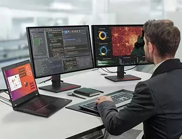
<p class="paragraph-secondary--white u-margin-bottom-small">Lenovo’s turn-key remote workstation solution is designed for power users working remotely. Unlike traditional remote, virtual or mobile workstations, this best-in-class solution delivers the FULL power of Lenovo Workstations to remote or hybrid users; allowing employees to work from any location without compromising productivity and end user experience.</p>
</div>

<div class="section-2__container--right">
<drupal-entity data-embed-button="media_entity_embed" data-entity-embed-display="view_mode:media.image_preview" data-entity-embed-display-settings="" data-entity-type="media" data-entity-uuid="a193d11a-a43a-404b-b64a-615df96a6033" data-langcode="mm-en"></drupal-entity>
</div>

<div class="section-2__container">
<p class="heading-secondary--orange">Secure</p>

<p class="paragraph-primary--white">&nbsp;</p>

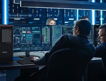
<p class="paragraph-secondary--white u-margin-bottom-small">Secure corporate data and IP with SSL encryption for all network traffic. No data leaves the host workstation; only graphical pixels that are encrypted by 256-AES encryption.</p>
</div>

<div class="section-2__container--right">
<drupal-entity data-embed-button="media_entity_embed" data-entity-embed-display="view_mode:media.image_preview" data-entity-embed-display-settings="" data-entity-type="media" data-entity-uuid="29617d24-c731-4a2f-b372-df3e6e02077f" data-langcode="mm-en"></drupal-entity>
</div>

<div class="section-2__container">
<p class="heading-secondary--orange">Multi-User Collaboration</p>

<p class="paragraph-primary--white">&nbsp;</p>

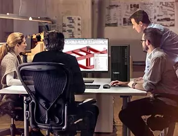
<p class="paragraph-secondary--white u-margin-bottom-small">Seamlessly connect users across the globe for easy collaboration on complex projects, design and creative review sessions, and more.</p>
</div>

<div class="section-2__container--right">
<drupal-entity data-embed-button="media_entity_embed" data-entity-embed-display="view_mode:media.image_preview" data-entity-embed-display-settings="" data-entity-type="media" data-entity-uuid="32389be3-fde3-4e7a-87f4-04a78b56200e" data-langcode="mm-en"></drupal-entity>
</div>

<div class="section-2__container">
<p class="heading-secondary--orange">Out-of-the-Box</p>

<p class="paragraph-primary--white">&nbsp;</p>

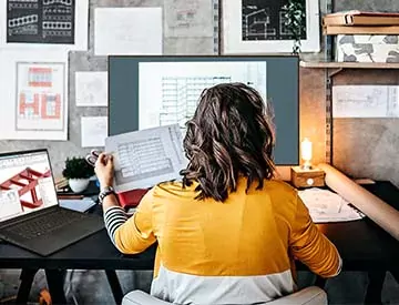
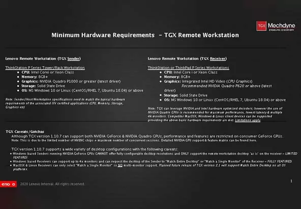
<p class="paragraph-secondary--white u-margin-bottom-small">Combine a highly configurable Lenovo ThinkStation P Series desktop or rack-mounted workstation with TGX Remote Workstation software and your choice of client or end-point device for access to workstation power anytime, anywhere.</p>
</div>

<style type="text/css">#smarter { position: absolute; top: -90px; }
.section-3w { background-color: #ffffff; width: 100%; padding-top: 40px!important; padding-bottom: 40px !important; position: relative; text-align: center }
.section-3w__container { max-width: 1100px; margin: 0 auto; }
.section-3w__heading-primary { font-family: 'Lato', sans-serif; color: #000000 !important; font-size: 24px !important; line-height: 36px !important; font-weight: 900 !important; margin-bottom: 25px; margin-top: 0 !important; }
.section-3w__paragraph { font-family: 'Lato', sans-serif; color: #000000 !important; font-size: 20px !important; line-height: 25px !important; font-weight: 400 !important; margin-bottom: 40px !important; }
.section-3w__paragraph_bullet {
width: calc(50% - 28px);
float:left;
}

@media only screen and (max-width: 600px) {
.section-3w { padding: 40px 20px 30px 20px !important; }
.section-3w__heading-primary { font-size: 22px !important; line-height: 24px !important; }
.section-3w__paragraph { font-size: 16px !important; line-height: 24px !important; margin-bottom: 0 !important; }
}
</style>
<div class="section-3w__container">
<h1 class="section-3w__heading-primary text-align-center">Connecting the Enterprise with TGX Remote Workstation Software</h1>

<p class="section-3w__paragraph text-align-center">TGX is different. Developed by Mechdyne, a visualization company with a background in designing and delivering advanced display and visualization solutions globally, TGX was made with the user in mind. Created for designers, engineers, geoscientists, or any user with a graphic intensive application or a requirement to visualize their data at extreme resolutions, TGX transforms the way you work.</p>

<div class="section-3w__paragraph_bullet">
<p class="section-3w__paragraph text-align-left"><strong>· 4K UHD Support @ 60Hz<br />
· Multi-Monitor Support (Up to 4)<br />
· Low Latency, As Local Experience<br />
· Low Network Bandwidth<br />
· Powerful USB Pass-Through</strong></p>
</div>

<div class="section-3w__paragraph_bullet">
<p class="section-3w__paragraph text-align-left"><strong>· Unique Wacom Tablet Support<br />
· LAN, WAN &amp; 5G Networks Supported<br />
· Enterprise Grade Security with 256bit AES Encryption<br />
· Windows, Linux &amp; MacOS Client Devices Supported<br />
· Fully Scalable from 1-1000+ Users</strong></p>
</div>
<cta-button data-embed-class="" data-embed-label="Test Drive TGX Software" data-embed-media="" data-embed-scheme="red" data-embed-target="_self" data-embed-type="link" data-embed-url="https://www.lenovoremoteworkstations.com/">Test Drive TGX Software</cta-button></div>

<style type="text/css">@import url("https://fonts.googleapis.com/css?family=Lato:400,700&display=swap&quot;);
.section-12-container {
padding: 0 35px 60px !important;
position: relative;
}
.section-12, .section-12 * {
box-sizing: border-box;
}
.section-12 .bg-resize {
display: flex;
flex-flow: row wrap;
justify-content: space-between;
margin: auto !important;
max-width: 1090px !important;
}
.section-12 .bg-resize > div {
margin: 60px 0 0;
width: calc(50% - 38px);
}
.section-12 .text-img-resize {
display: flex;
align-items: center;
margin-bottom: 10px;
}
.section-12 .text-img-resize img {
width: 76px;
height: 76px;
}
.section-12 .text-img-resize p {
margin: 0 0 0 20px;
line-height: 1.5;
}
body.cke_editable .section-12 .text-img-resize > span {
background-color: #222f38 !important;
}
.section-12 .text-resize-1 {
font-family: 'Lato', sans-serif, Arial, Helvetica !important;
font-size: 20px !important;
font-weight: 700 !important;
line-height: 1.2 !important;
margin: 0;
}
.section-12 .text-resize-1 span {
white-space: nowrap;
}
.section-12 .text-resize-2 {
font-family: 'Lato', sans-serif, Arial, Helvetica !important;
font-size: 16px !important;
line-height: 1.38 !important;
margin: 10px 0 0;
}
.section-12 .img-resize {
margin: auto !important;
max-width: 1090px !important;
}
body.cke_editable .section-12 .img-resize {
display: flex;
justify-content: space-between;
}

@media screen and (max-width: 1365px) {
.section-12 .bg-resize > div {
width: 46.38%;
}
}

@media screen and (max-width: 767px) {
.section-12-container {
padding: 20px 20px 60px !important;
}
.section-12 .bg-resize > div {
margin-top: 40px;
width: 100%;
}
.section-12 .text-img-resize {
flex-flow: row wrap;
}
.section-12 .text-img-resize img {
margin: 0 0 20px 0;
}
.section-12 .text-img-resize p {
margin: 0;
width: 100%;
}
}
</style>
<div class="section-12">
<div class="img-resize">
<div class="bg-resize">
<div>
<div class="text-img-resize">
<drupal-entity data-embed-button="media_entity_embed" data-entity-embed-display="view_mode:media.image_preview" data-entity-embed-display-settings="" data-entity-type="media" data-entity-uuid="8ddba7fe-6ff9-4b61-aa61-4eefab14ac82" data-langcode="mm-en"></drupal-entity>

<p class="text-resize-1">Ultra-Responsive</p>
</div>

<p class="text-resize-2">Supremely responsive keyboard and mouse interactions with minimal network bandwidth, typically less than 30% compared to competitor offerings.</p>
<a class="btn btn-cta-button btn-red" href="/mm/en/solutions/media/5544/download" style="margin-top: 20px;" target="_blank">Learn more about TGX Software</a></div>

<div>
<div class="text-img-resize">
<drupal-entity data-embed-button="media_entity_embed" data-entity-embed-display="view_mode:media.image_preview" data-entity-embed-display-settings="" data-entity-type="media" data-entity-uuid="55e5c43b-68b3-44ff-974e-7027b7575388" data-langcode="mm-en"></drupal-entity>

<p class="text-resize-1">Windows or Linux Operating Systems</p>
</div>

<p class="text-resize-2">Full support for Microsoft Windows or Linux operating systems to deliver a diverse set of use cases and user personas, regardless of location or workflow.</p>
<a class="btn btn-cta-button btn-red" href="//www.lenovo.com/linux-workstations&quot; style="margin-top: 20px;" target="_blank">Learn more about Lenovo’s Linux Support</a></div>

<div>
<div class="text-img-resize">
<drupal-entity data-embed-button="media_entity_embed" data-entity-embed-display="view_mode:media.image_preview" data-entity-embed-display-settings="" data-entity-type="media" data-entity-uuid="942d2731-042d-44d2-9c58-5651d42deb3b" data-langcode="mm-en"></drupal-entity>

<p class="text-resize-1">Multi-Monitor</p>
</div>

<p class="text-resize-2">Operate up to four monitors/displays with ease, delivering maximum desktop real-estate and ultimate workflow efficiency.</p>
<a class="btn btn-cta-button btn-red" href="#" style="margin-top: 20px;" target="_blank">Explore Professional Monitors</a></div>

<div>
<div class="text-img-resize">
<drupal-entity data-embed-button="media_entity_embed" data-entity-embed-display="view_mode:media.image_preview" data-entity-embed-display-settings="" data-entity-type="media" data-entity-uuid="ca396292-9e9d-4c36-8f26-53ade1854fdc" data-langcode="mm-en"></drupal-entity>

<p class="text-resize-1">Work Your Way</p>
</div>

<p class="text-resize-2">Set up a workspace that’s as efficient as any cubicle with Lenovo Go’s range of accessories, including wireless mice, headphones with Active Noise Cancelling, power banks, and more.</p>
<a class="btn btn-cta-button btn-red" href="https://www.lenovo.com/us/en/accessories/lenovo-go&quot; style="margin-top: 20px;" target="_blank">Explore Lenovo Go Accessories</a></div>

<div>
<div class="text-img-resize">
<drupal-entity data-embed-button="media_entity_embed" data-entity-embed-display="view_mode:media.image_preview" data-entity-embed-display-settings="" data-entity-type="media" data-entity-uuid="a61370f6-9802-4b5b-884e-8b79674b19a3" data-langcode="mm-en"></drupal-entity>

<p class="text-resize-1">Connect to Ultimate Power</p>
</div>

<p class="text-resize-2">Access the most powerful workstations from anywhere by tapping into the power of our ThinkStation P Series portfolio anytime, anywhere.</p>
<a class="btn btn-cta-button btn-red" href="https://www.lenovo.com/us/en/think-workstations/thinkstation-p-series/c…; style="margin-top: 20px;" target="_blank">Explore ThinkStation P Series</a></div>

<div>
<div class="text-img-resize">
<drupal-entity data-embed-button="media_entity_embed" data-entity-embed-display="view_mode:media.image_preview" data-entity-embed-display-settings="" data-entity-type="media" data-entity-uuid="a35d3772-9f9d-4e80-a5c1-45c12d6bc75c" data-langcode="mm-en"></drupal-entity>

<p class="text-resize-1">Your Choice of Client Device</p>
</div>

<p class="text-resize-2">Choose any of our thin, light and TRUSTWORTHY ThinkPad portfolio, from thin and light laptops to portable, yet powerful mobile workstations. Or for a small and highly compact desktop, check out the world’s smallest desktop PCs.</p>
<a class="btn btn-cta-button btn-red" href="https://www.lenovo.com/us/en/thinkpad&quot; style="margin-top: 20px;" target="_blank">Explore ThinkPad</a> <a class="btn btn-cta-button btn-red" href="https://news.lenovo.com/pressroom/press-releases/new-family-thinkstatio…; style="margin-top: 20px;" target="_blank">Explore ThinkStation P350 Tiny</a> <a class="btn btn-cta-button btn-red" href="https://www.lenovo.com/us/en/desktops-and-all-in-ones/thinkcentre/m-nan…; style="margin-top: 20px;" target="_blank">Explore ThinkCentre Nano</a></div>
</div>
</div>
</div>

<style type="text/css">#workstation { position: absolute; top: -90px; }
.section-7 { padding: 79px 0 0 0 !important; background-color: #f2f2f2; position: relative; }
.section-7__card { display: flex; flex-direction: column; align-items: center; height: 300px; }
.section-7 img { width: 120px }
.section-7__heading { font-size: 20px !important; font-weight: 700; line-height: 24px; max-width: 270px; margin: 20px 0 10px 0 !important; display: inline-block; text-align: center; color: #000 !important; }
.section-7__paragraph { font-size: 16px !important; font-weight: 400; line-height: 20px; max-width: 270px; margin: 0px 0 20px 0 !important; display: inline-block; text-align: center; color: #000 !important; }
.section-7__main-heading { display: block; text-align: center; padding: 0! important; margin: 0 0 42px 0 !important; font-size: 30px !important; line-height: 36px; color: #000 !important; font-weight: 900; }
.section-7__btn { font-size: 15px !important; font-weight: 400; line-height: 15px; margin: auto 0 20px 0 !important; display: inline-block; text-align: center; color: #000 !important; }

@media only screen and (max-width: 600px) {
.section-7 { padding: 35px 0 0 0 !important; }
.section-7 .field { padding: 0 !important; }
.section-7 .row { padding: 0 !important; }
.section-7__main-heading { margin: 0 !important; font-size: 22px !important; line-height: 22px !important; }
.section-7__card { height: 280px !important; }
.section-7 img { width: 90px }
.section-7__btn { margin: 0 !important; }
.section-7 .paragraph--type--body-text { padding-bottom: 0 !important; }
}
</style>
<p class="section-7__main-heading">Enabling Power Users Across Industries</p>

<div class="section-7__card">
<drupal-entity data-embed-button="media_entity_embed" data-entity-embed-display="view_mode:media.image_preview" data-entity-embed-display-settings="" data-entity-type="media" data-entity-uuid="81baa041-6fc2-4936-9881-39fcdc0af31d" data-langcode="mm-en"></drupal-entity>

<p class="section-7__heading">Architecture, Engineering, and Construction (AEC)</p>

<p class="section-7__paragraph"><cta-button data-embed-class="" data-embed-label="LEARN MORE" data-embed-media="" data-embed-scheme="red" data-embed-target="_self" data-embed-type="link" data-embed-url="/node/3375">LEARN MORE</cta-button></p>
</div>

<div class="section-7__card">
<drupal-entity data-embed-button="media_entity_embed" data-entity-embed-display="view_mode:media.image_preview" data-entity-embed-display-settings="" data-entity-type="media" data-entity-uuid="2957b941-991d-440c-9089-7fd32928f504" data-langcode="mm-en"></drupal-entity>

<p class="section-7__heading">Product development</p>

<p class="section-7__paragraph"><cta-button data-embed-class="" data-embed-label="LEARN MORE" data-embed-media="" data-embed-scheme="red" data-embed-target="_self" data-embed-type="link" data-embed-url="/node/3382">LEARN MORE</cta-button></p>
</div>

<div class="section-7__card">
<drupal-entity data-embed-button="media_entity_embed" data-entity-embed-display="view_mode:media.image_preview" data-entity-embed-display-settings="" data-entity-type="media" data-entity-uuid="76dad736-ce18-45a4-b8f1-d9725e9920eb" data-langcode="mm-en"></drupal-entity>

<p class="section-7__heading">Media and&nbsp;entertainment</p>

<p class="section-7__paragraph"><cta-button data-embed-class="" data-embed-label="LEARN MORE" data-embed-media="" data-embed-scheme="red" data-embed-target="_self" data-embed-type="link" data-embed-url="/node/3383">LEARN MORE</cta-button></p>
</div>

<div class="section-7__card">
<drupal-entity data-embed-button="media_entity_embed" data-entity-embed-display="view_mode:media.image_preview" data-entity-embed-display-settings="" data-entity-type="media" data-entity-uuid="28b92b86-27e9-4119-9eb1-bd2af582d2ab" data-langcode="mm-en"></drupal-entity>

<p class="section-7__heading">Data Science</p>

<p class="section-7__paragraph"><cta-button data-embed-class="" data-embed-label="LEARN MORE" data-embed-media="" data-embed-scheme="red" data-embed-target="_self" data-embed-type="link" data-embed-url="/node/3386">LEARN MORE</cta-button></p>
</div>

<style type="text/css">@import url("https://fonts.googleapis.com/css?family=Lato:400,700&display=swap&quot;);

.section-13-container {
background-image: linear-gradient(to bottom, #000000, #292929 28%, #2b2b2b 56%, #000000);
padding: 60px 35px 125px !important;
}

.section-13-container .field--name-field-sub-text {
max-width: 100%;
padding: 0 10px;
}

.section-13-slide, .section-13-slide * {
box-sizing: border-box;
}

.section-13-slide-container {
padding: 0 !important;width:100% !important;
}

.section-13 .bg-resize {
margin: 0 auto 60px;
max-width: 850px;
}

.section-13 .text-resize-1 {
font-family: 'Lato', sans-serif;
font-size: 30px !important;
font-weight: 700;
line-height: 1.2;
margin: 0 !important;
text-align: center;
}

.section-13 .text-resize-1 span {
white-space: nowrap;
}

.section-13-container .text-resize-1 {
color: #ffffff !important;
}

.section-13-slide .btn-gated-resource {
color: #ffffff !important;
font-family: 'Lato', sans-serif, Arial, Helvetica;
font-size: 16px;
font-weight: 700;
outline: none !important;
line-height: 1;
padding: 12px 20px;
}

.section-13-slide .btn-gated-resource::after {
color: inherit !important;
}

.section-13-container .slick-dots {
bottom: -90px !important;
}

.section-13-container.paragraph--type--slide-anything .slick-slide-anything .slick-dots li.slick-active button:before {
width: 14px !important;
height: 14px !important;
background-color: #ffffff !important;
}

.section-13-container.paragraph--type--slide-anything .slick-slide-anything .slick-dots li button:before {
top: 50% !important;
left: 50% !important;
transform: translate(-50%, -50%) !important;
width: 14px !important;
height: 14px !important;
content: '' !important;
background-color: transparent !important;
border: 1px solid #ffffff !important;
border-radius: 50% !important;
text-shadow: none !important;
}

@media screen and (max-width: 767px) {
.section-13-container {
padding: 40px 10px 65px !important;
}

.section-13 .text-resize-1 {
font-size: 24px !important;
line-height: 1.17;
}

.section-13 .bg-resize {
padding: 0 10px;
margin-bottom: 30px;
}
}
</style>
<div class="section-13">
<div class="bg-resize">
<p class="text-resize-1">Smarter Technology <span>in Action</span></p>
</div>
</div>

<style type="text/css">@import url("https://fonts.googleapis.com/css?family=Lato:400,700&display=swap&quot;);

.section-13-slide {
overflow: visible;
margin: 0 auto;
max-width: 296px;
}

.section-13-slide .img-resize img {
display: inline-flex;
margin: 0 auto;
height: 205px;
}

.section-13-slide .text-resize-1 {
font-family: 'Lato', sans-serif, Arial, Helvetica !important;
font-size: 20px !important;
font-weight: 700 !important;
height: auto !important;
line-height: 1.25 !important;
margin: 20px 0 10px;
}

.section-13-slide .text-resize-2 {
font-family: 'Lato', sans-serif, Arial, Helvetica !important;
font-size: 16px !important;
font-weight: normal !important;
height: auto !important;
line-height: 1.25 !important;
margin: 0;
}

.section-13-slide .text-resize-3 {
height: auto !important;
margin: 20px 0 0;
}

@media screen and (max-width: 767px) {

.section-13-slide {
text-align: center;
max-width: 296px;
}

.section-13-slide .img-resize img {
height: 195px;
}
}
</style>
<div class="section-13-slide">
<div class="img-resize">
<drupal-entity data-embed-button="media_entity_embed" data-entity-embed-display="view_mode:media.original_dimension" data-entity-embed-display-settings="" data-entity-type="media" data-entity-uuid="685aa27a-0125-44bf-b5c0-7d1d49dfc929" data-langcode="mm-en"></drupal-entity>
</div>

<p class="text-resize-1">Solution Guide</p>

<p class="text-resize-2">Learn more about the remote workstation solution</p>

<p class="text-resize-3"><cta-button data-embed-class="btn-gated-resource" data-embed-label="LEARN MORE" data-embed-media="" data-embed-scheme="red" data-embed-target="_blank" data-embed-type="link" data-embed-url="/mm/en/solutions/media/5544/download">LEARN MORE </cta-button></p>
</div>

<style type="text/css">@import url("https://fonts.googleapis.com/css?family=Lato:400,700&display=swap&quot;);

.section-13-slide {
overflow: visible;
margin: 0 auto;
max-width: 296px;
}

.section-13-slide .img-resize img {
display: inline-flex;
margin: 0 auto;
height: 205px;
}

.section-13-slide .text-resize-1 {
font-family: 'Lato', sans-serif, Arial, Helvetica !important;
font-size: 20px !important;
font-weight: 700 !important;
height: auto !important;
line-height: 1.25 !important;
margin: 20px 0 10px;
}

.section-13-slide .text-resize-2 {
font-family: 'Lato', sans-serif, Arial, Helvetica !important;
font-size: 16px !important;
font-weight: normal !important;
height: auto !important;
line-height: 1.25 !important;
margin: 0;
}

.section-13-slide .text-resize-3 {
height: auto !important;
margin: 20px 0 0;
}

@media screen and (max-width: 767px) {

.section-13-slide {
text-align: center;
max-width: 296px;
}

.section-13-slide .img-resize img {
height: 195px;
}
}
</style>
<div class="section-13-slide">
<div class="img-resize">
<drupal-entity data-embed-button="media_entity_embed" data-entity-embed-display="view_mode:media.original_dimension" data-entity-embed-display-settings="" data-entity-type="media" data-entity-uuid="ab7f8aa2-d8a2-4408-9fa4-e8e7168ccb7e" data-langcode="mm-en"></drupal-entity>
</div>

<p class="text-resize-1">Case Study</p>

<p class="text-resize-2">See how Horizon implemented remote working</p>

<p class="text-resize-3"><cta-button data-embed-class="btn-gated-resource" data-embed-label="LEARN MORE" data-embed-media="" data-embed-scheme="red" data-embed-target="_blank" data-embed-type="link" data-embed-url="https://www.youtube.com/watch?v=GQRSANa5_co">LEARN MORE </cta-button></p>
</div>

<style type="text/css">@import url("https://fonts.googleapis.com/css?family=Lato:400,700&display=swap&quot;);

.section-13-slide {
overflow: visible;
margin: 0 auto;
max-width: 296px;
}

.section-13-slide .img-resize img {
display: inline-flex;
margin: 0 auto;
height: 205px;
}

.section-13-slide .text-resize-1 {
font-family: 'Lato', sans-serif, Arial, Helvetica !important;
font-size: 20px !important;
font-weight: 700 !important;
height: auto !important;
line-height: 1.25 !important;
margin: 20px 0 10px;
}

.section-13-slide .text-resize-2 {
font-family: 'Lato', sans-serif, Arial, Helvetica !important;
font-size: 16px !important;
font-weight: normal !important;
height: auto !important;
line-height: 1.25 !important;
margin: 0;
}

.section-13-slide .text-resize-3 {
height: auto !important;
margin: 20px 0 0;
}

@media screen and (max-width: 767px) {

.section-13-slide {
text-align: center;
max-width: 296px;
}

.section-13-slide .img-resize img {
height: 195px;
}
}
</style>
<div class="section-13-slide">
<div class="img-resize">
<drupal-entity data-embed-button="media_entity_embed" data-entity-embed-display="view_mode:media.original_dimension" data-entity-embed-display-settings="" data-entity-type="media" data-entity-uuid="f0f0db95-7104-4c26-9fd7-4dd63b8b85b8" data-langcode="mm-en"></drupal-entity>
</div>

<p class="text-resize-1">Configuration Recipe Card</p>

<p class="text-resize-2">Configure your own Remote Workstation solution</p>

<p class="text-resize-3"><cta-button data-embed-class="btn-gated-resource" data-embed-label="LEARN MORE" data-embed-media="" data-embed-scheme="red" data-embed-target="_blank" data-embed-type="link" data-embed-url="/mm/en/solutions/media/13235/download">LEARN MORE </cta-button></p>
</div>

<style type="text/css">

.section-16-container {
padding: 60px 35px !important;
}

.section-16, .section-16 * {
box-sizing: border-box;
}

.section-16 .bg-resize {
display: flex;
flex-flow: column wrap;
justify-content: center;
max-width: 625px;
margin: 0 auto;
text-align: center !important;
}

.section-16 .text-resize-1 {
font-family: 'Lato', sans-serif, Arial, Helvetica !important;
font-size: 30px !important;
font-weight: 900;
line-height: 1.2;
margin: 0;
}

.section-16 .text-resize-2 {
font-family: 'Lato', sans-serif, Arial, Helvetica !important;
font-size: 20px !important;
font-weight: normal;
line-height: 1.25;
margin: 20px 0 30px;
}

.section-16 .text-resize-3 {
margin: 0;
}

.section-16 .btn-gated-resource {
font-size: 16px;
line-height: 1;
font-family: 'Lato', sans-serif, Arial, Helvetica;
font-weight: 700;
padding: 12px 20px;
}

@media screen and (max-width: 767px) {
.section-16-container {
background-position: 76% 50% !important;
padding: 116px 20px 62px !important;
}

.section-16 .bg-resize {
text-align: left !important;
}

.section-16 .text-resize-2 {
font-size: 16px !important;
line-height: 1.2;
margin: 10px 0 20px;
}
}
</style>
<div class="section-16">
<div class="bg-resize">
<p class="text-resize-1">Get in touch</p>

<p class="text-resize-2">For further information on how Lenovo Professional VR/XR solutions can transform your workflow, or to test drive one of these best in class Virtual &amp; Mixed Reality solutions, please click below.&nbsp;</p>

<p class="text-resize-3"><gated-resource data-embed-button-icon="" data-embed-form="3647" data-embed-label="GET IN TOUCH" data-embed-media="" data-embed-scheme="red" data-embed-target="" data-embed-type="form" data-embed-url="">GET IN TOUCH</gated-resource></p>
</div>
</div>

<style type="text/css">

.s10-wrap { position: relative; height:500px; width: 100% !important }
.s10__container { width: 544px; position: absolute; top: 150px; left: 90px; }
.s10__primary-text { font-family: 'Lato', sans-serif; font-weight: 900; font-size: 41px !important; line-height: 41px !important; color: #ffffff !important; }
.s10__secondary-text { font-family: 'Lato', sans-serif; font-weight: 400; font-size: 22px !important; line-height: 26px !important; color: #ffffff !important; }

@media screen and (max-width: 600px) {
.s10-wrap { height: 350px !important; font-size: 16px !important }
.s10__container { width: 223px; position: absolute; top: 49px; left: 25px; }
.s10__primary-text { font-size: 28px !important; line-height: 28px; }
.s10__secondary-text { font-size: 16px !important; line-height: 18px; }
.s10-wrap .btn-orange {
width: 270px !important;
}
}
</style>
<div class="s10__container">
<p class="s10__primary-text">Smarter creates the future</p>

<p class="s10__secondary-text">Push the limits of productivity, creativity, and innovation with Lenovo Workstations.</p>
<cta-button data-embed-class="" data-embed-label="GO BACK TO WORKSTATION" data-embed-media="" data-embed-scheme="red" data-embed-target="_self" data-embed-type="link" data-embed-url="/node/3278">GO BACK TO WORKSTATION</cta-button></div>