<style type="text/css">
.sec-nav-container {
position: fixed;
padding: 0 !important;
z-index: 1000;
width: 100%;
transform: translateY(-100%);
background-color: #000000;
}
.sec-nav-container .field--name-field-body {
max-width: none !important;
}
.sec-nav, .sec-nav * {
box-sizing: border-box;
}
.sec-nav {
height: 60px;
background-color: #000000;
display: flex;
align-items: center;
}
.sec-nav-container + * {
margin-top: 60px;
}
.sec-nav .cont {
margin: 0 auto;
padding: 0 10px;
max-width: 1320px;
width: 100%;
}
.sec-nav .ctabtn {
display: inline-block;
color: #ffffff;
}
.sec-nav .ctabtn a {
font-family: 'Lato', sans-serif, Arial, Helvetica !important;
font-size: 14px !important;
line-height: 1 !important;
color: #ffffff !important;
font-weight: 900;
background-color: transparent !important;
border: 1px solid transparent !important;
padding: 10px;
}
.sec-nav .ctabtn a:after {
content: none;
}
@media screen and (min-width: 950px) {
.sec-nav .cont {
padding: 0 30px;
}
}
</style>
<div class="sec-nav">
<div class="cont">
<div class="ctabtn"><cta-button data-embed-class="" data-embed-label="< Back to Smart Collaboration" data-embed-media="" data-embed-scheme="blue" data-embed-target="" data-embed-type="link" data-embed-url="/node/2947/">< Back to Smart Collaboration</cta-button></div>
</div>
</div>
<style type="text/css">
.sec-01-container {
padding: 0 !important;
background-image: linear-gradient(to right, #101010, #2E3033);
}
.sec-01-container .field--name-field-body {
max-width: none !important;
}
.sec-01-container .sec-01 {
background-color: transparent;
}
.sec-01, .sec-01 * {
box-sizing: border-box;
}
.sec-01 {
background-color: #505050;
}
.sec-01 .cont {
padding: 40px 20px 60px;
}
.sec-01 .rw {
display: flex;
flex-wrap: wrap;
align-items: center;
}
.sec-01 .col {
width: 100%;
}
.sec-01 h2 {
font-family: 'Lato', sans-serif, Arial, Helvetica !important;
font-size: 36px !important;
line-height: 1.22 !important;
font-weight: 800;
color: #46c8e1 !important;
margin: 0 0 18px;
}
.sec-01 h3 {
font-family: 'Lato', sans-serif, Arial, Helvetica !important;
font-size: 20px !important;
line-height: 1.2 !important;
font-weight: 700;
color: #ffffff !important;
margin: 0 0 30px;
}
.sec-01 .img-wrap1 img {
display: block;
width: 100%;
}
.sec-01 .img-wrap2 img {
display: block;
width: 219px;
margin: 41px auto 0 0;
}
@media screen and (min-width: 950px) {
.sec-01 .cont {
padding: 22px 40px 41px;
margin: 0 auto;
max-width: 1240px;
}
.sec-01 .col.txt {
width: 42%;
}
.sec-01 .col.img {
width: 58%;
}
.sec-01 h2 {
font-size: 47px !important;
line-height: 1.21 !important;
margin: 52px 0 32px;
}
.sec-01 h3 {
font-size: 24px !important;
line-height: 1.22 !important;
color: #e3e3e3 !important;
margin-bottom: 49px;
}
.sec-01 .img-wrap2 img {
display: block;
width: 219px;
margin: 13px 0 0 auto;
}
}
@media screen and (min-width: 1090px) {
.sec-01 h2 {
font-size: 55px !important;
}
}
@media screen and (min-width: 1360px) {
.sec-01 h2 {
font-size: 66px !important;
}
.sec-01 .rw {
margin-right: -60px;
}
.sec-01 .img-wrap2 img {
margin-right: 50px;
}
}
</style>
<div class="sec-01">
<div class="cont">
<div class="rw">
<div class="col txt">
<h2>Smarter rethinks collaboration</h2>
<h3>ThinkSmart for Google Meet</h3>
</div>
<div class="col img">
<div class="img-wrap1">
<drupal-entity data-embed-button="media_entity_embed" data-entity-embed-display="view_mode:media.original_dimension" data-entity-embed-display-settings="" data-entity-type="media" data-entity-uuid="cecd42e2-e6bb-45b7-b9d2-fe5a22f18ad3" data-langcode="ww-en"></drupal-entity>
</div>
<div class="img-wrap2">
<drupal-entity data-embed-button="media_entity_embed" data-entity-embed-display="view_mode:media.original_dimension" data-entity-embed-display-settings="" data-entity-type="media" data-entity-uuid="dff53193-9297-4314-ae1a-8c8a410de5b2" data-langcode="ww-en"></drupal-entity>
</div>
</div>
</div>
</div>
</div>
<style type="text/css">
.sec-02-container {
padding: 0 !important;
background-color: #ffffff;
}
.sec-02-container .field--name-field-body {
max-width: none !important;
}
.sec-02, .sec-02 * {
box-sizing: border-box;
}
.sec-02 .cont {
padding: 40px 20px 60px;
}
.sec-02 h2 {
font-family: 'Lato', sans-serif, Arial, Helvetica !important;
font-size: 30px !important;
line-height: 1.2 !important;
font-weight: 700;
color: #000000 !important;
margin: 0 0 10px;
}
.sec-02 h3 {
font-family: 'Lato', sans-serif, Arial, Helvetica !important;
font-size: 20px !important;
line-height: 1.2 !important;
font-weight: 400;
color: #000000 !important;
margin: 0 0 20px;
}
.sec-02 p {
font-family: 'Lato', sans-serif, Arial, Helvetica !important;
font-size: 16px !important;
line-height: 1.38 !important;
font-weight: 400;
color: #000000 !important;
margin: 20px 0 0;
}
.sec-02 .bg-wrap {
height: 100%;
width: 100%;
position: relative;
}
.sec-02 .bg-wrap div {
height: 100%;
}
.sec-02 .bg-wrap img {
object-fit: cover;
display: block;
height: 100%;
width: 100%;
}
.sec-02 .ctabtn {
display: inline-block;
}
.sec-02 .ctabtn a {
font-family: 'Lato', sans-serif, Arial, Helvetica !important;
font-weight: 700;
padding: 9px 14px 9px 19px;
margin: 20px 0 0;
}
@media screen and (min-width: 950px) {
.sec-02 .cont {
padding: 60px 20px 80px;
max-width: 1240px;
margin: 0 auto;
position: relative;
}
.sec-02 .txt-wrap {
width: 50%;
padding: 0 20px;
}
.sec-02 .bg-wrap {
width: 50%;
position: absolute;
right: 0;
top: 50%;
transform: translateY(-50%);
padding: 60px 40px 80px 20px;
}
.sec-02 h2 {
font-size: 41px !important;
line-height: 1.05 !important;
}
.sec-02 h3 {
font-size: 30px !important;
}
}
</style>
<div class="sec-02">
<div class="cont">
<div class="txt-wrap">
<h2>Collaboration starts with Google Meet</h2>
<h3>Purpose-built technology for Google’s leading communication platform</h3>
<div class="bg-wrap">
<drupal-entity data-embed-button="media_entity_embed" data-entity-embed-display="view_mode:media.original_dimension" data-entity-embed-display-settings="" data-entity-type="media" data-entity-uuid="0a0f8ba8-9109-4e5f-a29c-e48ab6934c00" data-langcode="ww-en"></drupal-entity>
</div>
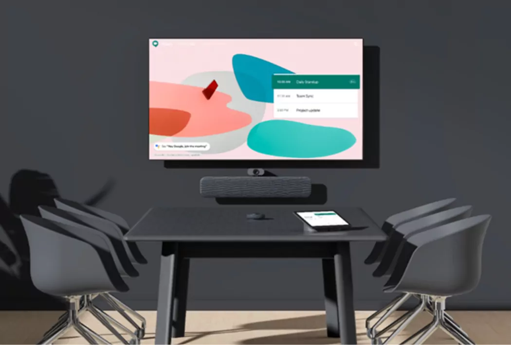
<p>Global organizations rely on Google Workspace and Google Meet to keep their employees communicating and collaborating effectively. Lenovo and Google offer a range of turnkey solutions that makes deploying hybrid workspaces fast, easy, and cost-efficient.</p>
<div class="ctabtn"><cta-button data-embed-class="" data-embed-label="Explore the room kits" data-embed-media="" data-embed-scheme="red" data-embed-target="_blank" data-embed-type="link" data-embed-url="https://www.lenovo.com/us/en/virtual-reality-and-smart-devices/smart-of… the room kits</cta-button></div>
</div>
</div>
</div>
<style type="text/css">
.sec-03-container {
padding: 0 !important;
}
.sec-03-container .field--name-field-body {
max-width: none !important;
}
.sec-03-container .sec-03 {
background-color: transparent;
}
.sec-03, .sec-03 * {
box-sizing: border-box;
}
.sec-03 {
background-color: #505050;
}
.sec-03 .cont {
padding: 40px 20px 60px;
}
.sec-03 h2 {
font-family: 'Lato', sans-serif, Arial, Helvetica !important;
font-size: 30px !important;
line-height: 1.2 !important;
font-weight: 700;
color: #46c8e1 !important;
margin: 0 0 10px;
}
.sec-03 h3 {
font-family: 'Lato', sans-serif, Arial, Helvetica !important;
font-size: 20px !important;
line-height: 1.2 !important;
font-weight: 400;
color: #ffffff !important;
margin: 0 0 30px;
}
.sec-03 p {
font-family: 'Lato', sans-serif, Arial, Helvetica !important;
font-size: 16px !important;
line-height: 1.38 !important;
font-weight: 400;
color: #ffffff !important;
margin: 30px 0 10px;
}
.sec-03 .bg-wrap {
height: 100%;
width: 100%;
position: relative;
}
.sec-03 .bg-wrap div {
height: 100%;
}
.sec-03 .bg-wrap img {
object-fit: cover;
display: block;
height: 100%;
width: 100%;
}
.sec-03 .ctabtn {
display: inline-block;
margin-right: 30px;
}
.sec-03 .ctabtn a {
font-family: 'Lato', sans-serif, Arial, Helvetica !important;
font-weight: 700;
padding: 0;
margin: 20px 0 0;
background-color: transparent;
border: 1px solid transparent;
}
@media screen and (min-width: 950px) {
.sec-03 .cont {
padding: 60px 20px 80px;
max-width: 1240px;
margin: 0 auto;
position: relative;
}
.sec-03 .txt-wrap {
width: 50%;
padding: 0 20px;
margin: 0 0 0 auto;
}
.sec-03 .bg-wrap {
width: 50%;
position: absolute;
left: 0;
top: 50%;
transform: translateY(-50%);
padding: 60px 20px 80px 40px;
}
.sec-03 h2 {
font-size: 41px !important;
line-height: 1.17 !important;
}
.sec-03 h3 {
margin-bottom: 20px;
}
.sec-03 p {
margin-top: 20px;
margin-bottom: 0;
}
}
</style>
<div class="sec-03">
<div class="cont">
<div class="txt-wrap">
<h2>Google Meet Series One Room Kits from Lenovo</h2>
<h3>Best-in-class technology to outfit any space</h3>
<div class="bg-wrap"><a class="use-ajax link link-gated-resource clicked" data-dialog-options="{"width":"600","dialogClass":""}" data-dialog-type="modal" data-modal-width="600px" href="/ww/en/solutions/media/9770">
<drupal-entity data-embed-button="media_entity_embed" data-entity-embed-display="view_mode:media.original_dimension" data-entity-embed-display-settings="" data-entity-type="media" data-entity-uuid="196884a3-787e-4cfe-ad98-c309c3e095b2" data-langcode="ww-en"></drupal-entity>
</a></div>
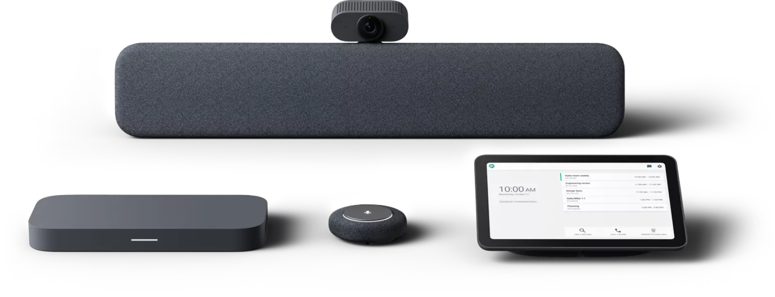
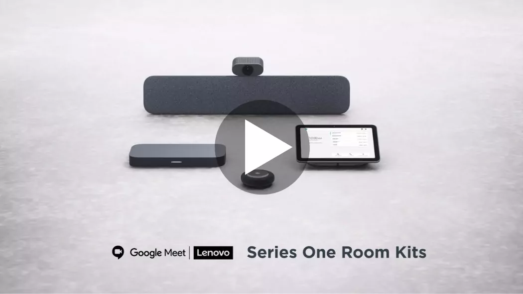
<p>Transform small, medium and large rooms with our range of turnkey solutions, specially designed to enhance collaboration using the Google Meet platform. Enterprise-grade components make these kits the first of their kind to carry the Series One designation.</p>
<div class="ctabtn"><cta-button data-embed-class="" data-embed-label="Shop Series One room kits" data-embed-media="" data-embed-scheme="red" data-embed-target="_blank" data-embed-type="link" data-embed-url="https://www.lenovo.com/us/en/virtual-reality-and-smart-devices/smart-of… Series One room kits</cta-button></div>
<div class="ctabtn"><cta-button data-embed-class="" data-embed-label="Download datasheet" data-embed-media="9771" data-embed-scheme="red" data-embed-target="" data-embed-type="media" data-embed-url="">Download datasheet</cta-button></div>
</div>
</div>
</div>
<style type="text/css">
.sec-04-container {
padding: 0 !important;
}
.sec-04-container .field--name-field-body {
max-width: none !important;
}
.sec-04-container .sec-04 {
background-color: transparent;
}
.sec-04, .sec-04 * {
box-sizing: border-box;
}
.sec-04 {
background-color: #505050;
}
.sec-04 .cont {
padding: 10% 20px 0;
position: absolute;
right: 0;
top: 0;
left: 0;
}
.sec-04 .rw {
display: flex;
flex-wrap: wrap;
}
.sec-04 .col {
width: 100%;
position: relative;
min-height: 410px;
}
.sec-04 h2 {
font-family: 'Lato', sans-serif, Arial, Helvetica !important;
font-size: 30px !important;
line-height: 1.2 !important;
font-weight: 700;
color: #46c8e1 !important;
margin: 0 0 20px;
}
.sec-04 p {
font-family: 'Lato', sans-serif, Arial, Helvetica !important;
font-size: 16px !important;
line-height: 1.38 !important;
font-weight: 400;
color: #ffffff !important;
margin: 0 0 20px;
}
.sec-04 .bg-wrap {
height: 100%;
width: 100%;
position: relative;
}
.sec-04 .bg-wrap div {
height: 100%;
}
.sec-04 .bg-wrap img {
object-fit: cover;
display: block;
height: 100%;
width: 100%;
}
.sec-04 .ctabtn {
display: inline-block;
}
.sec-04 .ctabtn a {
font-family: 'Lato', sans-serif, Arial, Helvetica !important;
font-weight: 700;
padding: 9px 14px 9px 19px;
margin: 0;
}
@media screen and (min-width: 360px) {
.sec-04 .col {
min-height: 380px;
}
}
@media screen and (min-width: 768px) {
.sec-04 .cont {
padding: 10% 6.5% 0;
}
.sec-04 .col {
width: 50%;
min-height: 430px;
}
.sec-04 h2 {
font-size: 41px !important;
line-height: 1.05 !important;
}
}
@media screen and (min-width: 950px) {
.sec-04 .cont {
padding: 10% 40px 0;
}
.sec-04 .col {
min-height: 410px;
}
}
@media screen and (min-width: 1360px) {
.sec-04 .cont {
padding: 0 15%;
top: 47%;
transform: translateY(-50%);
}
}
@media screen and (min-width: 1500px) {
.sec-04 .cont {
padding: 0 19%;
}
}
</style>
<div class="sec-04">
<div class="rw">
<div class="col">
<div class="bg-wrap">
<drupal-entity data-embed-button="media_entity_embed" data-entity-embed-display="view_mode:media.original_dimension" data-entity-embed-display-settings="" data-entity-type="media" data-entity-uuid="eaf54f54-058d-4a01-a5e7-9a774c0e42f2" data-langcode="ww-en"></drupal-entity>
</div>
<div class="cont">
<h2>See more<br />
collaboration solutions</h2>
<p>Making sure that teams can stay connected in a hybrid working environment is vital for success in the modern workplace. Find out more about how our Smart Collaboration portfolio can enhance your productivity and workflow efficiency.</p>
<div class="ctabtn"><cta-button data-embed-class="" data-embed-label="Explore Smart Collaboration" data-embed-media="" data-embed-scheme="red" data-embed-target="" data-embed-type="link" data-embed-url="/node/2947">Explore Smart Collaboration</cta-button></div>
</div>
</div>
<div class="col">
<div class="bg-wrap">
<drupal-entity data-embed-button="media_entity_embed" data-entity-embed-display="view_mode:media.original_dimension" data-entity-embed-display-settings="" data-entity-type="media" data-entity-uuid="2f0ac6ad-3a42-4884-a160-a095abc1eae6" data-langcode="ww-en"></drupal-entity>
</div>
<div class="cont">
<h2>Have a sales rep<br />
contact you</h2>
<p>Find out how Lenovo ThinkSmart solutions with Google Meet can break down communication barriers between workers, no matter where work is getting done.</p>
<div class="ctabtn"><gated-resource data-embed-button-icon="" data-embed-form="4827" data-embed-label="Get in touch" data-embed-media="" data-embed-scheme="red" data-embed-target="" data-embed-type="form" data-embed-url="">Get in touch</gated-resource></div>
</div>
</div>
</div>
</div>