Workstations - ProVR

<style type="text/css">

.component-navbar {
position: fixed;
padding: 0 !important;
margin: 0;
border: none;
z-index: 1000;
width: 100% !important;
height: 60px; /* the same height is used lower */
transform: translateY(-100%);
background-color: #000000;
}

article.is-unpublished .component-navbar {
/*position: absolute;*/
}

.component-navbar + * {
margin-top: 60px; /* same height */
}

.navbar__container {
background-color: #000000;
}

.navbar__list {
box-sizing: border-box;
display: flex;
justify-content: space-between;
list-style-type: none;
margin: 0 auto;
max-width: 1090px;
padding: 0 20px;
width: 100%;
}

.navbar__link, .navbar__link:active, .navbar__link:visited {
text-decoration: none;
color: #ffffff;
font-family: 'Lato', sans-serif;
font-weight: 900;
font-size: 14px;
line-height: 60px; /* same height */
}

.navbar__link:hover {
color: #ff6a00;
text-decoration: none;
cursor: pointer;
}

@media screen and (max-width: 767px) {
.component-navbar {
display: none !important;
}

.component-navbar + * {
margin-top: 0;
}
}
</style>
<nav class="navbar__container">
<ul class="navbar__list">
<li class="navbar__item"><a class="navbar__link" href="#pro-vr-design-and-engineering">Design &amp; Engineering</a></li>
<li class="navbar__item"><a class="navbar__link" href="#pro-vr-training-and-simulation">Training &amp; Simulation</a></li>
<li class="navbar__item"><a class="navbar__link" href="#pro-vr-medical-and-healthcare">Medical &amp; Healthcare</a></li>
</ul>
</nav>

<style type="text/css">

.header { position: relative; height:500px }
.header__container { width: 644px; position: absolute; top: 80px; left: 90px; }
.header__primary-text { font-family: 'Lato', sans-serif; font-weight: 900; font-size: 50px !important; line-height: 50px; color: #ffffff !important; }
.header__secondary-text { font-family: 'Lato', sans-serif; font-weight: 400; font-size: 28px !important; line-height: 32px; color: #ffffff !important; }
.dispy { display: inline-block !important }
.dispy img { width: 100px !important; margin-right: 40px !important }

@media screen and (max-width: 600px) {
.header { height: 420px !important; }
.header__container { width: 223px; position: absolute; top: 49px; left: 25px; }
.header__primary-text { font-size: 28px !important; line-height: 28px; }
.header__secondary-text { font-size: 16px !important; line-height: 18px; }
.dispy img { width: 70px !important; margin-right: 20px !important }
.header__container .row { width: 320px !important }
}
</style>
<div class="header__container">
<p class="header__primary-text">Explore Photorealistic Virtual and Mixed Reality</p>

<p class="header__secondary-text">Professional VR &amp; XR<br />
powered by Lenovo Workstations</p>
&nbsp;

<div class="row">
<!--
<div class="dispy"><img alt="logo-intel@2x" class="img-responsive" src="/origind8/sites/default/files/styles/original/public/2021-07/Intel%20Logo%20-%20V3.png?itok=QxjtPzE0" typeof="foaf:Image" /></div>
-->
<div class="dispy">
<drupal-entity data-embed-button="media_entity_embed" data-entity-embed-display="entity_reference:media_thumbnail" data-entity-embed-display-settings="{&quot;image_style&quot;:&quot;thumbnail&quot;,&quot;image_link&quot;:&quot;&quot;}" data-entity-type="media" data-entity-uuid="fdd8a76a-4207-4d8d-8b63-5aa4323f047d" data-langcode="ww-en"></drupal-entity>
</div>
</div>
</div>

<style type="text/css">@import url("https://fonts.googleapis.com/css?family=Lato:400,700&display=swap&quot;);

.section-02-container {
padding: 60px 35px 70px !important;
background-color: #ffffff;
}

.section-02, .section-02 * {
box-sizing: border-box;
}

.section-02 .bg-resize {
margin: auto !important;
max-width: 966px !important;
text-align: center !important;
}

.section-02 .text-resize-1 {
color: #6AC346 !important;
font-family: 'Lato', sans-serif, Arial, Helvetica !important;
font-size: 30px !important;
font-weight: 700 !important;
line-height: 1.2 !important;
margin: 0;
}

.section-02 .text-resize-2 {
color: #000000 !important;
font-family: 'Lato', sans-serif, Arial, Helvetica !important;
font-size: 20px !important;
line-height: 1.2 !important;
margin: 18px 0 0;
}

@media screen and (max-width: 767px) {
.section-02-container {
padding: 40px 20px 30px !important;
}

.section-02 .bg-resize {
text-align: left !important;
}

.section-02 .text-resize-1 {
font-size: 24px !important;
line-height: 1.17 !important;
}

.section-02 .text-resize-2 {
margin: 10px 0 0;
}
}
</style>
<div class="section-02">
<div class="bg-resize">
<p class="text-resize-1">Bring your Visions to Life Faster than Ever</p>

<p class="text-resize-2">Our end-to-end, enterprise-class solution focuses on providing immersive virtual and mixed reality experiences with the highest visual quality. Drive forward advancements in product design, manufacturing, training, medical and research projects with faster, safer or more cost-effective ways to complete projects.</p>
</div>
</div>

<style type="text/css">@import url("https://fonts.googleapis.com/css?family=Lato:400,700&display=swap&quot;);

.section-03-container {
background-color: #f5f5f5 !important;
background-position: calc(50% + 341px) center !important;
background-size: auto 100% !important;
padding: 75px 35px !important;
}

.section-03, .section-03 * {
box-sizing: border-box;
}

.section-03 .bg-resize {
display: flex;
align-items: center;
margin: 0 auto;
max-width: 1090px;
}

.section-03 .text-container {
width: 50%;
padding: 0 7.34% 0 0;
text-align: left;
}

.section-03 .text-resize-1 {
color: #000000 !important;
font-family: 'Lato', sans-serif, Arial, Helvetica !important;
font-size: 16px !important;
font-weight: 700 !important;
line-height: 1.2 !important;
margin: 0;
}

.section-03 .text-resize-2 {
color: #000000 !important;
font-family: 'Lato', sans-serif, Arial, Helvetica !important;
font-weight: normal !important;
font-size: 16px !important;
line-height: 1.2 !important;
margin: 21px 0 30px;
}

.section-03 .text-resize-3 {
margin: 0;
}

.section-03 .btn-gated-resource {
font-family: 'Lato', sans-serif, Arial, Helvetica;
font-size: 16px;
font-weight: 700;
line-height: 1;
padding: 12px 20px;
}

@media screen and (max-width: 767px) {

.section-03-container {
background-color: #f5f5f5 !important;
background-position: center bottom !important;
background-size: 100% auto !important;
padding: 40px 20px 55.06% !important;
}

.section-03 .bg-resize {
flex-direction: column;
padding: 0;
}

.section-03 .text-container {
flex: none;
padding: 0 0 30px;
width: 100%;
}
}
</style>
<div class="section-03">
<div class="bg-resize">
<div class="text-container">
<p class="text-resize-1">Unlike consumer-focused VR experiences which concentrate on VR content consumption, Pro VR focuses on content creation.</p>

<p class="text-resize-2">It offers further technology enhancements that include real-time hand and eye tracking, ultra-low-latency video pass-through (for XR experiences) and a significantly improved visual experience (higher resolution, wider field of view, increased pixel degree density and more).</p>

<div class="text-resize-3"><cta-button data-embed-class="btn-gated-resource" data-embed-label="LEARN MORE" data-embed-media="" data-embed-scheme="green" data-embed-target="_blank" data-embed-type="link" data-embed-url="https://news.lenovo.com/transforming-the-way-professionals-invent-desig… MORE </cta-button></div>
</div>
</div>
</div>

<style type="text/css">

.section-04-container {
background-color: #000000;
background-position: center !important;
background-size: auto 100% !important;
padding: 60px 35px 70px !important;
}

.section-04, .section-04 * {
box-sizing: border-box;
}

body.cke_editable .logo-resize-container {
background-color: #000000;
}

.section-04 .bg-resize {
display: flex;
flex-flow: column wrap;
justify-content: center;
max-width: 1090px;
margin: 0 auto;
}

.section-04 .text-resize-1 {
font-family: 'Lato', sans-serif, Arial, Helvetica !important;
font-size: 30px !important;
font-weight: 700;
line-height: 1.2;
margin: 30px 0 18px;
max-width: 800px;
}

.section-04 .text-resize-2 {
font-family: 'Lato', sans-serif, Arial, Helvetica !important;
font-size: 16px !important;
line-height: 1.2;
margin: 0 0 30px;
max-width: 768px;
}

.section-04 .text-resize-3 a {
margin-right: 54px;
}

.section-04 .btn-gated-resource {
font-family: 'Lato', sans-serif, Arial, Helvetica;
font-size: 16px;
font-weight: 700;
line-height: 1;
padding: 12px 20px;
}

.section-04 .logo-resize-container {
display: flex;
flex-flow: row wrap;
justify-content: flex-start;
align-items: center;
}

.section-04 .logo-resize-container img {
width: 100%;
}

.section-04 .logo-resize-1 {
width: 123px !important;
margin-right: 30px;
}

.section-04 .logo-resize-2 {
width: 90px !important;
margin-right: 30px;
}

.section-04 .logo-resize-3 {
width: 120px !important;
}

@media screen and (max-width: 1099px) {
.section-04-container {
background-position: 70% center !important;
}

.section-04 .text-resize-1 {
max-width: 420px;
}

.section-04 .text-resize-2 {
max-width: 400px;
}
}

@media screen and (max-width: 767px) {
.section-04-container {
background-position: 78% bottom !important;
background-size: 500% auto !important;
padding: 40px 20px 94.17% !important;
}

.section-04 .logo-resize-container img {
margin-bottom: 40px;
}

.section-04 .text-resize-1 {
font-size: 24px !important;
line-height: 1.17;
margin-top: 0;
max-width: 100%;
}

.section-04 .text-resize-2 {
margin-bottom: 0;
max-width: 100%;
}

.section-04 .text-resize-3 a {
margin-top: 30px;
}
}
</style>
<div class="section-04">
<div class="bg-resize">

<p class="text-resize-1">Work in Astonishing Detail with Simple VR &amp; XR Solutions</p>

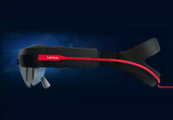
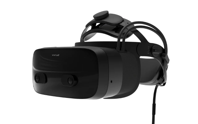
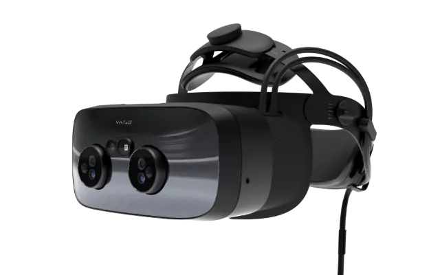
<p class="text-resize-2">Lenovo works closely with Varjo Technologies, developers of the world’s most advanced VR &amp; XR headsets. These devices deliver best in class VR &amp; XR experiences with high quality visuals at never-before-seen human eye resolution (71pdd). These are available as part of our complete end-to-end Enterprise Class ProVR/XR solution. See our blog for more detail.</p>

<div class="text-resize-3"><cta-button data-embed-class="btn-gated-resource" data-embed-label="READ BLOG" data-embed-media="" data-embed-scheme="green" data-embed-target="_blank" data-embed-type="link" data-embed-url="https://news.lenovo.com/transforming-the-way-professionals-invent-desig… BLOG </cta-button></div>
</div>
</div>

<style type="text/css">@import url("https://fonts.googleapis.com/css?family=Lato:400,700&display=swap&quot;);

.section-05-container {
padding: 60px 35px 80px !important;
position: relative
}

.section-05, .section-05 * {
box-sizing: border-box;
}

.section-05 .bg-resize-1 {
margin: 0 auto !important;
max-width: 768px !important;
text-align: center !important;
}

.section-05 .text-resize-1 {
font-family: 'Lato', sans-serif, Arial, Helvetica !important;
font-size: 30px !important;
font-weight: 700 !important;
line-height: 1.2 !important;
margin: 0;
}

.section-05 .text-resize-2 {
font-family: 'Lato', sans-serif, Arial, Helvetica !important;
font-size: 20px !important;
line-height: 1.2 !important;
margin: 20px 0 0;
}

.section-05 .text-resize-3 {
font-family: 'Lato', sans-serif, Arial, Helvetica !important;
font-size: 16px !important;
line-height: 1.2 !important;
margin: 20px 0 0;
}

.section-05 .bg-resize-2 {
align-items: center;
display: flex;
margin: 0 auto;
max-width: 1090px;
padding: 60px 0 0;
}

.section-05 .text-container {
flex: 1 0 53.94%;
padding: 0 7.34% 0 0;
text-align: left;
}

.section-05 .video-container {
width: 100%;
}

.section-05 .video-container img {
max-width: 100%;
}

.section-05 .video-link {
padding: 0;
display: block;
position: relative;
}

.section-05 .video-link span.icon {
margin-left: 0;
position: absolute;
top: 47.5%;
left: 48.5%;
transform: translate(-50%, -50%);
}

.section-05 .video-link::after {
display: none;
}

@media screen and (max-width: 767px) {
.section-05-container {
padding: 40px 20px 60px !important;
background-position: 80% center !important;
}

.section-05 .bg-resize-1 {
text-align: left !important;
}

.section-05 .bg-resize-2 {
padding: 30px 0 0;
flex-direction: column;
}

.section-05 .text-container {
width: 100%;
flex: none;
padding: 0 0 30px;
}

.section-05 .text-resize-1 {
font-size: 24px !important;
line-height: 1.17 !important;
}

.section-05 .text-resize-2 {
font-size: 16px !important;
}
}
</style>
<div class="section-05">
<div class="bg-resize-1">
<p class="text-resize-1">ProVR – Vertical Solutions</p>

<p class="text-resize-2">Modern digital workflow transformations – including the move to more augmented (AR) and virtual reality (VR) project processes – can drive down costs and save time for companies across a variety of industries.</p>
</div>

<div class="bg-resize-2">
<div class="text-container">
<p class="text-resize-1">Lenovo Workstations for Professional VR &amp; Professional XR</p>

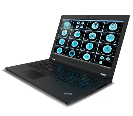
<p class="text-resize-3">Professional AR and VR workflows are exceptionally demanding. Our specialist workstations are designed and engineered from the ground up not just to meet, but to exceed those performance requirements. Whether your work focuses on VR content creation or you need a solution to deliver faultless VR consumption, the Lenovo ThinkStation &amp; ThinkPad P Series of workstations delivers outstanding levels of VR/XR performance. NVIDIA RTX GPUs provide stunning levels of visual quality for breathtaking immersive experiences. All while maintaining maximum VR frame rates at the lowest possible latency.</p>
</div>

<div class="video-container"> <a href="https://www.youtube.com/watch?v=RKmg4JWkkNY&quot; target="_blank">
<img src="/origind8/sites/default/files/styles/original/public/2021-02/img-sec4%402x.jpg?itok=q1gSd4fo" alt="ProVR VR Video Image" typeof="foaf:Image" class="img-responsive"></a>

</div>
</div>
</div>

<style type="text/css">@import url("https://fonts.googleapis.com/css?family=Lato:700&display=swap&quot;);

.section-06-container {
padding: 0 !important;
position: relative;
}

.section-06 .section-anchor {
position: absolute;
top: -60px;
}

.section-06, .section-06 * {
box-sizing: border-box;
}

.section-06 {
display: flex;
align-items: center;
height: 413px;
}

.section-06 .text-resize {
font-family: 'Lato', sans-serif, Arial, Helvetica !important;
font-size: 44px !important;
font-weight: 700 !important;
line-height: 1.2 !important;
margin: auto;
max-width: calc(100% - 40px);
text-align: center;
width: 100%
}
</style>
<div class="section-06">
<div class="section-anchor" id="pro-vr-design-and-engineering">&nbsp;</div>

<p class="text-resize">Design &amp; Engineering</p>
</div>

<style type="text/css">@import url("https://fonts.googleapis.com/css?family=Lato:400,700&display=swap&quot;);

.section-07-container {
padding: 20px 35px 60px !important;
background-color: #f5f5f5;
}

.section-07, .section-07 * {
box-sizing: border-box;
}

.section-07 .bg-resize {
display: flex;
flex-flow: row wrap;
justify-content: space-between;
margin: auto !important;
max-width: 1090px !important;
}

.section-07 .bg-resize > div {
margin-top: 40px;
width: calc(50% - 38px);
}

.section-07 .text-resize-1 {
color: #6AC346 !important;
font-family: 'Lato', sans-serif, Arial, Helvetica !important;
font-size: 20px !important;
font-weight: 700 !important;
line-height: 1.05 !important;
margin: 0;
}

.section-07 .text-resize-2 {
color: #000000 !important;
font-family: 'Lato', sans-serif, Arial, Helvetica !important;
font-size: 16px !important;
line-height: 1.38 !important;
margin: 10px 0 0;
}

@media screen and (max-width: 1365px) {

.section-07 .bg-resize > div {
margin-top: 40px;
width: 46.38%;
}
}

@media screen and (max-width: 767px) {
.section-07-container {
padding: 0 20px 60px !important;
}

.section-07 .bg-resize > div {
margin-top: 40px;
width: 100%;
}
}
</style>
<div class="section-07">
<div class="bg-resize">
<div>
<p class="text-resize-1">Design Reviews</p>

<p class="text-resize-2">Make your design reviews faster and smoother with photorealistic immersive virtual and mixed reality experiences. Visualize and explore exterior and interior design features in beautiful human-eye resolution VR/XR. Plus, bring your visual sketches into reality and see the changes you make as you make them, in true 1:1 scale.</p>
</div>

<div>
<p class="text-resize-1">Digital Factory</p>

<p class="text-resize-2">Move your layout and assembly planning from traditional 2D and 3D into VR and XR, creating photorealistic digital twins. This way, you can improve quality assurance by ensuring early on in the project that your 3D models match reality.</p>
</div>

<div>
<p class="text-resize-1">Virtual Showrooms</p>

<p class="text-resize-2">Leverage Virtual &amp; Mixed Realty to create a truly immersive marketing or sales experience. Showcase your highest-value, most luxurious products and largest scale design solutions inside flagship stores, showrooms, trade shows and live or virtual events. All with photorealistic visual quality and human eye resolution.</p>
</div>

<div>
<p class="text-resize-1">Human Machine Interface Design</p>

<p class="text-resize-2">Perform your HMIs faster, and at a fraction of the cost of building physical prototypes, with Lenovo + Varjo XR solutions. Test real-world vehicle designs by performing photorealistic user studies like virtual test drives and implement design changes quickly and cost-efficiently inside normal project timescales. Bring virtual to the forefront of physical with the power of Lenovo ThinkStation &amp; Varjo solutions.</p>
</div>
</div>
</div>

<style type="text/css">@import url("https://fonts.googleapis.com/css?family=Lato:400,700&display=swap&quot;);

.section-08-container {
padding: 60px 35px !important;
background-color: #ffffff;
}

.section-08, .section-08 * {
box-sizing: border-box;
}

.section-08 .bg-resize {
margin: auto !important;
max-width: 896px !important;
text-align: center !important;
}

.section-08 .text-resize-1 {
color: #000000 !important;
font-family: 'Lato', sans-serif, Arial, Helvetica !important;
font-size: 20px !important;
font-weight: 400 !important;
line-height: 1.5 !important;
margin: 0;
}

.section-08 .text-resize-1 span {
color: #6AC346 !important;
}

@media screen and (max-width: 767px) {
.section-08-container {
padding: 40px 20px 60px !important;
}
}
</style>
<div class="section-08">
<div class="bg-resize">
<p class="text-resize-1"><span>Lenovo Workstations</span> combined with the power of <span>Varjo Technology Virtual &amp; Mixed Reality headsets</span> can deliver full power, fixed desktop or portable/mobile VR solutions for your audience.</p>
</div>
</div>

<style type="text/css">@import url("https://fonts.googleapis.com/css?family=Lato:700&display=swap&quot;);

.section-09-container {
padding: 0 !important;
position: relative;
}

.section-09 .section-anchor {
position: absolute;
top: -60px;
}

.section-09, .section-09 * {
box-sizing: border-box;
}

.section-09 {
display: flex;
align-items: center;
height: 413px;
}

.section-09 .text-resize {
font-family: 'Lato', sans-serif, Arial, Helvetica !important;
font-size: 44px !important;
font-weight: 700 !important;
line-height: 1.2 !important;
margin: auto;
max-width: calc(100% - 40px);
text-align: center;
width: 100%
}
</style>
<div class="section-09">
<div class="section-anchor" id="pro-vr-training-and-simulation">&nbsp;</div>

<p class="text-resize">Training &amp; Simulation</p>
</div>

<style type="text/css">@import url("https://fonts.googleapis.com/css?family=Lato:400,700,800&display=swap&q…;);

.section-10-container {
background-image: linear-gradient(to bottom, #363636, #212121 83%, #141414);
padding: 60px 35px 60px !important;
position: relative;
}

.section-10, .section-10 * {
box-sizing: border-box;
}

.section-10 .bg-resize {
display: flex;
flex-flow: row wrap;
justify-content: space-between;
margin: auto !important;
max-width: 1090px !important;
}

.section-10 .bg-resize > div {
width: calc(50% - 38px);
}

.section-10 .text-resize-1 {
font-family: 'Lato', sans-serif, Arial, Helvetica !important;
font-size: 20px !important;
font-weight: 700 !important;
line-height: 1.2 !important;
margin: 0;
}

.section-10 .text-resize-1 span {
white-space: nowrap;
}

.section-10 .text-resize-2 {
font-family: 'Lato', sans-serif, Arial, Helvetica !important;
font-size: 16px !important;
line-height: 1.38 !important;
margin: 10px 0 0;
}

.section-10 .text-resize-2:first-child {
margin: 0 0 40px;
}

.section-10 .text-resize-3 {
border-top: solid 1px #ffffff;
border-bottom: solid 1px #ffffff;
display: inline-block;
font-family: 'Lato', sans-serif, Arial, Helvetica !important;
font-size: 20px !important;
font-style: italic;
font-weight: 800;
line-height: 1.2 !important;
margin: 20px 0 10px;
padding: 20px 0 30px;
}

body.cke_editable .section-10 .text-resize-3 {
border-color: #000000 !important;
}

.section-10 .img-resize {
margin: auto !important;
max-width: 1090px !important;
}

.section-10 .img-resize img {
height: 361px;
right: 54%;
position: absolute;
top: 0;
transform: translateY(-381px);
}

body.cke_editable .section-10 .img-resize img {
margin-bottom: 40px;
position: static;
transform: none;
}

@media screen and (max-width: 1365px) {

.section-10 .bg-resize > div {
width: 46.38%;
}
}

@media screen and (max-width: 767px) {
.section-10-container {
padding: 20px 20px 60px !important;
}

.section-10 .bg-resize > div {
width: 100%;
}

.section-10 .text-resize-2:first-child {
margin-top: 30px;
}

.section-10 .img-resize img {
height: 187px;
margin: 0 0 20px -20px;
position: static;
transform: none;
}
}
</style>
<div class="section-10">

<div class="bg-resize">
<div>
<p class="text-resize-1">Join a Training Revolution; Leveraging Immersive <span>VR Solutions</span></p>

<p class="text-resize-2">Traditional simulators are big, bulky, expensive and often immobile, making them very inefficient to use at scale, across different parts of an organization. Using virtual and mixed reality technologies from Varjo, powered by VR Ready Lenovo Workstations, you can drive training forward with a photorealistic, immersive and easily portable VR/XR environment that can deliver results quickly and effortlessly.</p>

<p class="text-resize-3">Operate ThinkPad P series mobile workstations paired with Varjo Technologies VR/XR headsets to deliver an easy to set up, fully deployable mobile training facility.</p>

<p class="text-resize-2">Getting large numbers of people up and running within an organization, virtually anywhere in the world, means multiple trainees can learn to operate aircraft, work heavy machinery, treat patients and more – at their own pace, wherever and whenever they want.</p>
</div>

<div>
<p class="text-resize-2">Using standard VR &amp; XR devices in the market today, with limited and poor resolution, ultimately makes immersive training less successful for customers. High-precision training and simulation demands absolute visual fidelity, and until now it’s been impossible to effectively train in virtual environments.</p>

<p class="text-resize-1">Train in Photorealistic VR &amp; XR Environments</p>

<p class="text-resize-2">See every detail near and far, read even the smallest text, and train in completely realistic immersive environments – all with Lenovo Workstations and the human-eye resolution of Varjo’s Bionic Display™.</p>

<p class="text-resize-2">Bring the tiniest details and the big picture into never-before-seen focus, allowing professionals like pilots, industrial engineers, heavy machinery operators and others to train safely, effectively and remotely – with the extreme and uncompromising visual fidelity their work demands.</p>
</div>
</div>
</div>

<style type="text/css">@import url("https://fonts.googleapis.com/css?family=Lato:700&display=swap&quot;);

.section-11-container {
padding: 0 !important;
position: relative;
}

.section-11 .section-anchor {
position: absolute;
top: -60px;
}

.section-11, .section-11 * {
box-sizing: border-box;
}

.section-11 {
display: flex;
align-items: center;
min-height: 413px;
padding: 14% 0;
}

.section-11 .text-resize {
font-family: 'Lato', sans-serif, Arial, Helvetica !important;
font-size: 44px !important;
font-weight: 700 !important;
line-height: 1.2 !important;
margin: auto;
max-width: calc(100% - 40px);
text-align: center;
width: 100%
}
</style>
<div class="section-11">
<div class="section-anchor" id="pro-vr-medical-and-healthcare">&nbsp;</div>

<p class="text-resize">Medical &amp; Healthcare</p>
</div>

<style type="text/css">@import url("https://fonts.googleapis.com/css?family=Lato:400,700&display=swap&quot;);

.section-12-container {
padding: 0 35px 60px !important;
position: relative;
}

.section-12, .section-12 * {
box-sizing: border-box;
}

.section-12 .bg-resize {
display: flex;
flex-flow: row wrap;
justify-content: space-between;
margin: auto !important;
max-width: 1090px !important;
}

.section-12 .bg-resize > div {
margin: 60px 0 0;
width: calc(50% - 38px);
}

.section-12 .text-img-resize {
display: flex;
align-items: center;
margin-bottom: 10px;
}

.section-12 .text-img-resize img {
width: 76px;
height: 76px;
}

.section-12 .text-img-resize p {
margin: 0 0 0 20px;
line-height: 1.5;
}

body.cke_editable .section-12 .text-img-resize > span {
background-color: #222f38 !important;
}

.section-12 .text-resize-1 {
font-family: 'Lato', sans-serif, Arial, Helvetica !important;
font-size: 20px !important;
font-weight: 700 !important;
line-height: 1.2 !important;
margin: 0;
}

.section-12 .text-resize-1 span {
white-space: nowrap;
}

.section-12 .text-resize-2 {
font-family: 'Lato', sans-serif, Arial, Helvetica !important;
font-size: 16px !important;
line-height: 1.38 !important;
margin: 10px 0 0;
}

.section-12 .img-resize {
margin: auto !important;
max-width: 1090px !important;
}

body.cke_editable .section-12 .img-resize {
display: flex;
justify-content: space-between;
}

@media screen and (max-width: 1365px) {

.section-12 .bg-resize > div {
width: 46.38%;
}
}

@media screen and (max-width: 767px) {
.section-12-container {
padding: 20px 20px 60px !important;
}

.section-12 .bg-resize > div {
margin-top: 40px;
width: 100%;
}

.section-12 .text-img-resize {
flex-flow: row wrap;
}

.section-12 .text-img-resize img {
margin: 0 0 20px 0;
}

.section-12 .text-img-resize p {
margin: 0;
width: 100%;
}
}
</style>
<div class="section-12">
<div class="img-resize">
<div class="bg-resize">
<div>
<p class="text-resize-1">The Ultimate &amp; Highest-End VR &amp; XR for <span>Medical Professionals</span></p>

<p class="text-resize-2">Transform how you interact with and visualize medical data, and utilize VR for true 3D human-eye resolution quality. Plus, reduce cognitive load in education, and achieve better and safer training results with immersive Virtual &amp; Mixed Reality (XR) simulations.</p>

<p class="text-resize-2">Designed for the most demanding use cases, Lenovo Workstations are configured with NVIDIA RTX GPUs. They deliver the high-end, consistent performance needed to drive the Varjo Technologies human-eye resolution VR/XR devices. Together, they create a revolutionary solution for medical professionals who want to explore immersive applications.</p>
</div>

<div>
<p class="text-resize-1">Lenovo &amp; Varjo are Ushering in a New Way to <span>Explore Medicine</span></p>

<p class="text-resize-2">With the power of Lenovo ThinkStation Workstations and the Varjo Bionic Display, even the most complex anatomical structures and their properties can be represented and explored in a true-to-life virtual environment. Varjo’s devices have a resolution of over 70 pixels per degree (ppd), which is multiple times higher than any other VR headset on the market today.</p>

<p class="text-resize-2">Paired with NVIDIA RTX professional GPUs inside certified Lenovo Workstations, clinicians and students can explore 3D models and medical images more realistically than ever before, advancing medical education and training to help accomplish more effective procedures and treatments.</p>
</div>

<div>
<div class="text-img-resize">
<drupal-entity data-embed-button="media_entity_embed" data-entity-embed-display="view_mode:media.image_preview" data-entity-embed-display-settings="" data-entity-type="media" data-entity-uuid="d5d36d0a-3b4c-45d9-89e8-01285de1af1f" data-langcode="ww-en"></drupal-entity>

<p class="text-resize-1">Visualize Medical Datasets in<br />
Ultra-High-Resolution 3D</p>
</div>

<p class="text-resize-2">Moving traditional medical image visualization to virtual reality enables professionals to visualize human anatomy in a photorealistic way. Now, they can explore true-to-life, highly detailed medical images in 3D, and collaborate with other physicians in real time for faster results.</p>
</div>

<div>
<div class="text-img-resize">
<drupal-entity data-embed-button="media_entity_embed" data-entity-embed-display="view_mode:media.image_preview" data-entity-embed-display-settings="" data-entity-type="media" data-entity-uuid="2b12ce1d-8812-4940-a9bc-4c3017b54348" data-langcode="ww-en"></drupal-entity>

<p class="text-resize-1">Maximize Patient Safety with Immersive<br />
Pre-Operation Training</p>
</div>

<p class="text-resize-2">Improve pre-operative planning by allowing surgeons and medical professionals to train for complex procedures in human-eye resolution virtual and mixed reality. Dramatically improve patient safety and procedure accuracy like never before.</p>
</div>

<div>
<div class="text-img-resize">
<drupal-entity data-embed-button="media_entity_embed" data-entity-embed-display="view_mode:media.image_preview" data-entity-embed-display-settings="" data-entity-type="media" data-entity-uuid="4f9a0a42-07d3-4253-8140-99fee26fcc18" data-langcode="ww-en"></drupal-entity>

<p class="text-resize-1">Create More <span>Engaging Education</span></p>
</div>

<p class="text-resize-2">High-resolution 3D models of the human anatomy enable medical students to interact intuitively, like no other training medium. Rendering the human body in human-eye resolution delivers a truly immersive learning experience that not only improves adoption, but also helps reduce cognitive load.</p>
</div>

<div>
<div class="text-img-resize">
<drupal-entity data-embed-button="media_entity_embed" data-entity-embed-display="view_mode:media.image_preview" data-entity-embed-display-settings="" data-entity-type="media" data-entity-uuid="de99abf4-9883-4866-8bd0-0b76b395a31c" data-langcode="ww-en"></drupal-entity>

<p class="text-resize-1">Achieve Better <span>Training Results</span></p>
</div>

<p class="text-resize-2">Train and collaborate with other clinicians on real medical scenarios in VR/XR, transferring knowledge and improving procedural understanding before operations.</p>
</div>
</div>
</div>
</div>

<style type="text/css">@import url("https://fonts.googleapis.com/css?family=Lato:400,700&display=swap&quot;);

.section-13-container {
background-image: linear-gradient(to bottom, #000000, #292929 28%, #2b2b2b 56%, #000000);
padding: 60px 35px 125px !important;
}

.section-13-container .field--name-field-sub-text {
max-width: 100%;
padding: 0 10px;
}

.section-13-slide, .section-13-slide * {
box-sizing: border-box;
}

.section-13-slide-container {
padding: 0 !important;
}

.section-13 .bg-resize {
margin: 0 auto 60px;
max-width: 850px;
}

.section-13 .text-resize-1 {
font-family: 'Lato', sans-serif;
font-size: 30px !important;
font-weight: 700;
line-height: 1.2;
margin: 0 !important;
text-align: center;
}

.section-13 .text-resize-1 span {
white-space: nowrap;
}

.section-13-container .text-resize-1 {
color: #ffffff !important;
}

.section-13-slide .btn-gated-resource {
color: #ffffff !important;
font-family: 'Lato', sans-serif, Arial, Helvetica;
font-size: 16px;
font-weight: 700;
outline: none !important;
line-height: 1;
padding: 12px 20px;
}

.section-13-slide .btn-gated-resource::after {
color: inherit !important;
}

.section-13-container .slick-dots {
bottom: -90px !important;
}

.section-13-container.paragraph--type--slide-anything .slick-slide-anything .slick-dots li.slick-active button:before {
width: 14px !important;
height: 14px !important;
background-color: #ffffff !important;
}

.section-13-container.paragraph--type--slide-anything .slick-slide-anything .slick-dots li button:before {
top: 50% !important;
left: 50% !important;
transform: translate(-50%, -50%) !important;
width: 14px !important;
height: 14px !important;
content: '' !important;
background-color: transparent !important;
border: 1px solid #ffffff !important;
border-radius: 50% !important;
text-shadow: none !important;
}

@media screen and (max-width: 767px) {
.section-13-container {
padding: 40px 10px 65px !important;
}

.section-13 .text-resize-1 {
font-size: 24px !important;
line-height: 1.17;
}

.section-13 .bg-resize {
padding: 0 10px;
margin-bottom: 30px;
}
}
</style>
<div class="section-13">
<div class="bg-resize">
<p class="text-resize-1">Smarter Technology <span>in Action</span></p>
</div>
</div>

<style type="text/css">@import url("https://fonts.googleapis.com/css?family=Lato:400,700&display=swap&quot;);

.section-13-slide {
overflow: visible;
margin: 0 auto;
max-width: 296px;
}

.section-13-slide .img-resize img {
display: inline-flex;
margin: 0 auto;
height: 205px;
}

.section-13-slide .text-resize-1 {
font-family: 'Lato', sans-serif, Arial, Helvetica !important;
font-size: 20px !important;
font-weight: 700 !important;
height: auto !important;
line-height: 1.25 !important;
margin: 20px 0 10px;
}

.section-13-slide .text-resize-2 {
font-family: 'Lato', sans-serif, Arial, Helvetica !important;
font-size: 16px !important;
font-weight: normal !important;
height: auto !important;
line-height: 1.25 !important;
margin: 0;
}

.section-13-slide .text-resize-3 {
height: auto !important;
margin: 20px 0 0;
}

@media screen and (max-width: 767px) {

.section-13-slide {
text-align: center;
max-width: 296px;
}

.section-13-slide .img-resize img {
height: 195px;
}
}
</style>
<div class="section-13-slide">
<div class="img-resize">
<drupal-entity data-embed-button="media_entity_embed" data-entity-embed-display="view_mode:media.original_dimension" data-entity-embed-display-settings="" data-entity-type="media" data-entity-uuid="dee9a2d8-148c-470e-b018-83f3a5811221" data-langcode="ww-en"></drupal-entity>
</div>

<p class="text-resize-1">Lenovo ThinkReality</p>

<p class="text-resize-2">In addition to Lenovo ProXR Solutions with Varjo, the Lenovo ThinkReality platform provides a proven, scalable, and streamlined path from proof of concept to productivity for AR/VR applications in your enterprise.</p>

<p class="text-resize-3"><cta-button data-embed-class="btn-gated-resource" data-embed-label="LEARN MORE" data-embed-media="" data-embed-scheme="green" data-embed-target="_blank" data-embed-type="link" data-embed-url="https://techtoday.lenovo.com/us/en/solutions/thinkreality">LEARN MORE </cta-button></p>
</div>

<style type="text/css">@import url("https://fonts.googleapis.com/css?family=Lato:400,700&display=swap&quot;);

.section-13-slide {
overflow: visible;
margin: 0 auto;
max-width: 296px;
}

.section-13-slide .img-resize img {
display: inline-flex;
margin: 0 auto;
height: 205px;
}

.section-13-slide .text-resize-1 {
font-family: 'Lato', sans-serif, Arial, Helvetica !important;
font-size: 20px !important;
font-weight: 700 !important;
height: auto !important;
line-height: 1.25 !important;
margin: 20px 0 10px;
}

.section-13-slide .text-resize-2 {
font-family: 'Lato', sans-serif, Arial, Helvetica !important;
font-size: 16px !important;
font-weight: normal !important;
height: auto !important;
line-height: 1.25 !important;
margin: 0;
}

.section-13-slide .text-resize-3 {
height: auto !important;
margin: 20px 0 0;
}

@media screen and (max-width: 767px) {

.section-13-slide {
text-align: center;
max-width: 296px;
}

.section-13-slide .img-resize img {
height: 195px;
}
}
</style>
<div class="section-13-slide">
<div class="img-resize">
<drupal-entity data-embed-button="media_entity_embed" data-entity-embed-display="view_mode:media.original_dimension" data-entity-embed-display-settings="" data-entity-type="media" data-entity-uuid="20288b19-b001-48b2-9231-5a1b06b2d33a" data-langcode="ww-en"></drupal-entity>
</div>

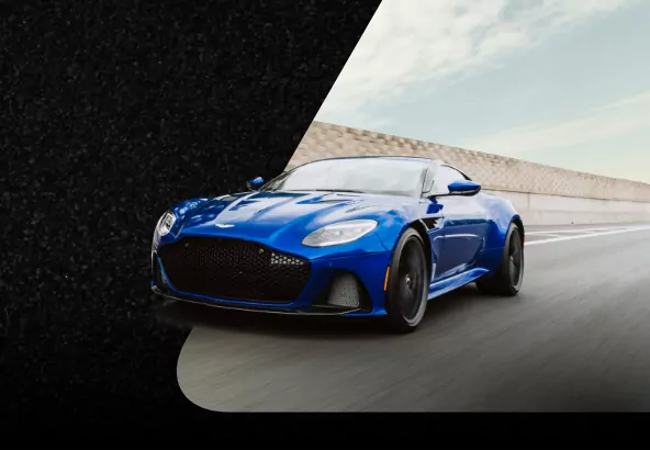
<p class="text-resize-1">Aston Martin and Lenovo Partnership</p>

<p class="text-resize-2">See how Lenovo Workstations drive Aston Martin’s pursuit of perfection across workflows.</p>

<p class="text-resize-3"><cta-button data-embed-class="btn-gated-resource" data-embed-label="LEARN MORE" data-embed-media="" data-embed-scheme="green" data-embed-target="_blank" data-embed-type="link" data-embed-url="https://techtoday.lenovo.com/ww/en/workstations/aston-martin">LEARN MORE </cta-button></p>
</div>

<style type="text/css">@import url("https://fonts.googleapis.com/css?family=Lato:400,700&display=swap&quot;);

.section-13-slide {
overflow: visible;
margin: 0 auto;
max-width: 296px;
}

.section-13-slide .img-resize img {
display: inline-flex;
margin: 0 auto;
height: 205px;
}

.section-13-slide .text-resize-1 {
font-family: 'Lato', sans-serif, Arial, Helvetica !important;
font-size: 20px !important;
font-weight: 700 !important;
height: auto !important;
line-height: 1.25 !important;
margin: 20px 0 10px;
}

.section-13-slide .text-resize-2 {
font-family: 'Lato', sans-serif, Arial, Helvetica !important;
font-size: 16px !important;
font-weight: normal !important;
height: auto !important;
line-height: 1.25 !important;
margin: 0;
}

.section-13-slide .text-resize-3 {
height: auto !important;
margin: 20px 0 0;
}

@media screen and (max-width: 767px) {

.section-13-slide {
text-align: center;
max-width: 296px;
}

.section-13-slide .img-resize img {
height: 195px;
}
}
</style>
<div class="section-13-slide">
<div class="img-resize">
<drupal-entity data-embed-button="media_entity_embed" data-entity-embed-display="view_mode:media.original_dimension" data-entity-embed-display-settings="" data-entity-type="media" data-entity-uuid="d1c14a22-e690-4312-9de5-435a597f98b1" data-langcode="ww-en"></drupal-entity>
</div>

<p class="text-resize-1">Accelerating a New Reality</p>

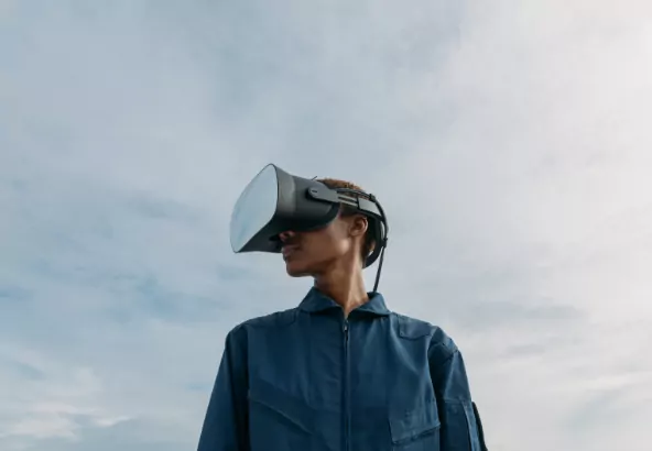
<p class="text-resize-2">See how Varjo and Lenovo Workstations, powered by NVIDIA, are transforming the way professionals invent, design and power experiences with ProVR.</p>

<p class="text-resize-3"><cta-button data-embed-class="btn-gated-resource" data-embed-label="VISIT BLOG" data-embed-media="" data-embed-scheme="green" data-embed-target="_blank" data-embed-type="link" data-embed-url="https://news.lenovo.com/transforming-the-way-professionals-invent-desig… BLOG </cta-button></p>
</div>

<style type="text/css">@import url("https://fonts.googleapis.com/css?family=Lato:400,700&display=swap&quot;);

.section-13-slide {
overflow: visible;
margin: 0 auto;
max-width: 296px;
}

.section-13-slide .img-resize img {
display: inline-flex;
margin: 0 auto;
height: 205px;
}

.section-13-slide .text-resize-1 {
font-family: 'Lato', sans-serif, Arial, Helvetica !important;
font-size: 20px !important;
font-weight: 700 !important;
height: auto !important;
line-height: 1.25 !important;
margin: 20px 0 10px;
}

.section-13-slide .text-resize-2 {
font-family: 'Lato', sans-serif, Arial, Helvetica !important;
font-size: 16px !important;
font-weight: normal !important;
height: auto !important;
line-height: 1.25 !important;
margin: 0;
}

.section-13-slide .text-resize-3 {
height: auto !important;
margin: 20px 0 0;
}

@media screen and (max-width: 767px) {

.section-13-slide {
text-align: center;
max-width: 296px;
}

.section-13-slide .img-resize img {
height: 195px;
}
}
</style>
<div class="section-13-slide">
<div class="img-resize">
<drupal-entity data-embed-button="media_entity_embed" data-entity-embed-display="view_mode:media.original_dimension" data-entity-embed-display-settings="" data-entity-type="media" data-entity-uuid="c9a87bc4-6bb4-4bd0-a762-a83f38e6fb3c" data-langcode="ww-en"></drupal-entity>
</div>

<p class="text-resize-1">Lenovo Remote Streaming Solutions with CloudXR</p>

<p class="text-resize-2">Take wireless VR/XR streaming to the edge, and leverage 5G &amp; Wi-Fi networks to deliver fully immersive remote VR/XR experiences to any Android or Windows client device. Powered by NVIDIA CloudXR.</p>

<p class="text-resize-3"><cta-button data-embed-class="btn-gated-resource" data-embed-label="LEARN MORE" data-embed-media="9332" data-embed-scheme="green" data-embed-target="" data-embed-type="media" data-embed-url="">LEARN MORE </cta-button></p>
</div>

<style type="text/css">@import url("https://fonts.googleapis.com/css?family=Lato:400,700&display=swap&quot;);

.section-14-container {
background-color: #ffffff;
padding: 60px 35px 65px !important;
}

.section-14-container .field--name-field-sub-text {
max-width: 100%;
padding: 0 10px;
}

.section-14-slide, .section-14-slide * {
box-sizing: border-box;
}

.section-14-slide-container {
padding: 0 !important;
}

.section-14 .bg-resize {
margin: 0 auto 60px;
max-width: 850px;
}

.section-14 .text-resize-1 {
font-family: 'Lato', sans-serif;
font-size: 30px !important;
font-weight: 700;
line-height: 1.2;
margin: 0 !important;
text-align: center;
}

.section-14-container .slick-dots {
/*bottom: -55px !important;*/
}

.section-14-container.paragraph--type--slide-anything .slick-slide-anything .slick-dots li.slick-active button:before {
width: 14px !important;
height: 14px !important;
}

.section-14-container.paragraph--type--slide-anything .slick-slide-anything .slick-dots li button:before {
top: 50% !important;
left: 50% !important;
transform: translate(-50%, -50%) !important;
width: 9px !important;
height: 9px !important;
content: '' !important;
background-color: #000000 !important;
border-radius: 50% !important;
text-shadow: none !important;
}

@media screen and (max-width: 767px) {
.section-14-container {
padding: 40px 10px 65px !important;
}

.section-14 .text-resize-1 {
font-size: 24px !important;
line-height: 1.17;
}

.section-14 .bg-resize {
padding: 0 10px;
margin-bottom: 30px;
}
}
</style>
<div class="section-14">
<div class="bg-resize">
<p class="text-resize-1">Explore Lenovo Workstations</p>
</div>
</div>

<style type="text/css">@import url("https://fonts.googleapis.com/css?family=Lato:400,700&display=swap&quot;);

.section-14-slide {
overflow: visible;
margin: 0 auto;
max-width: 200px;
text-align: center;
}

.section-14-slide .img-resize img {
display: inline-flex;
margin: 0 auto;
height: 200px;
}

.section-14-slide .text-resize-1 {
color: #000000 !important;
font-family: 'Lato', sans-serif, Arial, Helvetica !important;
font-size: 20px !important;
font-weight: 700 !important;
line-height: 1.25 !important;
margin: 30px 0;
}
</style>
<div class="section-14-slide">
<div class="img-resize">
<drupal-entity data-embed-button="media_entity_embed" data-entity-embed-display="view_mode:media.original_dimension" data-entity-embed-display-settings="" data-entity-type="media" data-entity-uuid="ef7f52cf-aa15-4e30-bd48-7d5525519540" data-langcode="ww-en"></drupal-entity>
</div>

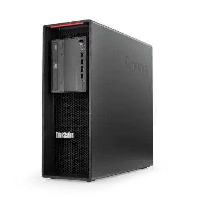
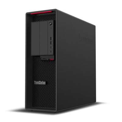
<p class="text-resize-1">ThinkStation P520</p>
</div>

<style type="text/css">@import url("https://fonts.googleapis.com/css?family=Lato:400,700&display=swap&quot;);

.section-14-slide {
overflow: visible;
margin: 0 auto;
max-width: 200px;
text-align: center;
}

.section-14-slide .img-resize img {
display: inline-flex;
margin: 0 auto;
height: 200px;
}

.section-14-slide .text-resize-1 {
color: #000000 !important;
font-family: 'Lato', sans-serif, Arial, Helvetica !important;
font-size: 20px !important;
font-weight: 700 !important;
line-height: 1.25 !important;
margin: 30px 0;
}
</style>
<div class="section-14-slide">
<div class="img-resize">
<drupal-entity data-embed-button="media_entity_embed" data-entity-embed-display="view_mode:media.original_dimension" data-entity-embed-display-settings="" data-entity-type="media" data-entity-uuid="b8db4bb3-5f28-4bb2-af24-c46fc039b8e5" data-langcode="ww-en"></drupal-entity>
</div>

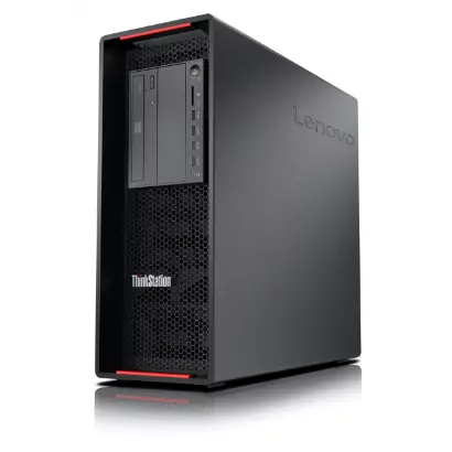
<p class="text-resize-1">ThinkStation P620</p>
</div>

<style type="text/css">@import url("https://fonts.googleapis.com/css?family=Lato:400,700&display=swap&quot;);

.section-14-slide {
overflow: visible;
margin: 0 auto;
max-width: 200px;
text-align: center;
}

.section-14-slide .img-resize img {
display: inline-flex;
margin: 0 auto;
height: 200px;
}

.section-14-slide .text-resize-1 {
color: #000000 !important;
font-family: 'Lato', sans-serif, Arial, Helvetica !important;
font-size: 20px !important;
font-weight: 700 !important;
line-height: 1.25 !important;
margin: 30px 0;
}
</style>
<div class="section-14-slide">
<div class="img-resize">
<drupal-entity data-embed-button="media_entity_embed" data-entity-embed-display="view_mode:media.original_dimension" data-entity-embed-display-settings="" data-entity-type="media" data-entity-uuid="f9b98c9f-97a9-4dcd-94b5-1d5a1df9e746" data-langcode="ww-en"></drupal-entity>
</div>

<p class="text-resize-1">ThinkStation P720</p>
</div>

<style type="text/css">@import url("https://fonts.googleapis.com/css?family=Lato:400,700&display=swap&quot;);

.section-14-slide {
overflow: visible;
margin: 0 auto;
max-width: 200px;
text-align: center;
}

.section-14-slide .img-resize img {
display: inline-flex;
margin: 0 auto;
height: 200px;
}

.section-14-slide .text-resize-1 {
color: #000000 !important;
font-family: 'Lato', sans-serif, Arial, Helvetica !important;
font-size: 20px !important;
font-weight: 700 !important;
line-height: 1.25 !important;
margin: 30px 0;
}
</style>
<div class="section-14-slide">
<div class="img-resize">
<drupal-entity data-embed-button="media_entity_embed" data-entity-embed-display="view_mode:media.original_dimension" data-entity-embed-display-settings="" data-entity-type="media" data-entity-uuid="22b5b677-55d4-4f17-8b30-bca3cd8cf202" data-langcode="ww-en"></drupal-entity>
</div>

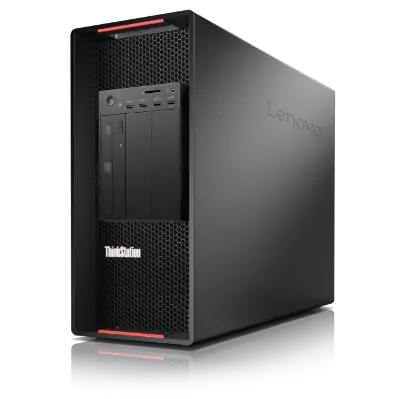
<p class="text-resize-1">ThinkStation P920</p>
</div>

<style type="text/css">@import url("https://fonts.googleapis.com/css?family=Lato:400,700&display=swap&quot;);

.section-14-slide {
overflow: visible;
margin: 0 auto;
max-width: 200px;
text-align: center;
}

.section-14-slide .img-resize img {
display: inline-flex;
margin: 0 auto;
height: 200px;
}

.section-14-slide .text-resize-1 {
color: #000000 !important;
font-family: 'Lato', sans-serif, Arial, Helvetica !important;
font-size: 20px !important;
font-weight: 700 !important;
line-height: 1.25 !important;
margin: 30px 0;
}
</style>
<div class="section-14-slide">
<div class="img-resize">
<drupal-entity data-embed-button="media_entity_embed" data-entity-embed-display="view_mode:media.original_dimension" data-entity-embed-display-settings="" data-entity-type="media" data-entity-uuid="a1b10ea7-0e16-4992-9786-aa4153f1919f" data-langcode="ww-en"></drupal-entity>
</div>

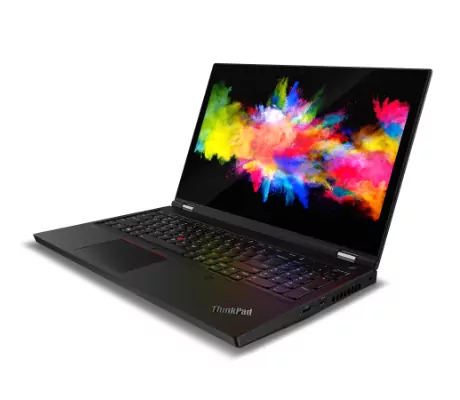
<p class="text-resize-1">ThinkPad P15</p>
</div>

<style type="text/css">@import url("https://fonts.googleapis.com/css?family=Lato:400,700&display=swap&quot;);

.section-14-slide {
overflow: visible;
margin: 0 auto;
max-width: 200px;
text-align: center;
}

.section-14-slide .img-resize img {
display: inline-flex;
margin: 0 auto;
height: 200px;
}

.section-14-slide .text-resize-1 {
color: #000000 !important;
font-family: 'Lato', sans-serif, Arial, Helvetica !important;
font-size: 20px !important;
font-weight: 700 !important;
line-height: 1.25 !important;
margin: 30px 0;
}
</style>
<div class="section-14-slide">
<div class="img-resize">
<drupal-entity data-embed-button="media_entity_embed" data-entity-embed-display="view_mode:media.original_dimension" data-entity-embed-display-settings="" data-entity-type="media" data-entity-uuid="06953f77-67f6-4045-8610-c25036fc5d57" data-langcode="ww-en"></drupal-entity>
</div>

<p class="text-resize-1">ThinkPad P17</p>
</div>

<style type="text/css">@import url("https://fonts.googleapis.com/css?family=Lato:400,700&display=swap&quot;);

.section-15-container {
background-color: #f5f5f5;
padding: 60px 35px 45px !important;
}

.section-15-container .field--name-field-sub-text {
max-width: 100%;
padding: 0 10px;
}

.section-15-container.paragraph--type--slide-anything .slick-slide-anything {
max-width: 850px;
}

.section-15-slide, .section-15-slide * {
box-sizing: border-box;
}

.section-15-slide-container {
padding: 0 !important;
}

.section-15 .bg-resize {
margin: 0 auto 60px;
max-width: 850px;
}

.section-15 .text-resize-1 {
font-family: 'Lato', sans-serif;
font-size: 30px !important;
font-weight: 700;
line-height: 1.2;
margin: 0 !important;
text-align: center;
}

.section-15-container .slick-dots {
/*bottom: -55px !important;*/
}

.section-15-container.paragraph--type--slide-anything .slick-slide-anything .slick-dots li.slick-active button:before {
width: 14px !important;
height: 14px !important;
}

.section-15-container.paragraph--type--slide-anything .slick-slide-anything .slick-dots li button:before {
top: 50% !important;
left: 50% !important;
transform: translate(-50%, -50%) !important;
width: 9px !important;
height: 9px !important;
content: '' !important;
background-color: #000000 !important;
border-radius: 50% !important;
text-shadow: none !important;
}

@media screen and (max-width: 767px) {
.section-15-container {
padding: 40px 10px 35px !important;
}

.section-15-container.paragraph--type--slide-anything .slick-slide-anything {
max-width: 100%;
}

.section-15 .text-resize-1 {
font-size: 24px !important;
line-height: 1.17;
}

.section-15 .bg-resize {
padding: 0 10px;
margin-bottom: 30px;
}
}
</style>
<div class="section-15">
<div class="bg-resize">
<p class="text-resize-1">Varjo Headsets</p>
</div>
</div>

<style type="text/css">@import url("https://fonts.googleapis.com/css?family=Lato:400,700&display=swap&quot;);

.section-15-slide {
overflow: visible;
margin: 0 auto;
max-width: 320px;
text-align: center;
}

.section-15-slide .img-resize img {
display: inline-flex;
margin: 0 auto;
height: 200px;
}

.section-15-slide .text-resize-1 {
color: #000000 !important;
font-family: 'Lato', sans-serif, Arial, Helvetica !important;
font-size: 20px !important;
font-weight: 700 !important;
line-height: 1.25 !important;
margin: 30px 0;
}
</style>
<div class="section-15-slide">
<div class="img-resize">
<drupal-entity data-embed-button="media_entity_embed" data-entity-embed-display="view_mode:media.original_dimension" data-entity-embed-display-settings="" data-entity-type="media" data-entity-uuid="1ed30ea3-2168-450a-bf24-ff03fd9d6287" data-langcode="ww-en"></drupal-entity>
</div>

<p class="text-resize-1">Varjo VR-3</p>
</div>

<style type="text/css">@import url("https://fonts.googleapis.com/css?family=Lato:400,700&display=swap&quot;);

.section-15-slide {
overflow: visible;
margin: 0 auto;
max-width: 320px;
text-align: center;
}

.section-15-slide .img-resize img {
display: inline-flex;
margin: 0 auto;
height: 200px;
}

.section-15-slide .text-resize-1 {
color: #000000 !important;
font-family: 'Lato', sans-serif, Arial, Helvetica !important;
font-size: 20px !important;
font-weight: 700 !important;
line-height: 1.25 !important;
margin: 30px 0;
}
</style>
<div class="section-15-slide">
<div class="img-resize">
<drupal-entity data-embed-button="media_entity_embed" data-entity-embed-display="view_mode:media.original_dimension" data-entity-embed-display-settings="" data-entity-type="media" data-entity-uuid="4563fcfc-289f-41ba-a927-7e87a5e16218" data-langcode="ww-en"></drupal-entity>
</div>

<p class="text-resize-1">Varjo XR-3</p>
</div>

<style type="text/css">

.section-16-container {
padding: 60px 35px !important;
}

.section-16, .section-16 * {
box-sizing: border-box;
}

.section-16 .bg-resize {
display: flex;
flex-flow: column wrap;
justify-content: center;
max-width: 625px;
margin: 0 auto;
text-align: center !important;
}

.section-16 .text-resize-1 {
font-family: 'Lato', sans-serif, Arial, Helvetica !important;
font-size: 30px !important;
font-weight: 900;
line-height: 1.2;
margin: 0;
}

.section-16 .text-resize-2 {
font-family: 'Lato', sans-serif, Arial, Helvetica !important;
font-size: 20px !important;
font-weight: normal;
line-height: 1.25;
margin: 20px 0 30px;
}

.section-16 .text-resize-3 {
margin: 0;
}

.section-16 .btn-gated-resource {
font-size: 16px;
line-height: 1;
font-family: 'Lato', sans-serif, Arial, Helvetica;
font-weight: 700;
padding: 12px 20px;
}

@media screen and (max-width: 767px) {
.section-16-container {
background-position: 76% 50% !important;
padding: 116px 20px 62px !important;
}

.section-16 .bg-resize {
text-align: left !important;
}

.section-16 .text-resize-2 {
font-size: 16px !important;
line-height: 1.2;
margin: 10px 0 20px;
}
}
</style>
<div class="section-16">
<div class="bg-resize">
<p class="text-resize-1">Get in touch</p>

<p class="text-resize-2">For further information on how Lenovo Professional VR/XR solutions can transform your workflow, or to test drive one of these best in class Virtual &amp; Mixed Reality solutions, please click below.&nbsp;</p>

<p class="text-resize-3"><gated-resource data-embed-button-icon="" data-embed-form="3647" data-embed-label="GET IN TOUCH" data-embed-media="" data-embed-scheme="green" data-embed-target="" data-embed-type="form" data-embed-url="">GET IN TOUCH</gated-resource></p>
</div>
</div>

<style type="text/css">

.section-17-container {
padding: 70px 35px 150px !important;
}

.section-17, .section-17 * {
box-sizing: border-box;
}

.section-17 .bg-resize {
display: flex;
flex-flow: column wrap;
justify-content: center;
max-width: 1090px;
margin: 0 auto;
padding: 0 40px;
}

.section-17 .text-resize-1 {
font-family: 'Lato', sans-serif, Arial, Helvetica !important;
font-size: 41px !important;
font-weight: 900;
line-height: 1.1;
margin: 0;
max-width: 320px;
}

.section-17 .text-resize-2 {
font-family: 'Lato', sans-serif, Arial, Helvetica !important;
font-size: 22px !important;
font-weight: normal;
line-height: 1.18;
margin: 10px 0 30px;
max-width: 440px;
}

.section-17 .text-resize-3 {
margin: 0;
}

.section-17 .btn-gated-resource {
font-size: 16px;
line-height: 1;
font-family: 'Lato', sans-serif, Arial, Helvetica;
font-weight: 700;
padding: 12px 25px;
}

.section-17 .btn-gated-resource::after {
content: none !important;
}

.section-17 .btn-gated-resource::before {
padding-right: 10px;
color: #fff;
font-size: 13px;
vertical-align: 0;
content: "\e257";
position: relative;
top: 1px;
display: inline-block;
font-family: 'Glyphicons Halflings';
font-style: normal;
font-weight: 400;
line-height: 1;
-webkit-font-smoothing: antialiased;
}

@media screen and (max-width: 767px) {
.section-17-container {
padding: 48px 20px !important;
}

.section-17 .bg-resize {
padding: 0;
}

.section-17 .text-resize-1 {
font-size: 28px !important;
line-height: 1.21;
max-width: 245px;
}

.section-17 .text-resize-2 {
font-size: 16px !important;
line-height: 1.5;
margin: 16px 0 32px;
max-width: 225px;
}
}
</style>
<div class="section-17">
<div class="bg-resize">
<p class="text-resize-1">Smarter creates the future</p>

<p class="text-resize-2">Push the limits of productivity, creativity and innovation with Lenovo Workstations.&nbsp;</p>

<p class="text-resize-3"><cta-button data-embed-class="btn-gated-resource" data-embed-label="GO BACK TO WORKSTATIONS" data-embed-media="" data-embed-scheme="green" data-embed-target="_blank" data-embed-type="link" data-embed-url="https://techtoday.lenovo.com/ww/en/workstations">GO BACK TO WORKSTATIONS </cta-button></p>
</div>
</div>

<style type="text/css">.sticky-cta {
padding: 0 !important;
z-index: 10000;
position: fixed;
top: 8vh;
right: 0;
transform: rotate(-90deg) translateY(-50%);
transform-origin: right center;
}

.sticky-cta a {
color: #ffffff !important;
padding: 10px 11px !important;
font-size: 16px;
font-weight: bold;
line-height: 1;
}

.sticky-cta a span {
display: none !important;
}

@media (max-width: 767px) {
.sticky-cta {
display: none;
}
}
</style>
<div><gated-resource data-embed-button-icon="" data-embed-form="3647" data-embed-label="GET IN TOUCH" data-embed-media="" data-embed-scheme="green" data-embed-target="" data-embed-type="form" data-embed-url="">GET IN TOUCH</gated-resource></div>